More than a decade ago, blogging took off in a big way. Back then, WordPress was the platform of choice for bloggers. WordPress has since evolved into a full-fledged publishing platform. Though many people still view WordPress as a blogging platform, discerning users have made it their Content Management System of choice. You can count many reputed organizations, big brands, and Fortune 500 companies. You need look no further than eBay, Forbes, GM and Reuters to find WordPress users.
WordPress Key Features
WordPress currently powers about 44% of the websites on the Internet. It is popular for many reasons, some of which are shown below:
- Open-source Content Publishing System. The source code is available for developers, and for the whole community, to customize, extend, modify and share.
- Constantly updated, and keeps up with the fast-changing technological scene. Users can easily download and install updates, thus maintaining website safety.
- 100+ themes built specifically for it. You can customize most of them using the options in the Admin panel or via direct coding. This also gives you the power to fully personalize your website, making it unique and distinct.
- Thousands of plugins that can extend functionality. Users should take care to purchase plugins only from reputable vendors or highly rated plugins that offer good support.
- The software is free and easy to install. However, you will have to pay for hosting and, if you wish, purchase premium themes and plugins.
- Easy to manage and use. A number of tutorials are available for you to fall back on. Backup of the entire site can also be made and kept for safety.
- Scalability — you can start your website in a small way and expand it along the way just as much as you want. If you hear talk about WordPress not being able to handle high traffic, you can most likely put it down to the limited resources of your server.
- Search Engine friendly and well-coded, fast loading, easily navigable, integrates well with social media and offers splendid user experience.
- Supports multimedia, and can load high resolution images and videos easily.
Whatever your future website maybe, you don’t need to hesitate in picking WordPress as your CMS. Take a look at some of the websites that have done just that.
The Walt Disney Company
Mickey Mouse, the mascot of the Fortune 500 company, has made his home with WordPress. Meanwhile, WordPress.org has proudly included The Walt Disney Company in its showcase. The website has loads of corporate information on many of its pages.
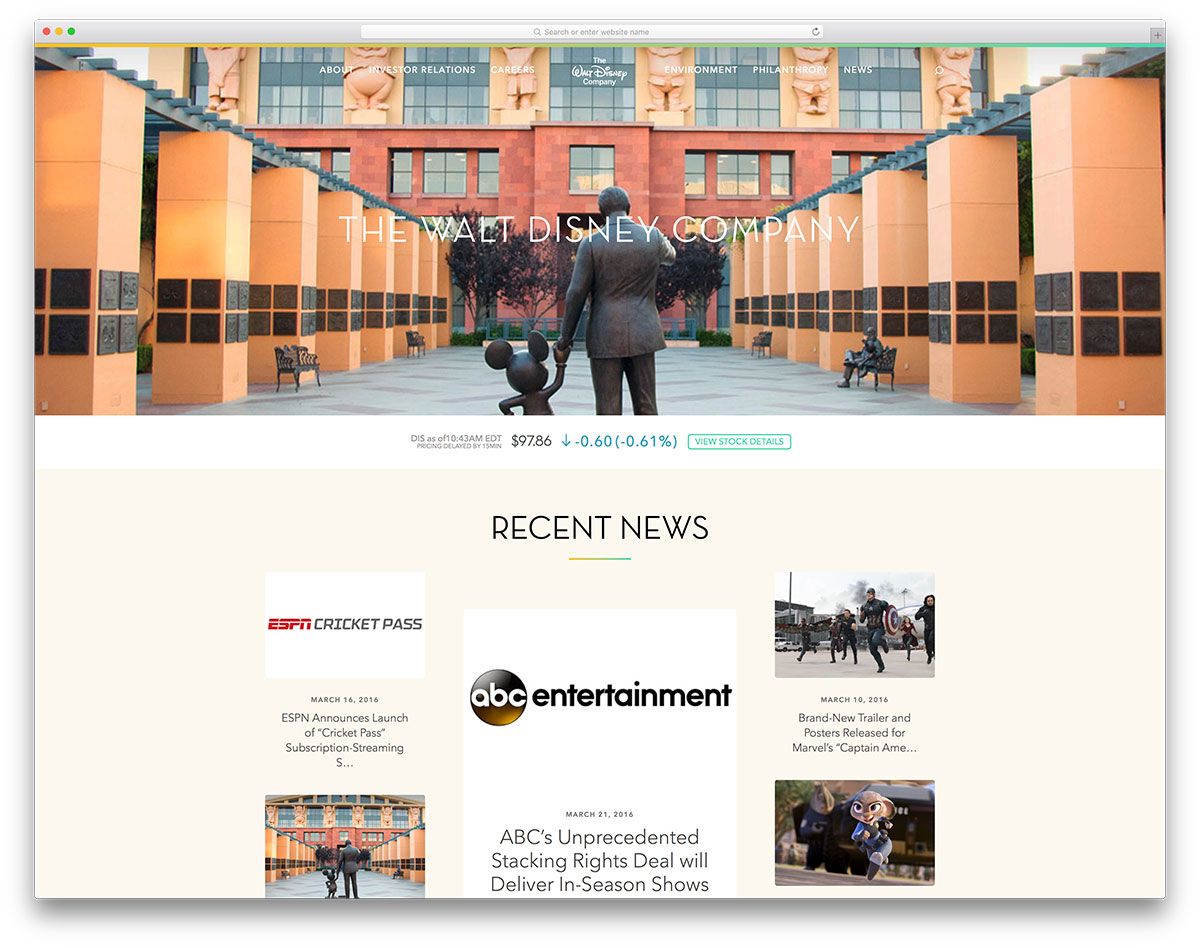
There is a lot of white space on the pages to make reading easy, and text is positioned in white boxes that accompany boxed images. The pages are sectioned neatly, with full width horizontal images serving as separators. The header on the homepage merges with the full width image, but becomes distinctive in a white background when you hover over it.
View Live PageGracenote
Gracenote is the leading entertainment data and technology company that help link people to the entertainment they want.
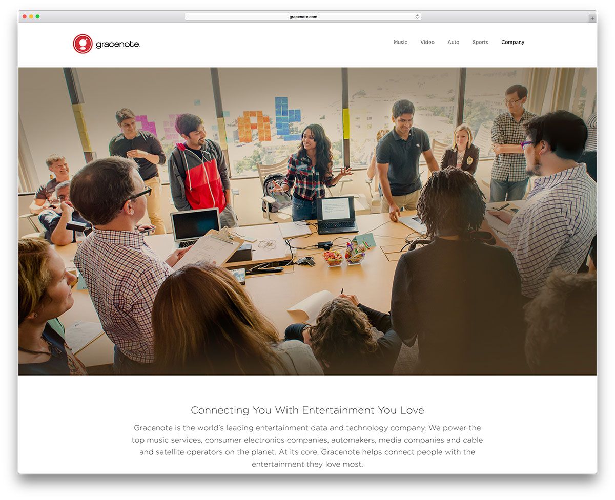
At a glance, the header appears ordinary, shrinking a bit as you move away. But when you hover over the menu, the submenu opens up to small, neat images with text alongside. A catchy way to make you read further. The images on the slider on the homepage will give you an idea of their services.
View Live PageHerald Sun
The Herald Sun is a daily newspaper in Australia. The content-heavy website has arranged content neatly on muted backgrounds with neat fonts. The menu is color coded; each item opens into a submenu that sports-related content in the same color almost throughout the website.
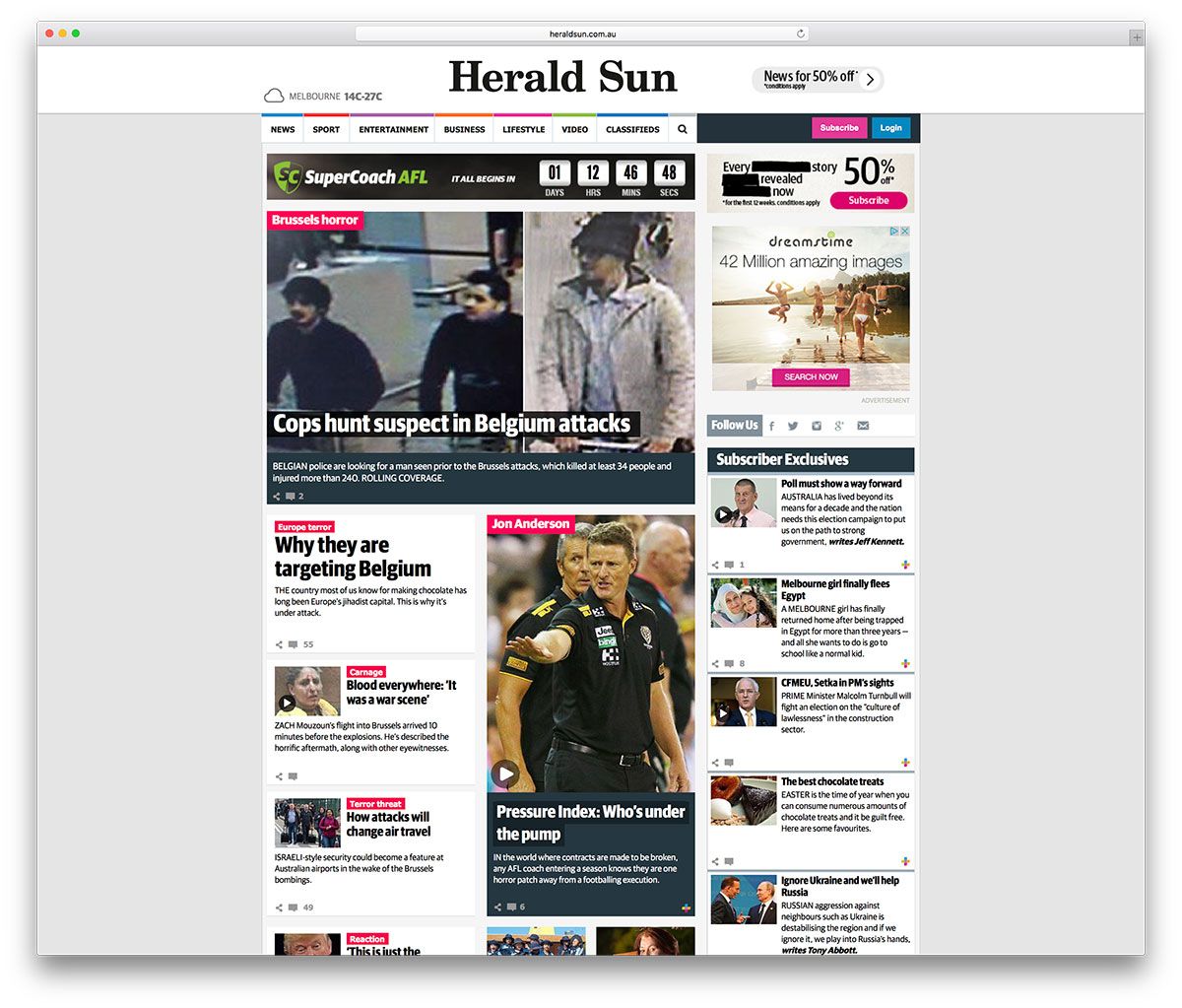
The news snippets are arranged in columns, and many videos are available to view the news on-screen. The footer is very broad and the entire website is boxed in a pale background to provide relief from the heavy content.
View Live PageAMC
AMC Network runs some of the most popular TV shows such as Walking Dead. The company has used WordPress for their website.
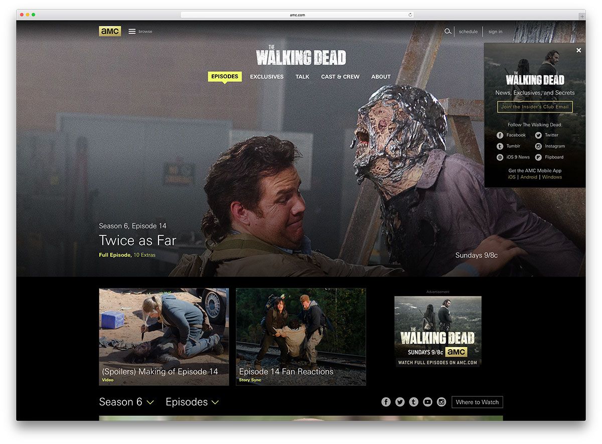
A click on the Browse button will display all the AMC shows on a full-width slider above an almost non-existent header. Clicking on the individual shows will take you to that page, where you can check out its cast and crew, schedules and episodes of that show. The website carries a dark layout throughout the page. Furthermore, you can find the menu in the footer.
View Live PageWooCommerce
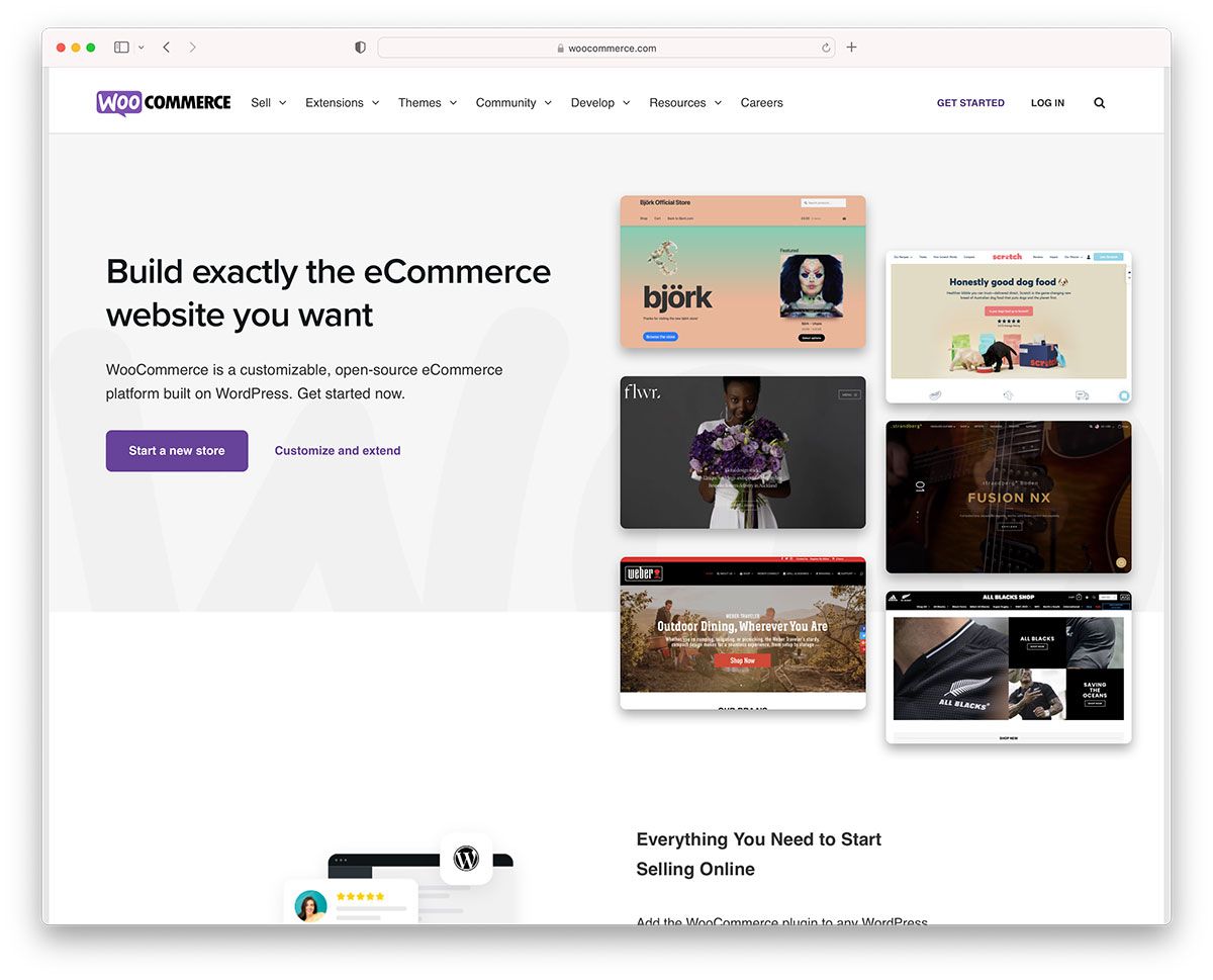
WooCommerce website mostly has a white background, with a broad horizontal band below the header and footer in the company’s signature blue color.
Mercedes-Benz
The black background of the website and the stunning scenery in the images on the slider make a perfect backdrop for the various models of cars of this corporate biggie. This slider moves down when the mouse hovers over a menu item, so you can read the submenu and see its images.
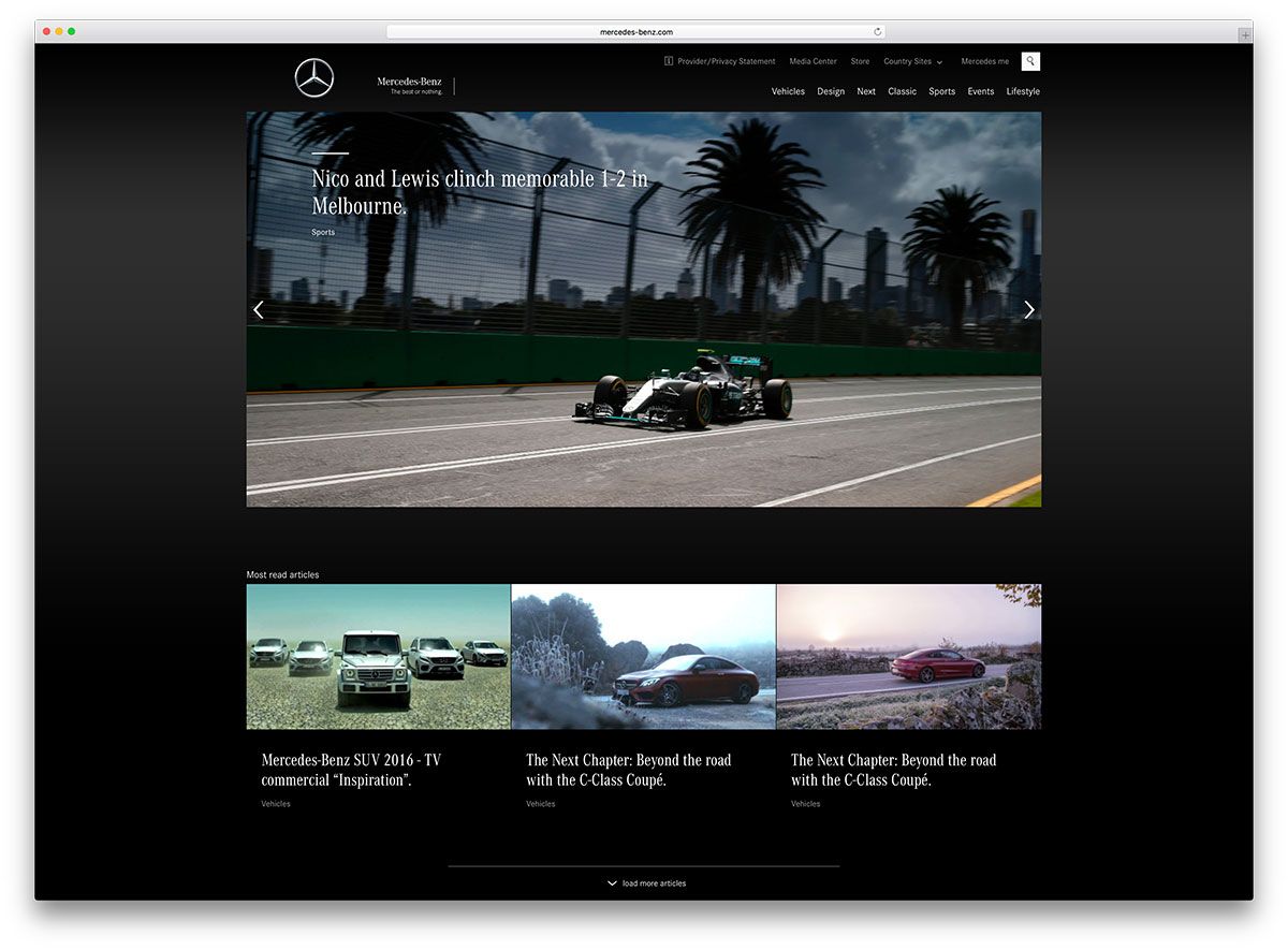
All the pages have horizontal sections in which articles are neatly arranged in marginless boxes. Some videos of cars in action also find a place on the website.
View Live PageBata
This famous shoe brand that serves over a million customers everyday has an image-rich website. The images showcase people modeling their various shoes. As you hover over the images, text headings appear, which you can click on to read more about the product.
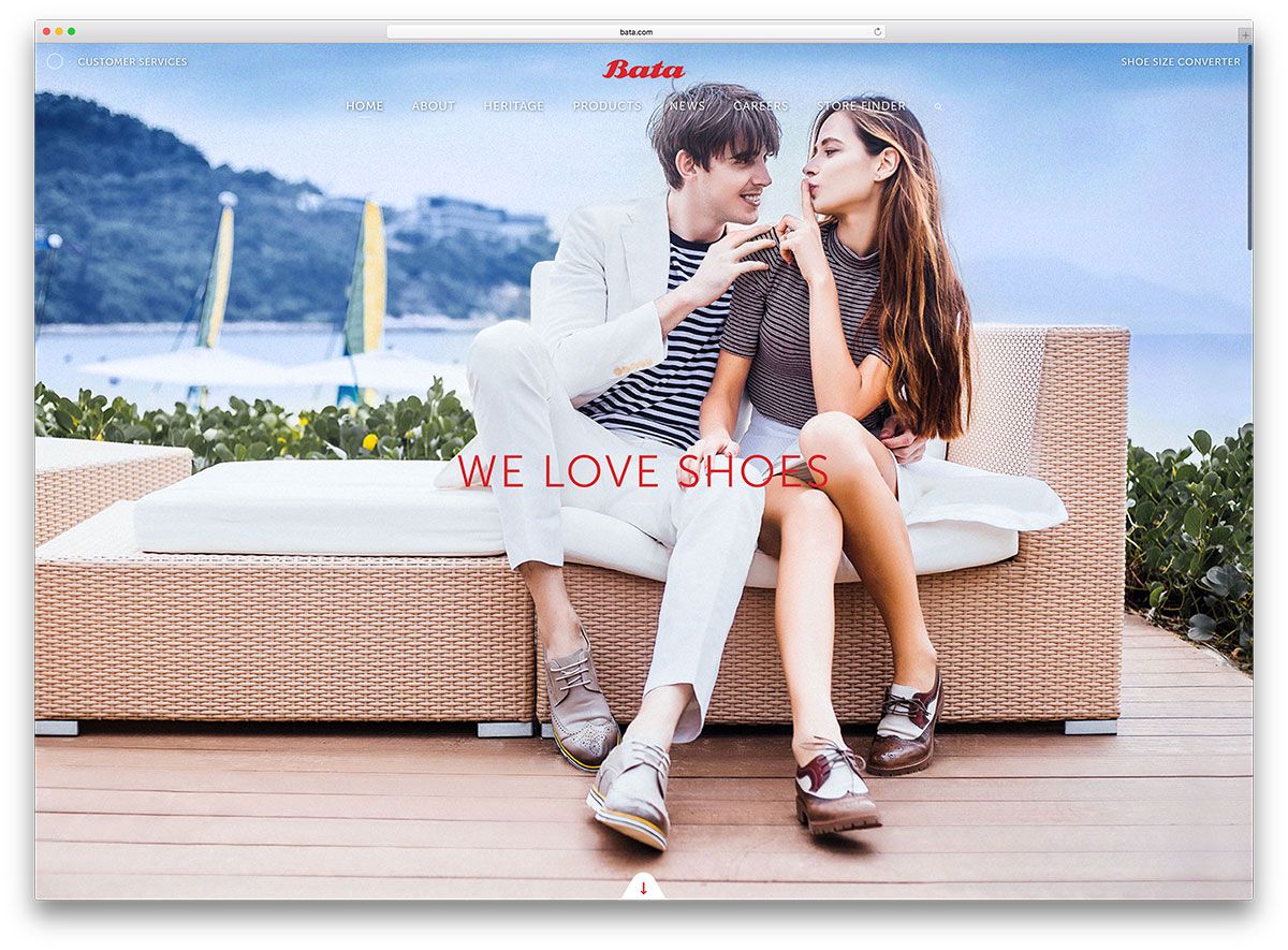
Small icons of a shoe and people appear alongside the text, so you know what you are likely to find within. Small, strategically-placed arrows also help you navigate around the website.
View Live PageBrian Smith
Brian Smith Pictures is the website of Pulitzer Prize winning Photographer, Brian Smith. He has placed a good number of his pictures in a portfolio on a slider. A viewer can immediately catch the highlight of his work on the slider before taking a closer look at the main content.
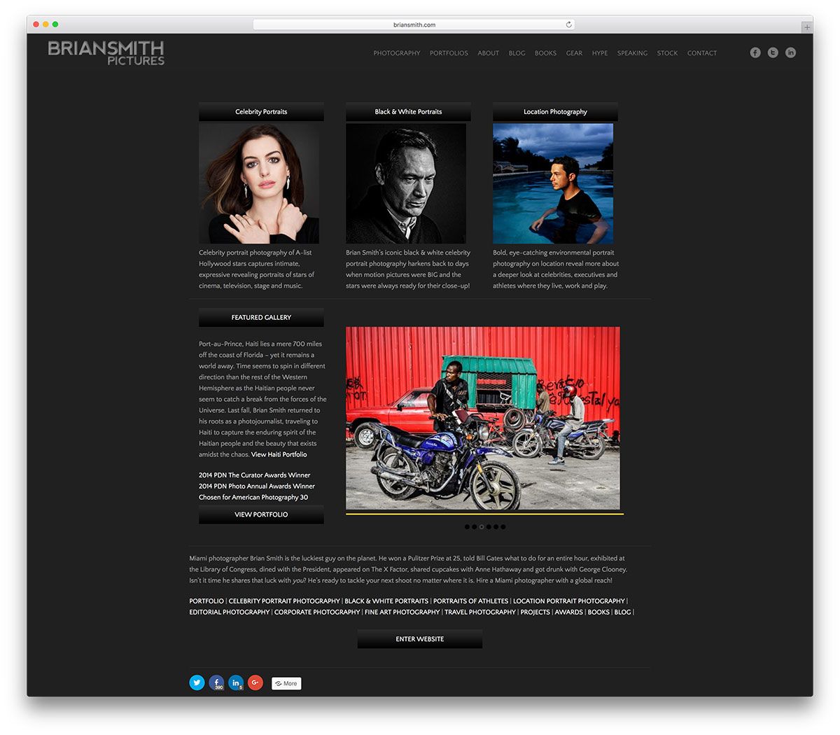
The dark skin layout of the website serves as an ideal backdrop for his pictures. This strategy allows for undistributed attention from the viewers, making them focus only on the images.
View Live PageSweden.se
Sweden.se is the official website of the country of Sweden. The site is also built on the WordPress platform. It also has many images with thin borders, arranged in a three-column layout.
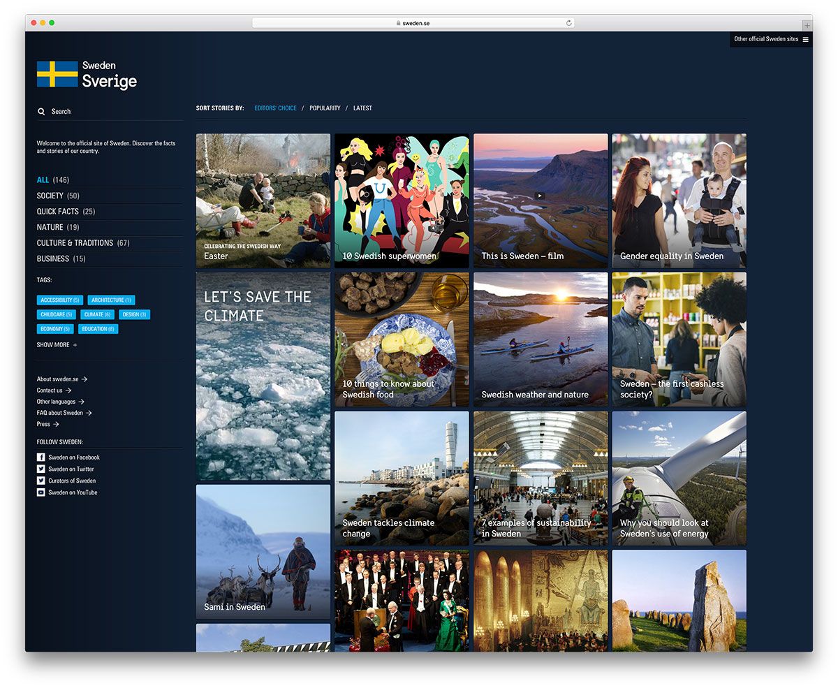
There is a broad empty space to the left, so the images do not seem to clutter the page. You can click on each of them to read more about the subject. The images cover a wide range of topics; human rights, cultural events, the Swedish Monarchy, elder care, and more. In addition, you can access information about the website via the footer, which you can pull and push back in as you please.
View Live PageCourts and Tribunals Judiciary
The Judiciary in the United Kingdom appears very formal on their WordPress website. There is nothing fancy about it, and the information is laid out in a no-fuss manner. In case you cannot find what you are looking for after glancing through the drop-down menu, you can search for judicial and legal information and citations at the top of the homepage.
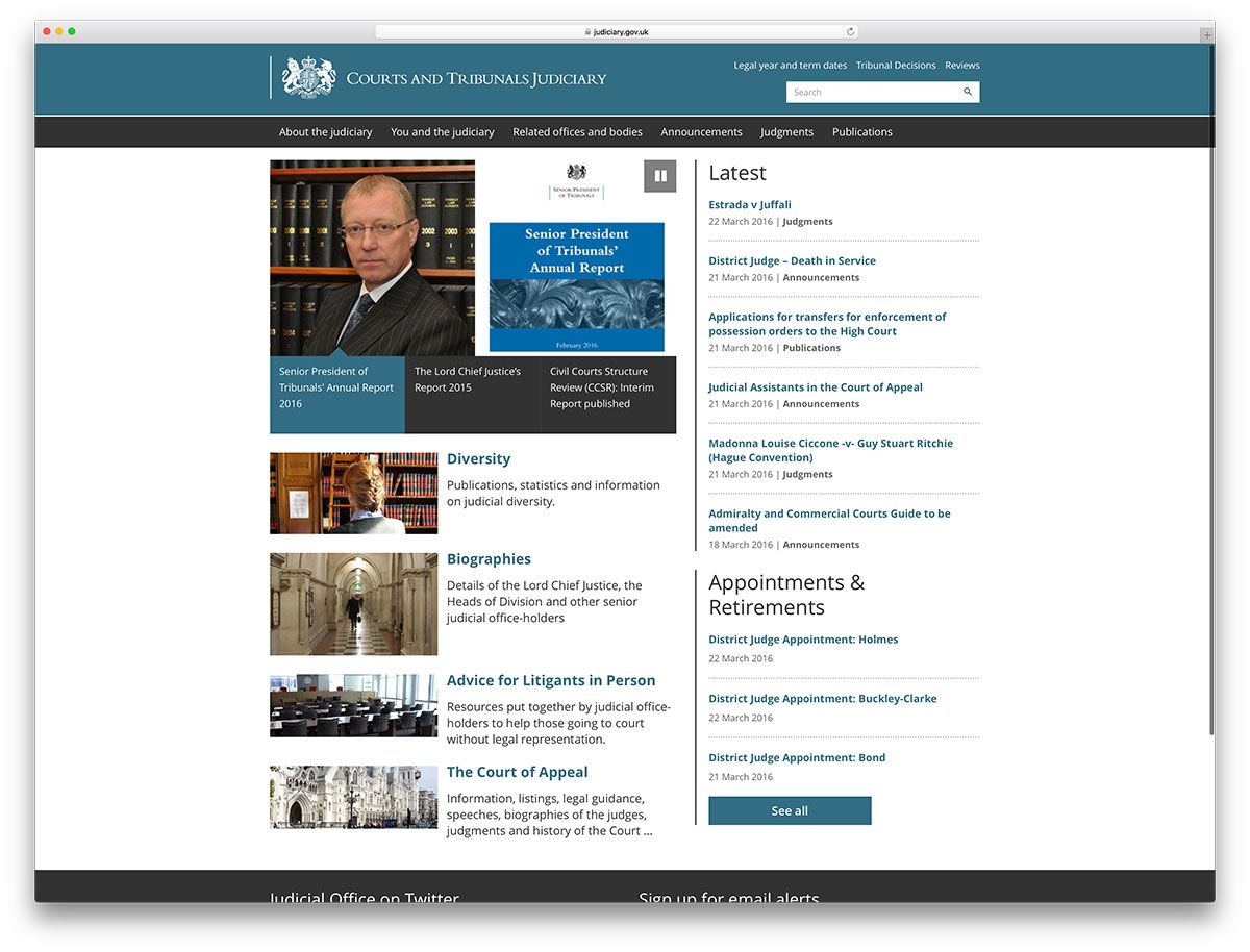
Sliders in one-half of the page show some of their current reports. The page is vertically divided, with updated information presented to the right and standard information occupying the left.
View Live PageDassault Aviation
The website of this French aviation company has a technical feel to it.
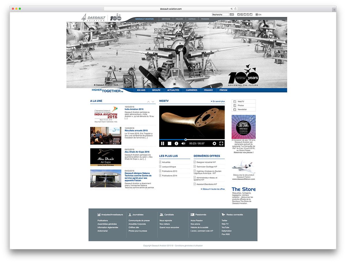
The full-width image at the top is placed in a streamlined frame, with the menu placed in the wider portion. Below the full-width image of the aircraft, the remainder of the website sports a boxed layout which contains small images, web TV and a boxed footer.
View Live PageChuck Yeagar
You can see the good General in all his glory in the full screen image on the homepage. A small box is cut-out in the homepage and the other pages. You can scroll the box for articles on General Yeager.
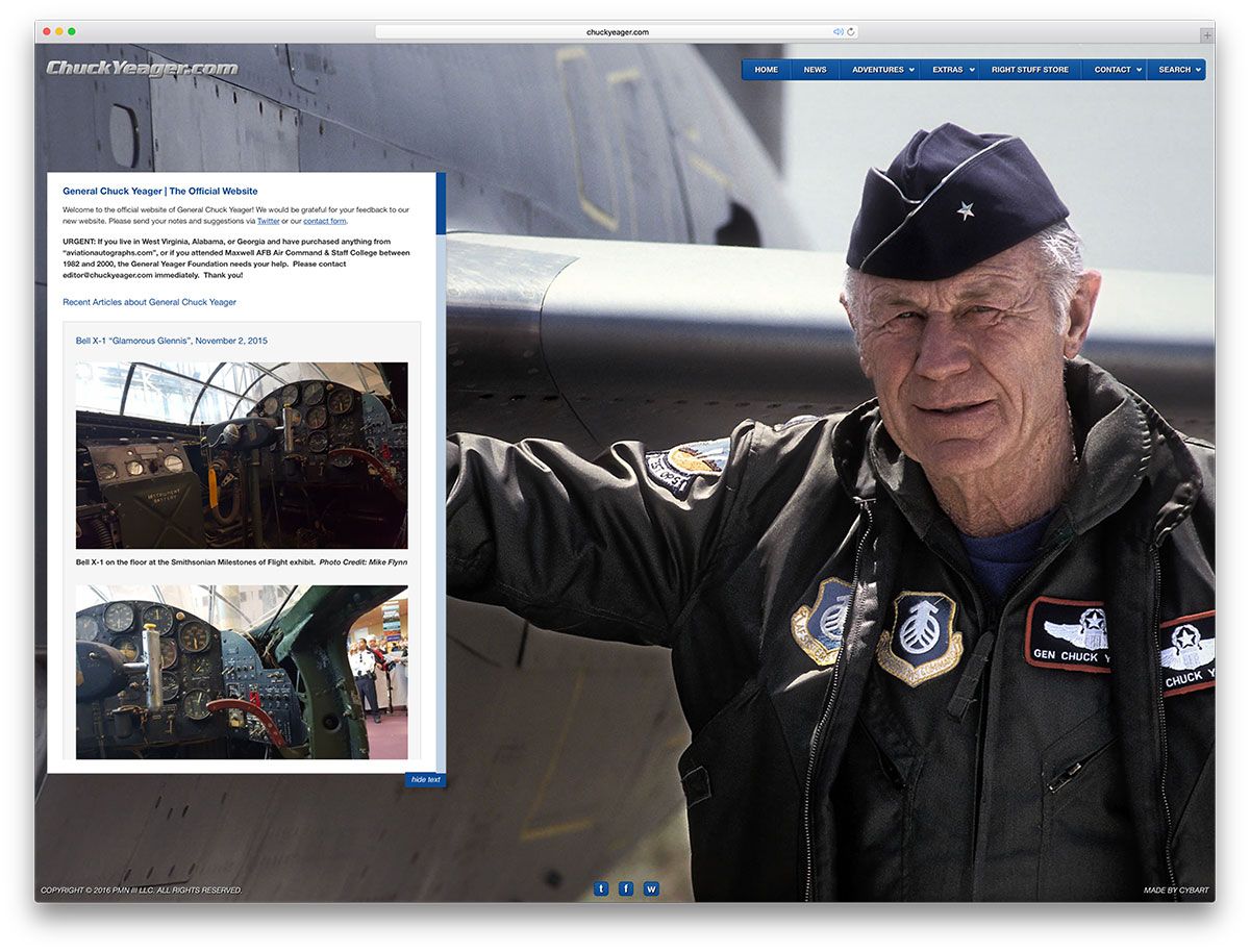
You can also find a store on the menu to purchase books and photographs that the General has signed himself. A visitor can also choose to hide the text and browse through the images.
View Live PageBoston Market
Baked Cod, Half Chicken and Sliced Ham are all temptingly advertised as full meals in the slider of the website of Boston Market.
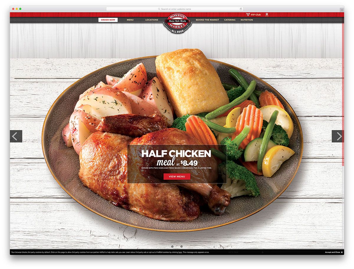
The menu can be accessed from the homepage and you can also locate the eatery easily with the help of call to action buttons. So the website makes it easy to find them or to order in, if you don’t want to make the trip. You can access exclusive offers by clicking on the VIP Club and the footer can be pulled out by clicking a button at the bottom. Very neat and mouth-watering display on a WordPress platform.
View Live PageThe Official James Bond Website
It appears that the James Bond saga can never die. You will be quite sure of this if you begin to scroll down this website. The never-ending list of articles, interviews, snippets, and memorabilia is placed below the other in a one plus three column boxed layout.
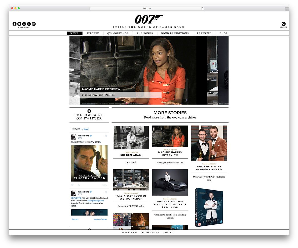
The images from the movies and the awards ceremonies stack on top of another in a fashion that is as stylish as the English spy himself. Stories about Bond and auction particulars of movie-related stuff are also included in the website.
View Live PageRealtor
This WordPress-based website will help you find just the right home you want. You can search for homes location-wise, and find realtors and Mortgage lenders to assist you in your search.
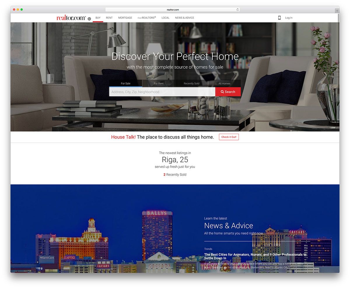
Appropriate attractive icons accompany the menu. Information or current news about the industry are placed on a small slider that runs midway down the page.
View Live PageRenault
The website of French car manufacturer, Renault, sports a bright yellow color throughout. From the horizontal strip above the header, you can pick how you want to view the website – as an analyst, journalist, job seeker, or shareholder. Social icons are also placed prominently in the same strip.
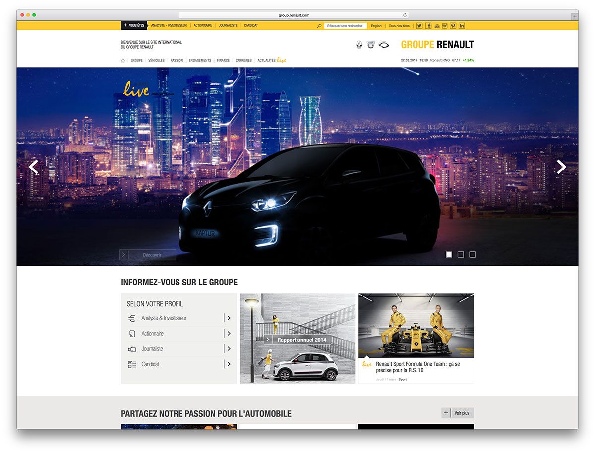
The menu in the header is attractively arranged and the drop down contains not only text, but also images and downloadable documents.
View Live PageBoardShorts
BoardShorts sells shorts for men and women online. The products are categorized and displayed neatly and accepted payment methods are mentioned prominently in the footer.
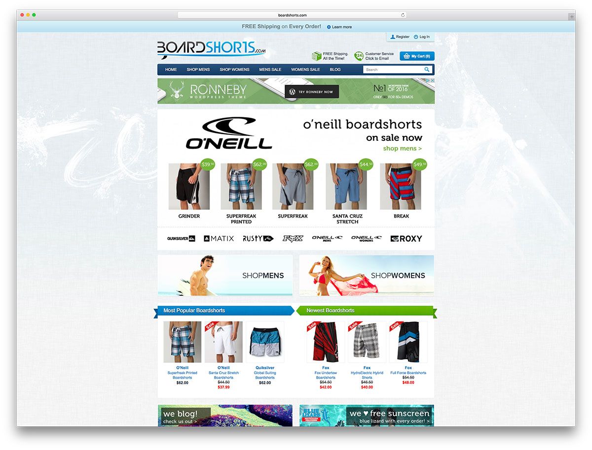
Imaginative icons for free shipping and customer care are found in the header. The store also has a blog section, in which you can find many articles mostly about travel and shorts, too.
View Live PageInvisible Children
Invisible Children is an organization working hard to return the captive child soldiers of East Africa to their homes. It is actively engaged in collecting money to end the war in Africa.
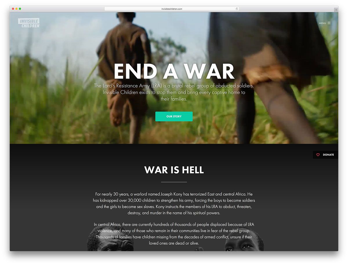
The call to Donate button remains sticky on the website, urging a visitor to contribute towards peace. The menu is located in a sidebar to the right.
View Live PageSylvester Stallone
The website of the Rocky star is simple and built on WordPress.
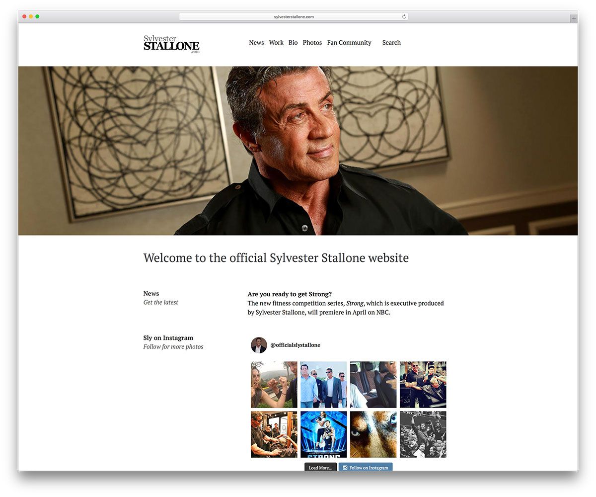
While some pages on the website support his bio data and fan login, the homepage pays more attention to his TV shows. His Instagram address is shared on the website.
View Live PageIZOD
IZOD is an online store that retails American fashion for every occasion. The website is innovative in the display of its wares. A click on the Shop Collection will allow you to browse through their recent collection. You can call up the next screen by clicking on bulleted points. For details on any particular item that catches your fancy, you can click on the + on that item.
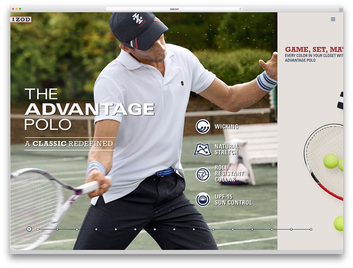
Attractive display and easy navigation makes online shopping a breeze.
View Live PageKaty Perry
Internationally famous singer Katy Perry is among many celebrities using WordPress for their website. The site is filled with images of the singer and they transition in interesting ways.
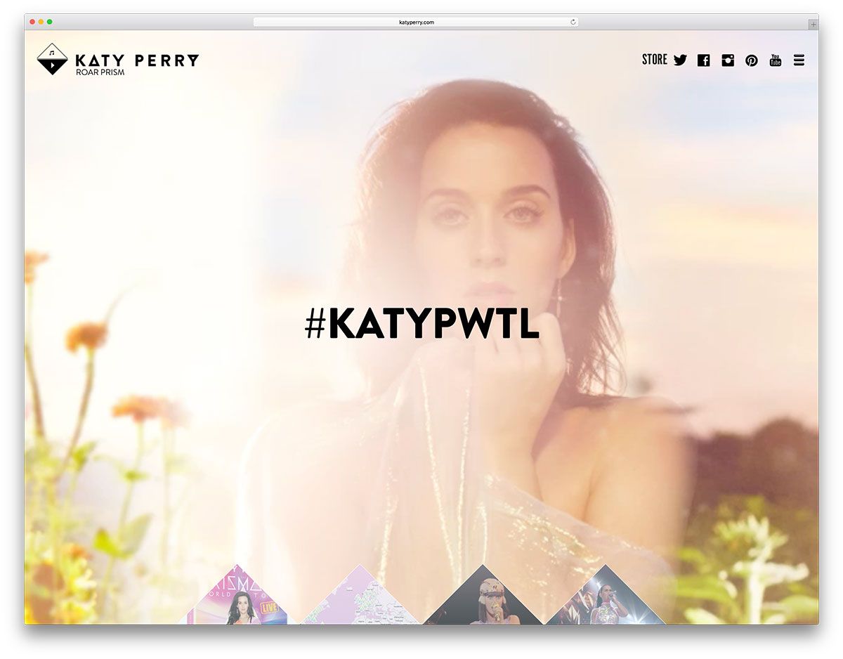
Latest album and video releases can be bought here or pre-ordered. And she also invites you to share Instagram pictures with her. Social icons are prominent on her website.
View Live PageChicago Weather Center
The website of Chicago Weather Center has been sectioned in a very functional way. The fixed sidebar to the right is divided into three. The top panel shows temperatures, the middle panel shows a video clipping of the weather roundup on the news, and the bottom panel is where visitors can upload photos.
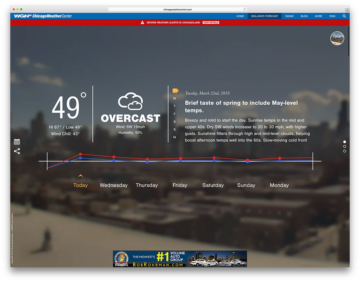
You can switch viewing buttons on the rest of the homepage to check out today and tomorrow’s weather forecast. Other articles can be seen as you scroll down the page.
View Live PageVan Heusen
Van Huesen sells formal and casual shirts, polos and neckties on their website.
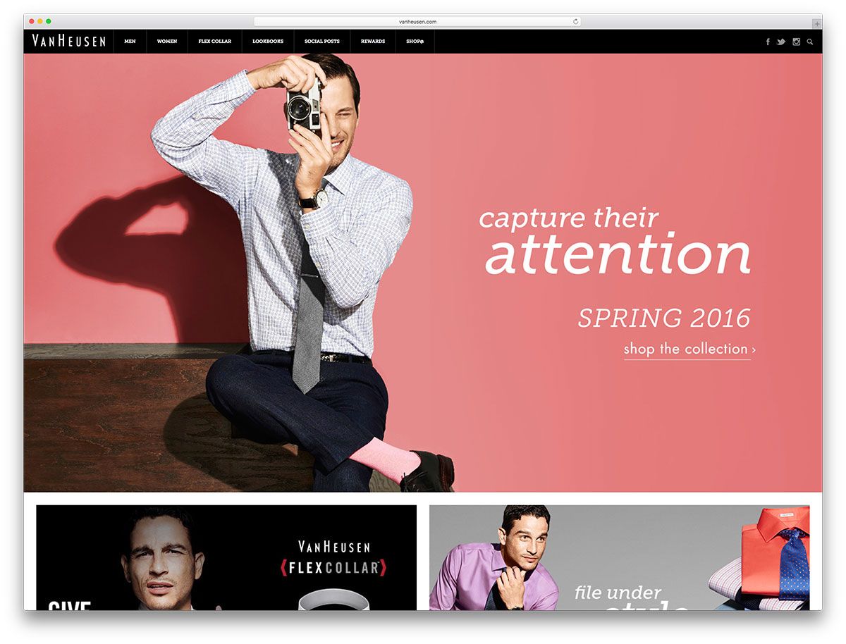
You can view their collection by scrolling down or simply by clicking on the menu in the shop collection page. Each piece is pulled away from the top to reveal a new item below it. A helpful store locator with map is included.
View Live PageThe Next Web
The Next Web is an Amsterdam-based group keen on finding and sharing technology and bringing technical people together.
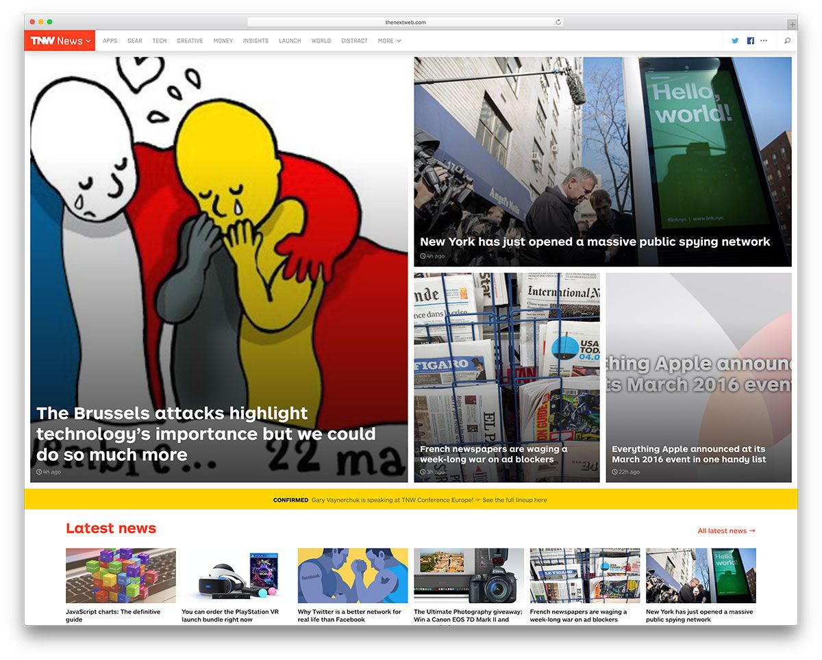
The website is brimming with technology-related information in a good mixture of text and images. There are also interesting tech tit-bits all around the site. There are very few video or transition effects, so the visitor focuses on the information displayed.
View Live PageJames Brandon Photography
Five stunning landscape photographs occupy the full screen in turns in the homepage of James Brandon, a photographer.
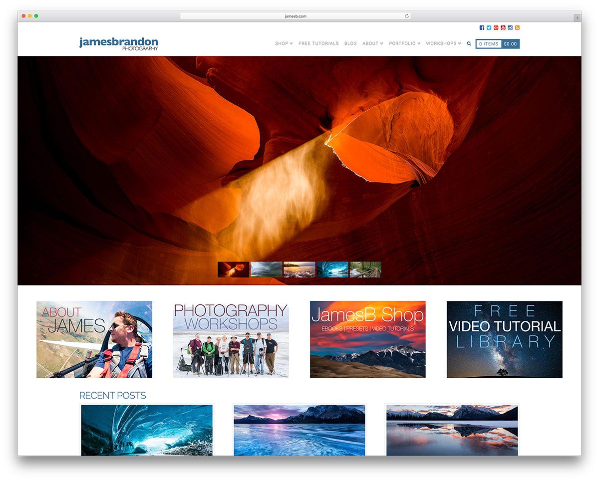
After glancing through them in the portfolio section, you can buy photographs on his website. Sign up for free tutorials, join workshops conducted by James, or ask him deep questions about photography or lives of photographers and he will get back to you with an answer.
View Live PageCienne
Cienne is an online store selling fashion clothing for women. The clothes are well displayed in the shopping section and you can filter them to help you make your choice.
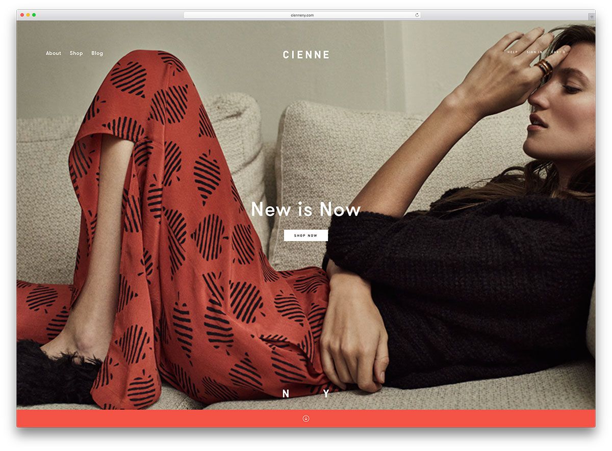
Hovering over each panel will give you a slightly different view of the dress. You can shop directly from the item you choose. The homepage also displays some clothes in alternating black/white and color sections.
View Live PageRotary Means Business
Rotary Means Business is a fellowship of Rotary International. It promotes business cooperation among members by referring other Rotarians to them. It has an event calendar integrated in the website, so members can keep track of upcoming events and locations.
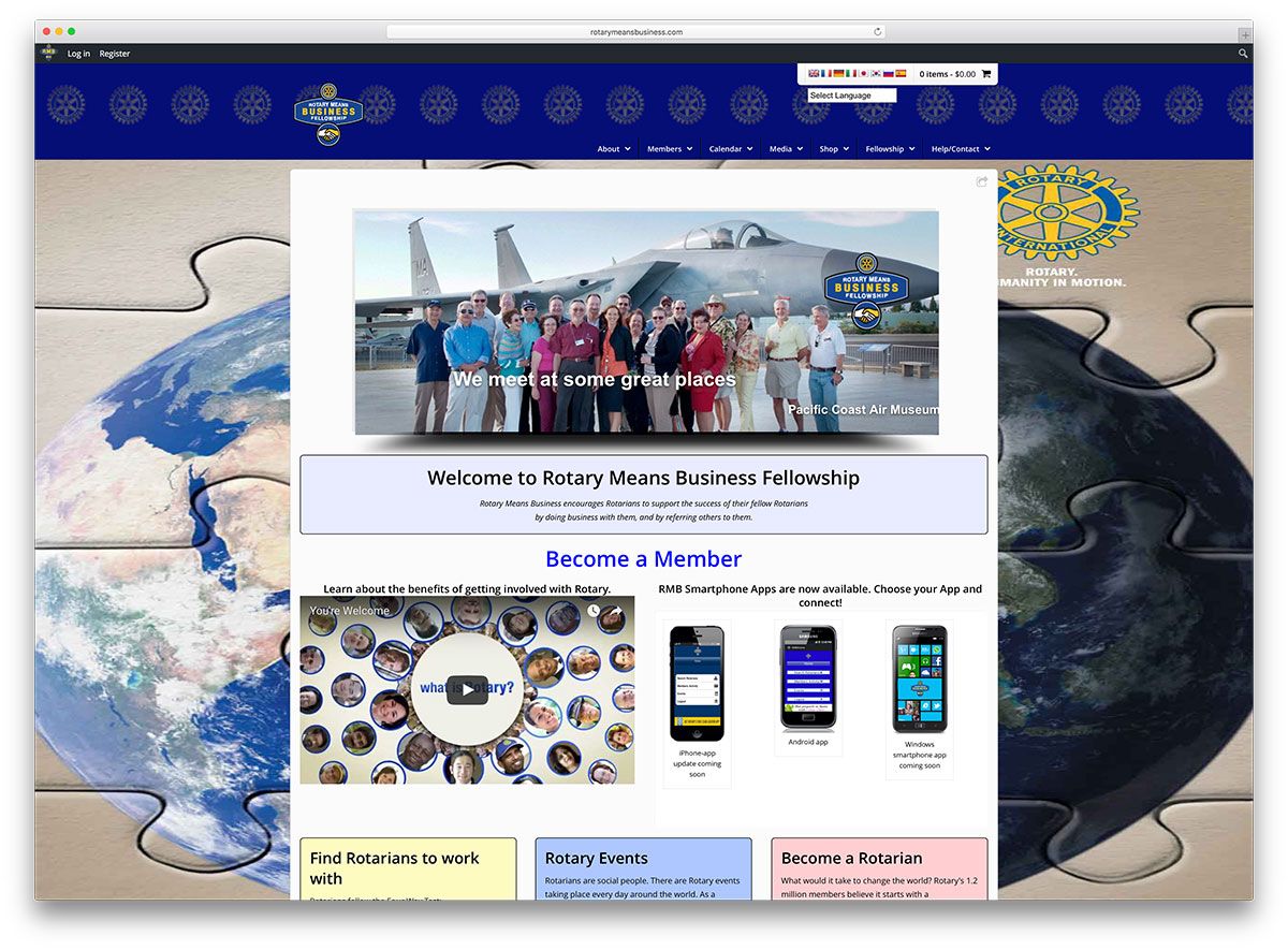
Content is placed in a white boxed layout with static images forming the background on the screen. Delayed text overlay on the images is an eye catcher.
View Live PageOutbrain
Outbrain is a marketing platform that helps websites gain recognition. They recommend content to readers and increase the visibility of the website.

They reach about a half a billion people every month globally. A slider contains all of their client testimonials.
View Live PageThe Washington Post
This newspaper daily needs no introduction. The layout and font gives the appearance of a traditional newspaper. Looking through the website almost feels like holding a newspaper in your hand and going through the columns slowly.
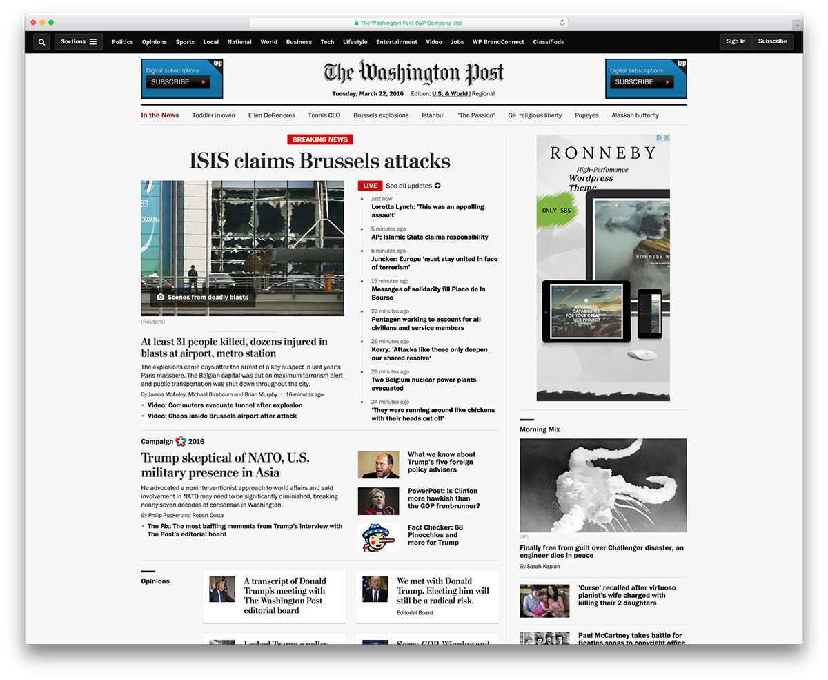
A narrow strip above the header carries the menu, and it disappears as you scroll down. But to make turning the pages easy, a drop down menu can be pulled down on the left side of the screen. Furthermore, you can spend many hours reading interesting stuff on various subjects on this website.
View Live PageConservative Tribune
The Conservative Tribune writes for a very conservative audience. The content is arranged in columns that reduces to one in number towards the bottom of the screen. A sidebar with just the Editor’s pick and little else runs down the length of the website to the right.
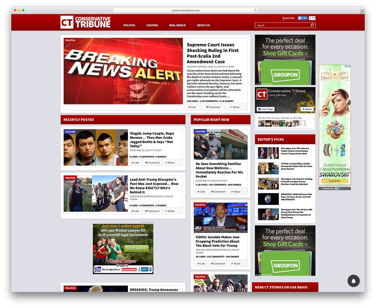
You can hear USA radio live if you click on the link in the sidebar.
View Live PageAnd Finally
The examples above may have given you how versatile WordPress can be. Many have built their websites on WordPress, from content-heavy reputed newspapers to individual photographers, retailers to realtors, and weather centers to celebrities. If you know of any other interesting WordPress websites, drop us a line.