The web is the work of an architect, the designer. The foundation is in the hands of the designer, the developer. We can use HTML to build websites, software, projects, and applications for the digital age. For a web browser to understand and interpret a website, it needs to be coded to according to standards, and most of the time that standard is HTML, with the addition of CSS and JavaScript.
There are some rewarding benefits for mastering HTML5. With enough experience, you could become a freelance front-end developer and earn money from developing websites for others. Still, the essential thing is that HTML5 gives you the power to create whatever you want on the web. Perhaps whatever is a broad term, but in terms of website development and design, HTML5 is your best chance of success. Excellent frameworks exist these days that can be complemented with your HTML5 knowledge to build unique and dynamic digital experiences.
Many veteran and expert developers have published books on becoming a front-end developer - someone who knows CSS and HTML –. While these books are great, they can rather quickly fall behind what is happening in web development. Neither of the two languages - HTML or CSS - are static, but always changing and are being improved to deliver more refined tools and techniques for building modern-day websites. So with that approach, a nice alternative for learning HTML5 is through web tutorials, guides and walkthroughs on how particular features work, or how a particular design was achieved. We’re giving you the best of the best, most recent and most modern tutorials and resources on how to become an HTML5 pro in a matter of weeks.
Improving User Flow Through Page Transitions
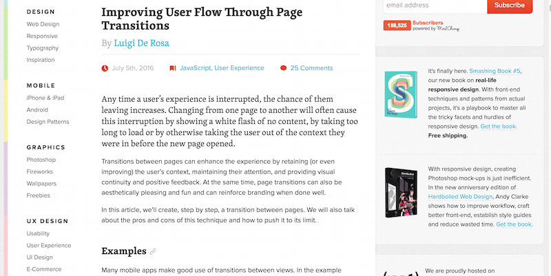
If you’re planning on studying HTML5 and front-end web development in general, you will inevitably have to learn about User Experience and everything that it has to offer. It’s nice to write neat code, but it’s even nicer when the code you’re writing reflects your understanding of what a solid user experience should feel like for websites and apps. These days countless experts spend their time analyzing page performance and the latest insights in what makes a user stay on the page, and what makes them leave the page. One of the latest research case studies shows us that page transitions could be improved to deliver a refined user experience.
Traditionally, we rely on the default transition when we click on a website’s new page, and we have to wait for the browser to reload that page. Although some themes and developers are catching up to how inefficient this concept is, we won’t see this global change of how page transitions are viewed anytime soon, unless of course, we’re going to try it out for ourselves and gradually spread the word about it. Within this tutorial you’ll find the required tools and information on how to amplify your page transitions so that the browser doesn’t have to do a hard reload for every new page that your visitors are opening, a stunning enrichment to the global user experience that your desktop and mobile apps are providing.
Smart Responsive Design Patterns, Or When Off-Canvas Isn’t Good Enough
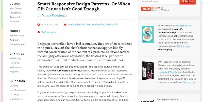
What is authentic responsive design? Is it a set of blocks and elements stitched together with minimal responsive design properties attached? There’s so much bad design going around these days. While it looks funky on the outside, if we take a deeper look at the codebase on the inside, many of the leading websites we see today completely avoid any structural setup for the way that the design of a page is presented, which means trouble for those who have to come and fix that code afterwards.
This article is less technical and richer in examples of how different websites mess up responsive design patterns and are technically providing a worse experience this way. As an HTML5 developer, you will want to know the design patterns to avoid and the methods to structure your projects better for maintainability to flexibility.
Form Design: How to Automatically Format User Input
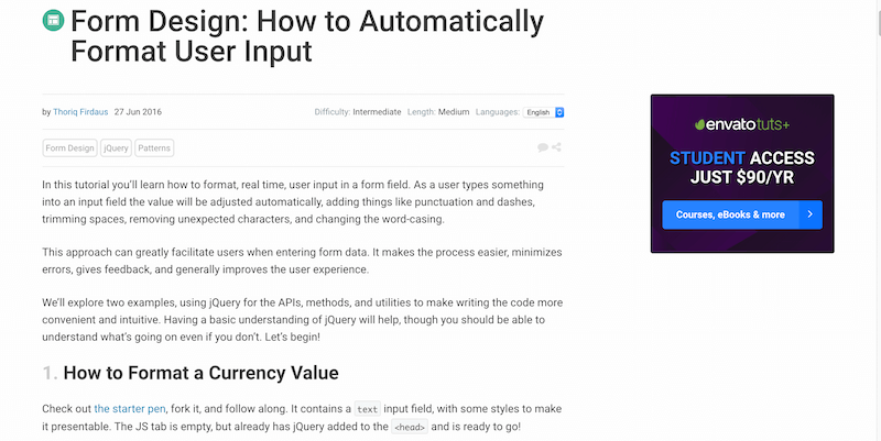
Designing good forms will net you some reputation points from fellow developers, not only them. With such vast growth of browser capabilities, users slowly get accustomed to stuff like automated forms completion. Think of doing any purchases online, if you’re an avid Google Chrome user then you’ll know that Chrome can save your credit card details for later, for easier access.
This tutorial from Thoriq focuses on the autocomplete forms function whenever a user is typing something in real time. This could be a serial number, a date of birth, or a string of characters you require. That form design makes a difference in how users view the browser they’re using and how open the website owner is to such autocomplete efforts; it’s possible to block them out, but mostly they’re available. Having an automated autocomplete and auto-sorting function can make a lasting impression for users who are first-time visitors. Sometimes it can even be helpful to your own project’s database, as you avoid having users enter silly data and instead autocorrect it as they’re typing it.
How to Build a News Website Layout with Flexbox
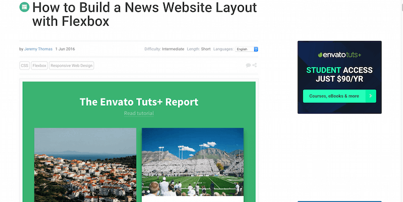
Flexbox is now the official king of layouts in web design. This wonderful little property can help you design a page with impeccable pixel and dimension clarity from which device the particular website is accessed. A good way to explore the possibilities of Flexbox is through tutorials, they’re often concise and provide many examples of how different grids and rows of design can be adjusted for perfect display on a page. Jeremy Thomas worked to produce the following tutorial of building a layout for a news website or magazine using only Flexbox layout properties. Learn how to create responsive columns, adjust their dimensions for design clarity, and move content around without sacrificing appearance.
A Comparison of Animation Technologies
Finding the right animation tool for you can be a tricky process, only because there are so many wonderful choices to pick from! Browsers are getting better at supporting animations, and developers are certainly taking full advantage of that through pushing the limits of how animation can be used in web design. This post explores two solutions, React Animations and Browser Native Animations - the tools covered are: CSS, Canvas, SMIL, Web Animations API, WebGL, GreenSock, Velocity.js, jQuery, Snap.svg, Three.js, Bodymovin, React Motion, and GSAP. There’s a concise explanation of the pros and cons for each of these tools, so get clear about your goals and take your pick. Some wonderful and insightful comments are at the bottom of that post so you can learn more about each of the tools there while also exploring different suggestions that weren’t covered in the post itself.
The Essential Meta Tags for Social Media
Social media is an inevitable part of a well-structured design, losing on social shares because of lack of social widgets is just plain dumb, irrational to say the least. However, this post doesn’t focus on cute social sharing buttons, and instead, focuses on a new aspect of social sharing known as social meta tags.
These meta tags can be used to help you create socially aligned content that would get displayed in a more refined manner on the particular social network. For Twitter we know it is Twitter Cards which allows us to share our posts to Twitter and have the image/description appear next to the comment we’ve written, for Facebook it is the same thing, except being able to attribute proper author credit which could be linked back to the person’s official Facebook account. This is a thoroughly in-depth guide on achieving that meta tags precision so your posts get more exposure on your friends and followers social media walls.
Sticky Footer, Five Ways
Do you ever wonder how websites create social sharing widgets that stick at the bottom of the page when you’re scrolling up and down a particular page? It’s called a sticky footer! Just like sticky header navigation bars, sticky footers have become extremely popular amongst those who want to expose essential information more conveniently, for some it is the exposure of social sharing buttons, some use the sticky footer functionality to show their email newsletter form, others will use it to broadcast important news about business, product, or the site in general. The uses for one are quite a few, so let your creativity run wild with this one as you learn five unique techniques for achieving the sticky footer on your own website. Those include negative margins (two versions), using the calc() feature, implementing with Flexbox, or using a global Grid.
Multiple File Upload is Easy in HTML5
Getting your file uploads right is essential, a large portion of websites these days manage some form of file upload, either for personal profile use or for the use of the site-wide features list. Even when you make a portfolio website for yourself, you might want to implement some form of file upload to make it easier for you to attach new portfolio items. It doesn’t take too long, and HTML5 makes it incredibly fast, secure, and convenient. In this tutorial from Raymond, you will learn how to create an HTML5 file uploading form capable of uploading multiple files at once, it’s a nice snippet of code that can be quickly readjusted and reused in different settings.
How to Build an iOS and Android App in 24 hours with HTML5 and Cordova
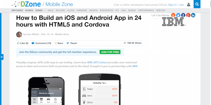
Building a mobile app is the dream of many these days. Sit around your local digital tech guy cafe, and you will find dozens of nerds sitting at their computers hacking away a functional demo of their first mobile application. Mobile apps are a huge business, and job opportunities are everywhere, even at large tech companies that rule the market. Getting to that level is a challenge, but hardly ever anything good comes out of situations where a challenge isn’t presented. This tutorial for building an Android/iOS app with Cordova focuses on a fast-paced approach to getting a working mobile app preview ready for your friends, so you can see where you stand with your ideas.
Dive Into HTML5
TDive Into HTML5 is a free online book that introduces you to HTML5 and explains in thorough detail how to go from being an HTML5 newbie to becoming a confident professional who can handle his own when it comes to building websites and HTML5 apps. utorials are the straightforward resources for learning about individual aspects of a particular programming language, with a tutorial you can not only explore the tiny aspects of a particular concept but learn how to apply those aspects in other parts of your projects too. Dou get great coverage of HTML5 history, important concepts, how to use animations, videos, and everything you’d typically encounter when reading a tutorial anyway.
Ultimate Guide to CSS3 & HTML5 Animation
A few years back you would have had to use Flash to create a fully animated website, these days it can all be accomplished through HTML5 and CSS3 - and each day designers are pushing the limits of these languages to provide even more concise experiences that reshape the way we understand animations on the web. Having a static website is fine, but having animations on your website could add a few extra points where credibility is concerned, even simple transition effects can be considered animations, and knowing how to use transitions is the first step in making apps and websites that feel smooth, clear, and easy to navigate.
This humongous resource you’re about to explore is packed with interesting and resourceful information about web animations, what kind of libraries you need to make them work, and how they generally interact with the browser. You’re only a few steps away from becoming a mastermind of animation design.
How to overcome the top 5 HTML5 elearning challenges
What are the common challenges brands experience when providing eLearning to their teams? Elucidat covers a nice range of important points that you’ll commonly experience when trying to teach something to large groups of people, in this specific case the subject is HTML5.
A Crash Course in Technical Responsive Web Design
Responsive design tutorials and guides will only get more concise and in-depth as we move towards a global phenomenon. You must know the ins and outs of responsive design. It’s where majority of internet users will be browsing from their smartphones. It will be a large portion of your website visitors who will visit from their mobile devices. People don’t have the patience to sit through a desktop mode website. This happens especially of the owner of the website couldn’t be bothered to do something about it. Learn from one of the best in the industry on how you can perfect your pixel-perfect designs. To turn smooth, responsive, and flexible on any device, you need to do this.
How to Design Rich Card-Based Layouts with Semantic UI
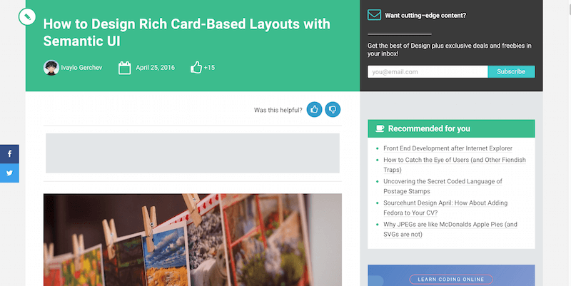
Cards designs are making their debut heard, everywhere. From Google to Pinterest, to mobile applications - everyone is beginning to embrace the beauty of greatly designed card designs. Tutorials are also pouring in from all sides on making the most of this beautiful new trend. Semantic-UI provides Bootstrap tools and components similar to Bootstrap, but in more semantic markup. You have a nice rundown of using the Semantic-UI to achieve a flawless card design for this tutorial. You need design to be ready for implementation on any website you’re currently working on. The final code setup is available on JS Bin where you can yourself play around with the design. Perhaps, you can make custom adjustments as you see fit for your projects.
How to use Chrome developer tools to test layouts
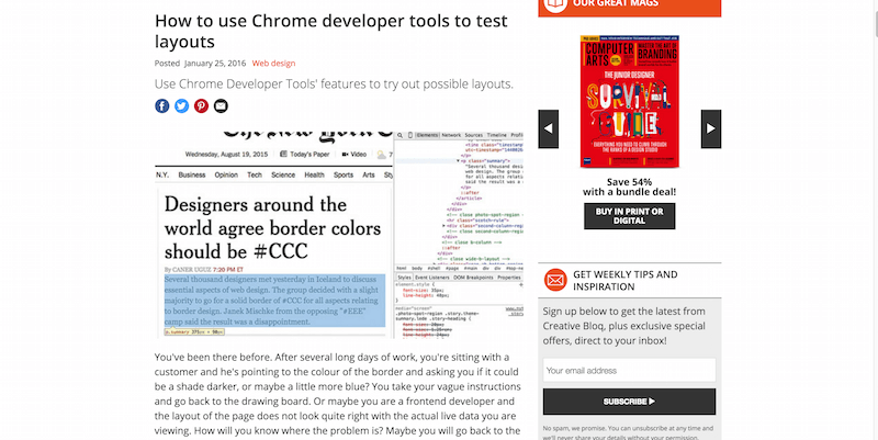
Testing isn’t only for heavy programming languages. Testing will always remain an integral part of web design. Without testing, you’re simply betting on your abilities to develop a flawless website without any errors. Typically, it’s never going to be the case because too much goes into a single design. The only way to ensure that this design is stable is through testing.
Many libraries exist these days to conclude HTML5 and CSS3 testing. But perhaps, the one that you’ve overlooked all this time is plugged right into your Chrome browser. It’s called the Chrome Developer Tools. It’s a suite of tools for front-end developers that you can use to test and analyze your designs in real-time. This goes directly in the browser. You can take two approaches that will help you improve how you work with these tools. If starting a new project, code the HTML first and play with the rules. The first draft of the HTML will go through the Dev Tools. You will see that the instant application of your changes will save you time as you refine your project.
Using the HTML lang attribute
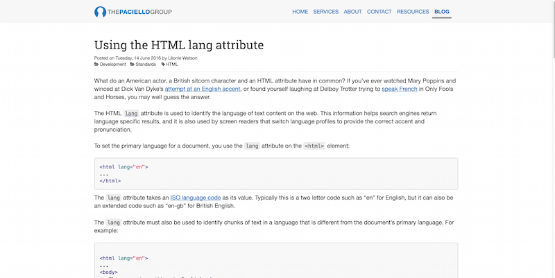
The language attribute in HTML5 helps you specify the default language your website is using. That specification, in turn, helps robots and remote tools to understand how to crawl and index your website. You don’t want to use a Spanish language attribute on a website only in English. The same applies to the vice versa situation.
