Massage therapy is growing in demand and prominence. Almost all adults understand its essence and long to experience its peaceful and rejuvenating effect. On top of that, massage therapy has also become a vital option for managing health conditions or enhancing wellness. Consequently, numerous therapy businesses emerged into the industry to provide professional massage experience to all who need it. A brand that wishes to get an edge over the competition must strive hard to excel with that in mind. One way to improve such a business is to build a massage website and learn to market your brand well. Fortunately, as a massage therapist, you don’t need to become a web developer to realize your goals. You can find genius developers, practical massage WordPress themes, and massage websites design inspiration to craft your website well.
Having a strong online presence lets you easily communicate with clients, effortlessly manage bookings and appointments, and exhibit awesome services 24/7. Due to these facts, you always need to plan your website accordingly. In this list of massage websites design, you can find various brands, styles, and layouts that will help you finalize your massage website. Thus, you can establish credibility with the exceptional design of the website without compromising the quality and functionality. Additionally, promoting your brand across social media platforms is quick and effective with such a good website.
Don’t miss to check these amazing massage websites designs and stand out in the competition!
Best Massage Therapy Websites
Divi Massage
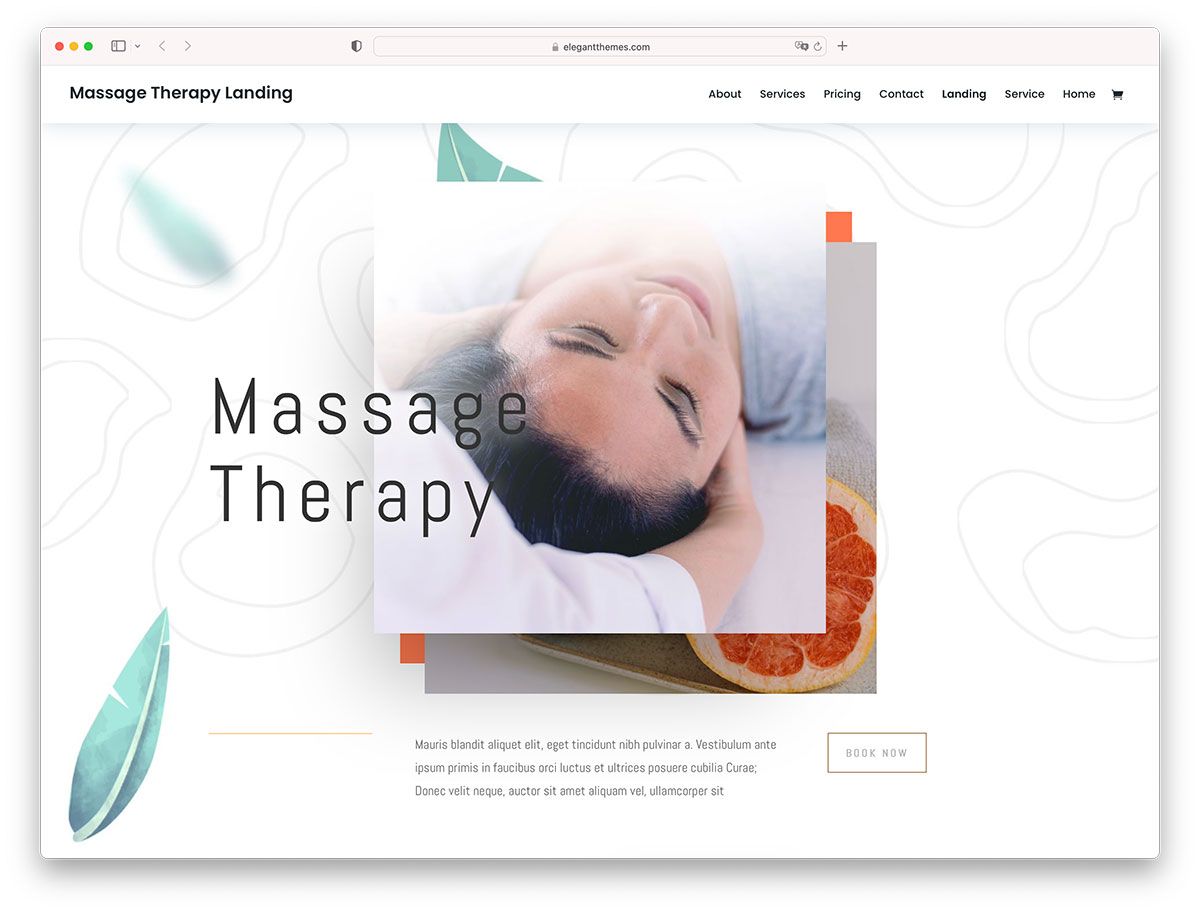
Below you will find several great examples of massage websites. However, if you want to build a website yourself, we recommend Divi WordPress theme. It comes with all the necessary functionality to create the website of your dreams.
Massage Naples
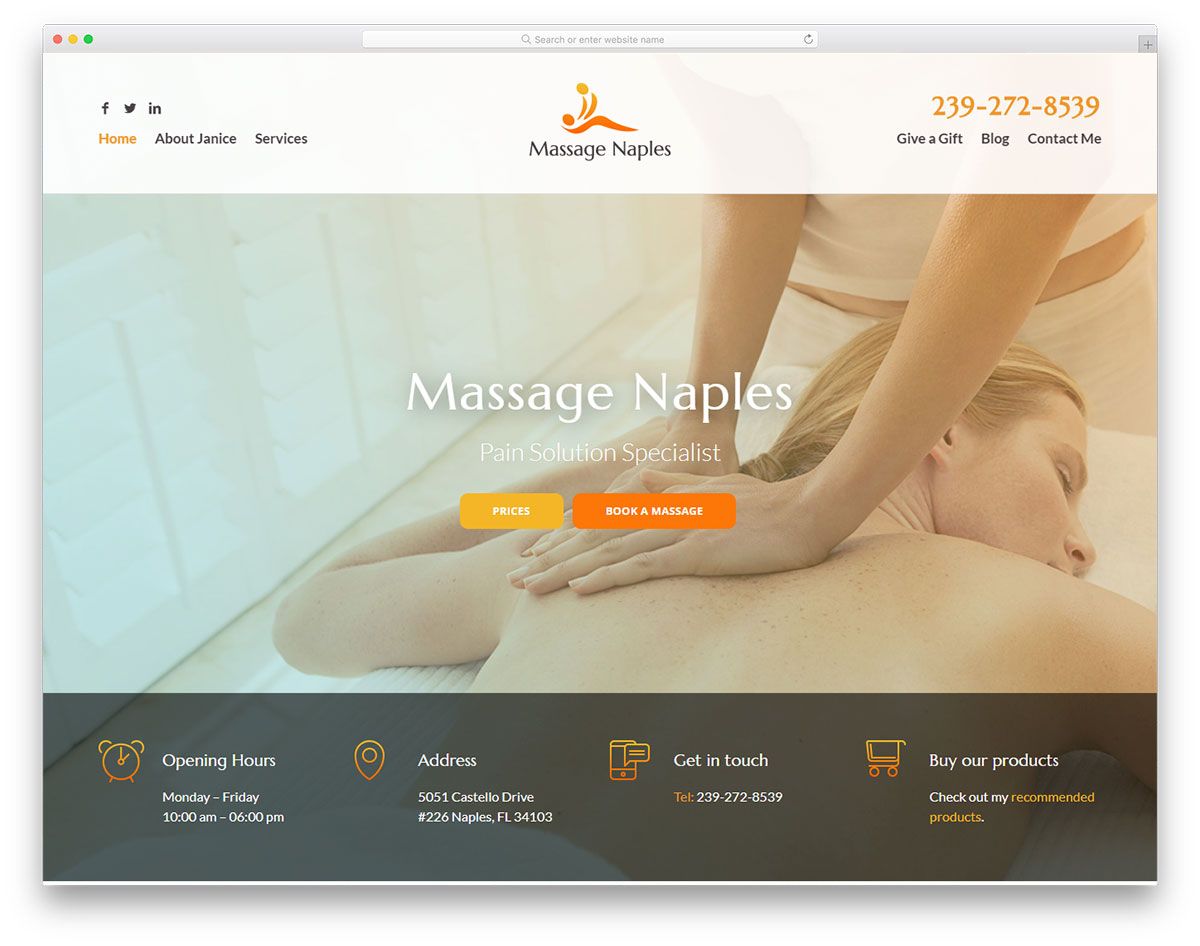
If you wish to build a strong online presence, you need to have a well-designed website to highlight your level of expertise and professionalism. Massage Naples, one of the awesome massage websites design excels with its visually appealing design. Bold and sleek in style, this website showcases contents clutter-free. It has a simple header with an attractive logo in the center, social media integration, phone number and a simple menu. Additionally, the header has a clear, fullwidth image and striking CTAs. Aside from that, it exhibits the services section in a creative way using rounded thumbnails linking to each page. This website enables users to book an appointment with ease, follow social media accounts, and sign up for the newsletter.
Patrick Mansell
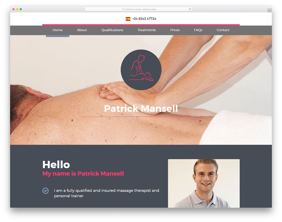
In building your website always consider the colors, images and good copy as these elements can make your break your visitors’ first impression. Patrick Mansell incredibly understands this essence of a good website. Hence, it has a visually appealing design and is fully responsive. This one-page massage website has an outstanding layout, embraces visual hierarchy, and a touch of creativity. It has a nice background image on the hero header with its logo on it. It also comes with a sticky menu so users can immediately navigate to the site’s other sections. The awards and qualifications exhibition also enhances the credibility of the brand. Moreover, the simple pricing element presented in boxes looks superb as well.
North Tampa Spine & Joint Center
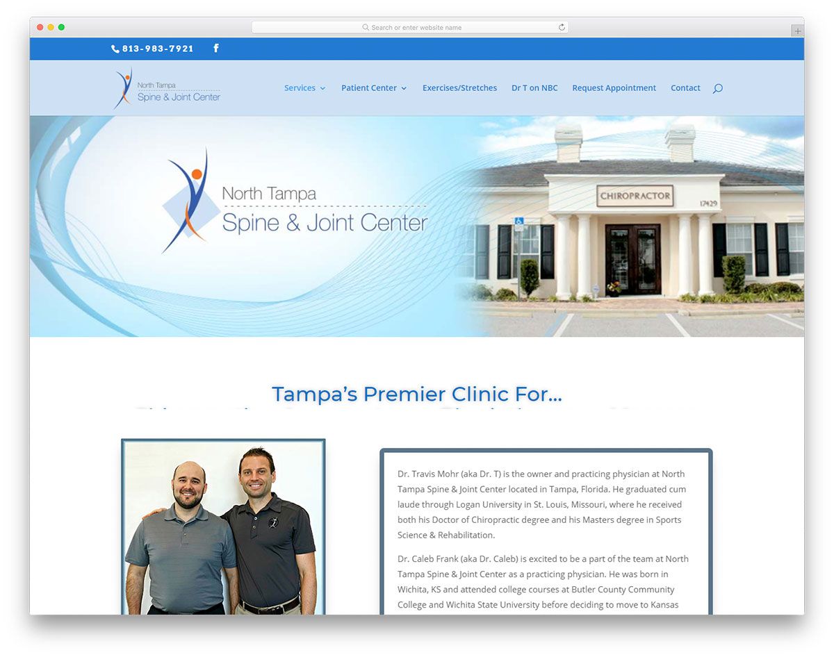
Consistency in the text and images in your website design helps increase conversions. Hence, always opt for high quality, relevant images and a good copy. North Tampa is one of the inspirations that deserves to be in this list of stunning massage websites design. It looks cool and minimalist with its blue and white color scheme. It has a simple design of the hero header – a cool combination of image and brand name. This massage website utilizes a sticky, dropdown menu where users can easily look into other pages. In addition, it uses great white space to improve readability and comprehension. Meanwhile, the testimonials play a vital role in the success of every brand, hence this website makes the testimonials look clean, neat and attractive.
City Touch NYC
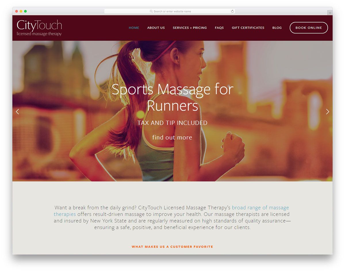
Upon building your website, always ensure that the content is engaging. This way, you can kindle a visitor’s interest and establish your brand. City Touch NYC has an exceptional design that will serve as a useful inspiration for massage therapists and entrepreneurs. The website comes with essential pages for a massage therapy business. It welcomes visitors with striking images on the hero header using a slider and primary CTA. Other contents look great with a white background too.
City Touch NYC ensures that potential clients
have a clear overview of their services through video integration. What’s more? Latest articles for blog also look interesting as it is presented in boxes with smooth slider. Similarly, another slider highlights the testimonials which in turn improves credibility.
Feel Bliss Massage
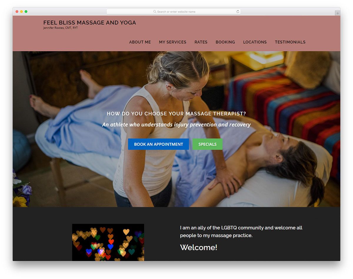
When you build a website always consider a visually appealing design. Whether you’re a designer working with a massage website for a client or working your own, these massage websites design will help you understand how to improve your designs. Feel Bliss Massage has an awesome design, clean and comprehensive content, and high-quality images. The hero header features the brand’s credibility using a slider. It also includes a descriptive CTA that allows users to book an appointment and specials. In addition, the services section looks exceptional as each of them is displayed using white boxes. In the same way, testimonials also engage a visitor with striking background colors. Check out how this website can help you reveal your personality.
Urban
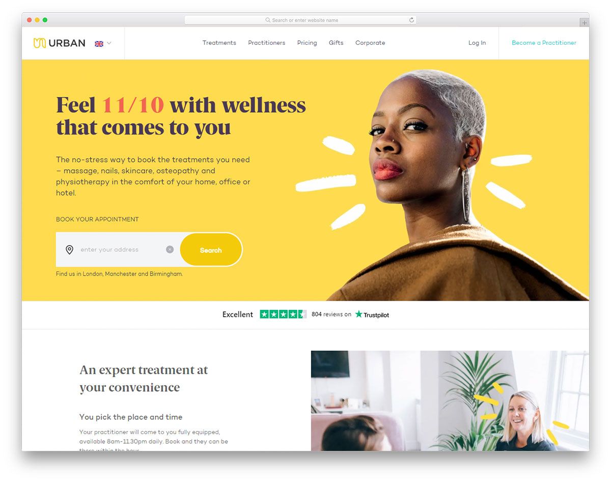
Make your first impression as powerful as possible when you embed your content in a well-designed website. Urban never fails to impress potential customers with its high-quality design. Specifically, it has a nice personality that is revealed in using canary yellow color, readable font, clear images, consistency and more. It has a nice homepage having the necessary elements it needs to represent its brand. Specifically, it utilizes a sticky menu to help retain customers through quick and easy navigation. Moreover, it has a pleasant hero header where descriptive CTA, appealing image background and the powerful tagline are combined. Other sections of the site also showcase a nice layout via a split-screen design.
Zeel
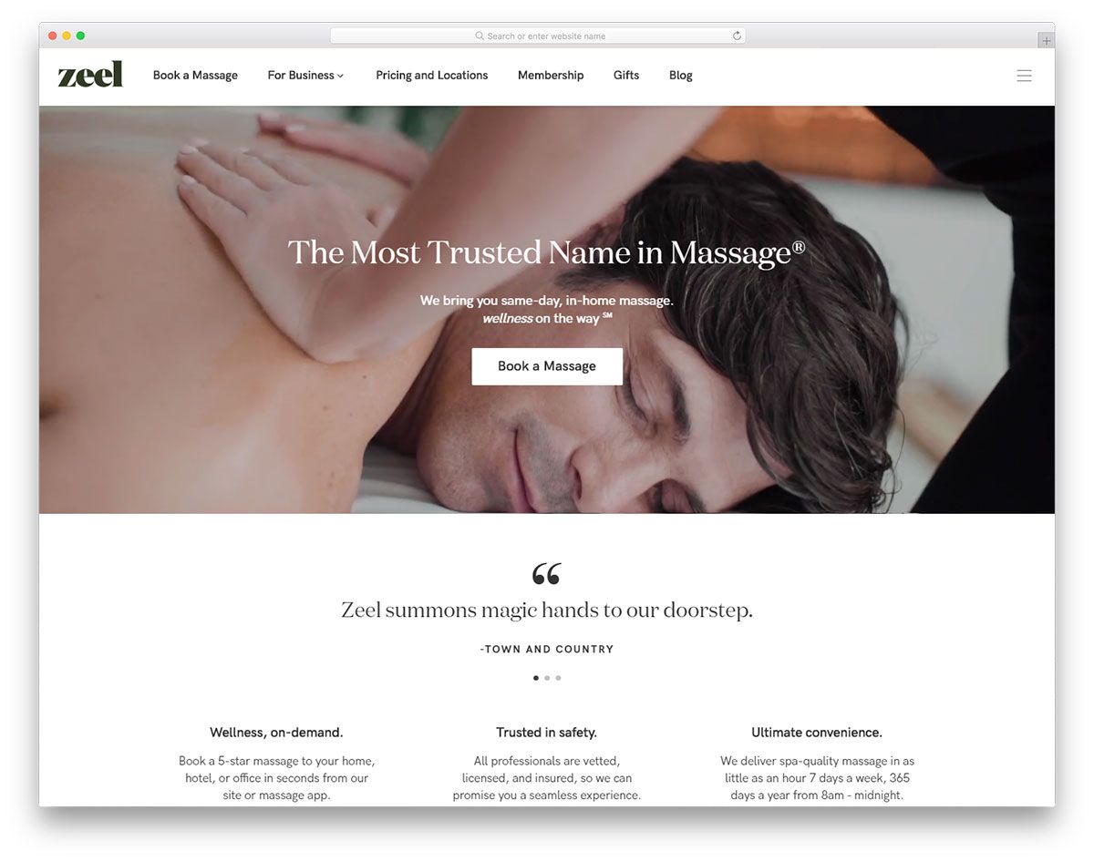
Reveal your personality as a massage therapy business with a user-friendly website. Here’s Zeel, one of the best massage websites design that will inspire brands in this industry. This website integrates the video background to capture the visitor’s attention. Of course, the essential elements are also added into the hero header which includes the “book a massage” as the primary CTA and its tag line. Meanwhile, testimonials are persuasive elements that can boost the brand’s trustworthiness hence Zeel places it just below the hero header using a smooth slider. A cool combination of images and copy will convey messages clearly. Therefore, Zeel presents other sections using the split screen layout. It also utilizes a beautiful exhibition of the massage techniques available with Zeel.
Xtreme Beauty Botany
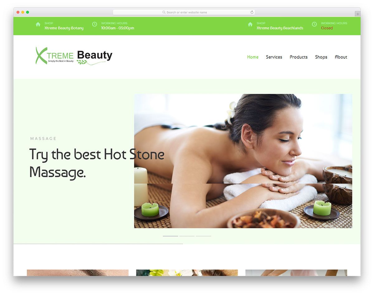
Massage therapy provides bountiful benefits. Aside from relaxation, it also offers health benefits to promote wellness. Many massage therapists are building their websites to improve their business. Xtreme Beauty Botany has an excellent design that can be used to stimulate fellow massage therapists. Having green as its primary color and ample white space, the website looks great and clutter-free. It embraces a smooth transition of images on the hero scene as it utilizes a cool slider. In displaying the services it offers, the website utilizes boxes with clear thumbnails and brief descriptions.
Press Modern Massage
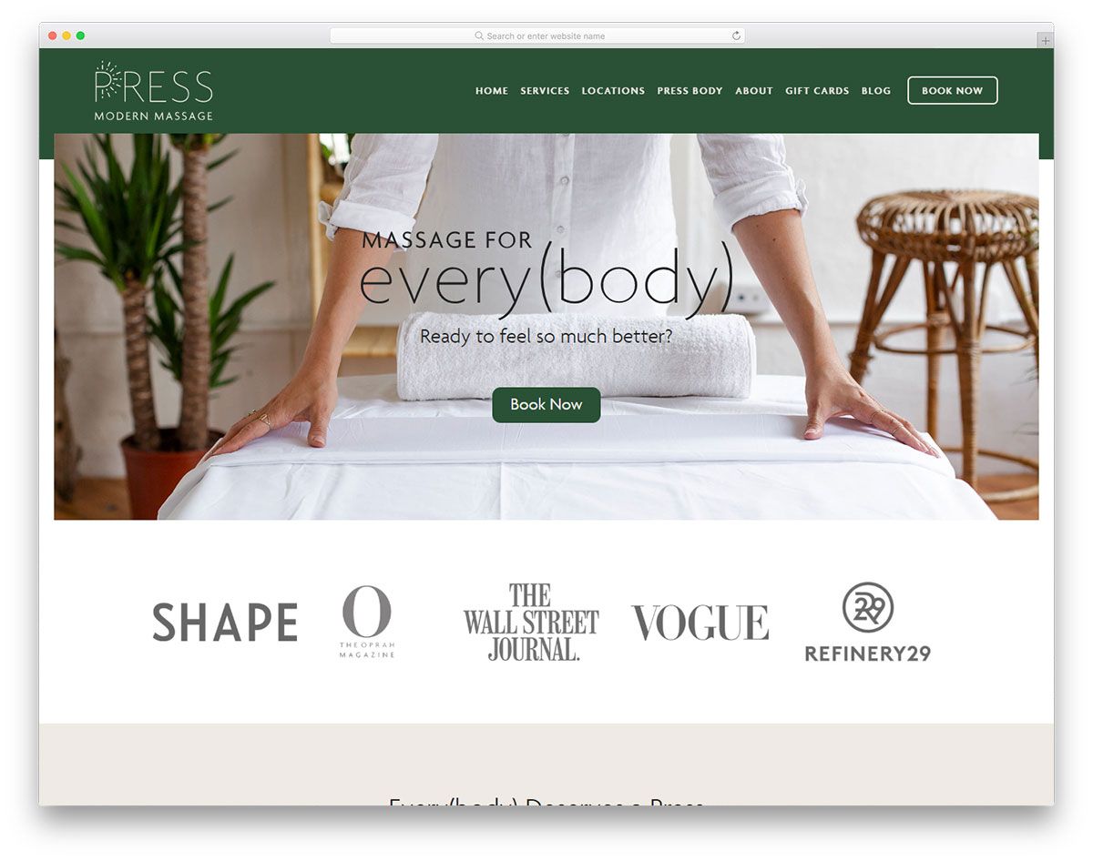
Finding and booking a highly professional massage therapist these days is not difficult. You just have to find them on search engines and you’ll find numerous brands to trust with. With such an idea, every massage therapist must build a web presence to win over the competition. Press Modern Massage is one of the unique massage websites design that you should look into. It has the necessary features that a massage website ought to have. Its components such as the color, fonts, images, consistency and creativity all look perfect on this website. It utilizes green as its primary color which can imply freshness and health. Other notable features of this website include sticky menu, dropdown menu, amazing hover effects, cool sliders, social media integration, and more.
The Massage Elite
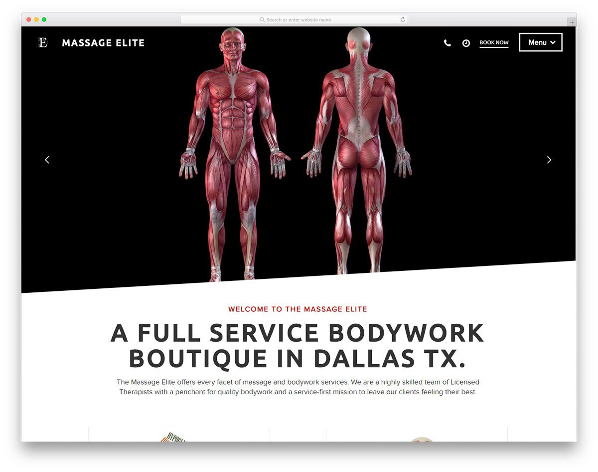
If you make relaxation and comfort a top priority, then you should embrace various strategies that work best for your brand to excel. The Massage Elite deserves to be one of the gorgeous massage websites design that will motivate entrepreneurs and therapists in this industry. It has an innovative and creative design of the homepage. Specifically, it uses fullwidth images presented through a charming slider and a tagline. As it is best to provide easy navigation for the users, Massage Elite embeds the sticky menu. Particularly, the featured services are showcased using huge boxes with thumbnails. It also comes with descriptive CTAs on different sections of the website. This way, a user can easily book an appointment, buy a gift card, read an article or follow social media accounts.
Castle Thai Spa
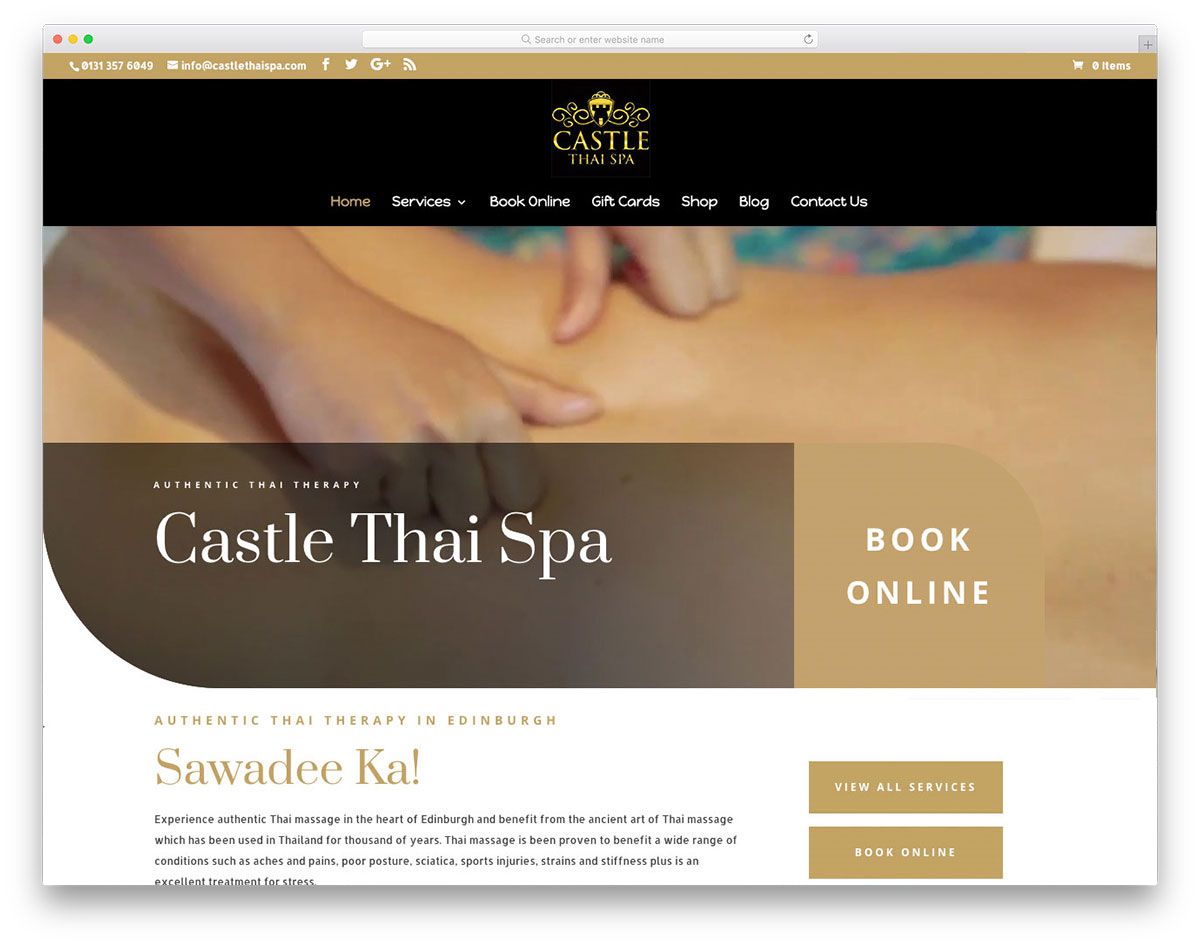
Whether you need to redesign your massage website or planning to build your web presence, these massage websites design will truly inspire you to build a creative one for your business. Castle Thai Spa is a great website that integrates video background that demands visitors’ attention along with a clear and huge CTA on the hero header. Apparently, a user can view all services available, book online or easily buy a gift card. In particular, the services look outstanding and fresh as they are displayed on rounded thumbnails that links to each individual service. Aside from that, the testimonials section is also available on the site to improve the brand’s credibility and authenticity. Furthermore, a visitor can also access the social media pages of the brand.
Massage Heights
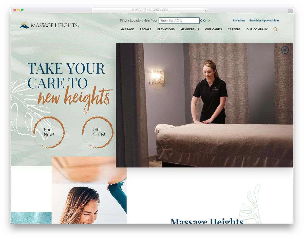
Your website speaks of your brand. Therefore, always pick the best elements to represent your business worldwide. Massage Heights don’t just have the essential elements of a good massage website but has a creative layout too. Specifically, the hero header comes with an out-of-the-box design – a video integration and creative CTAs. With the asymmetrical design of Massage Heights, contents look striking and breathtaking. That’s not all, the unique presentation of services also enhance the look and feel of the site. Other pages of the website also has stunning layout, great images, and good typography. For the membership page, it uses a beautiful table with a cool hover effect. It also uses social media integration, dropdown menu, slider, etc.
Remedy Massage
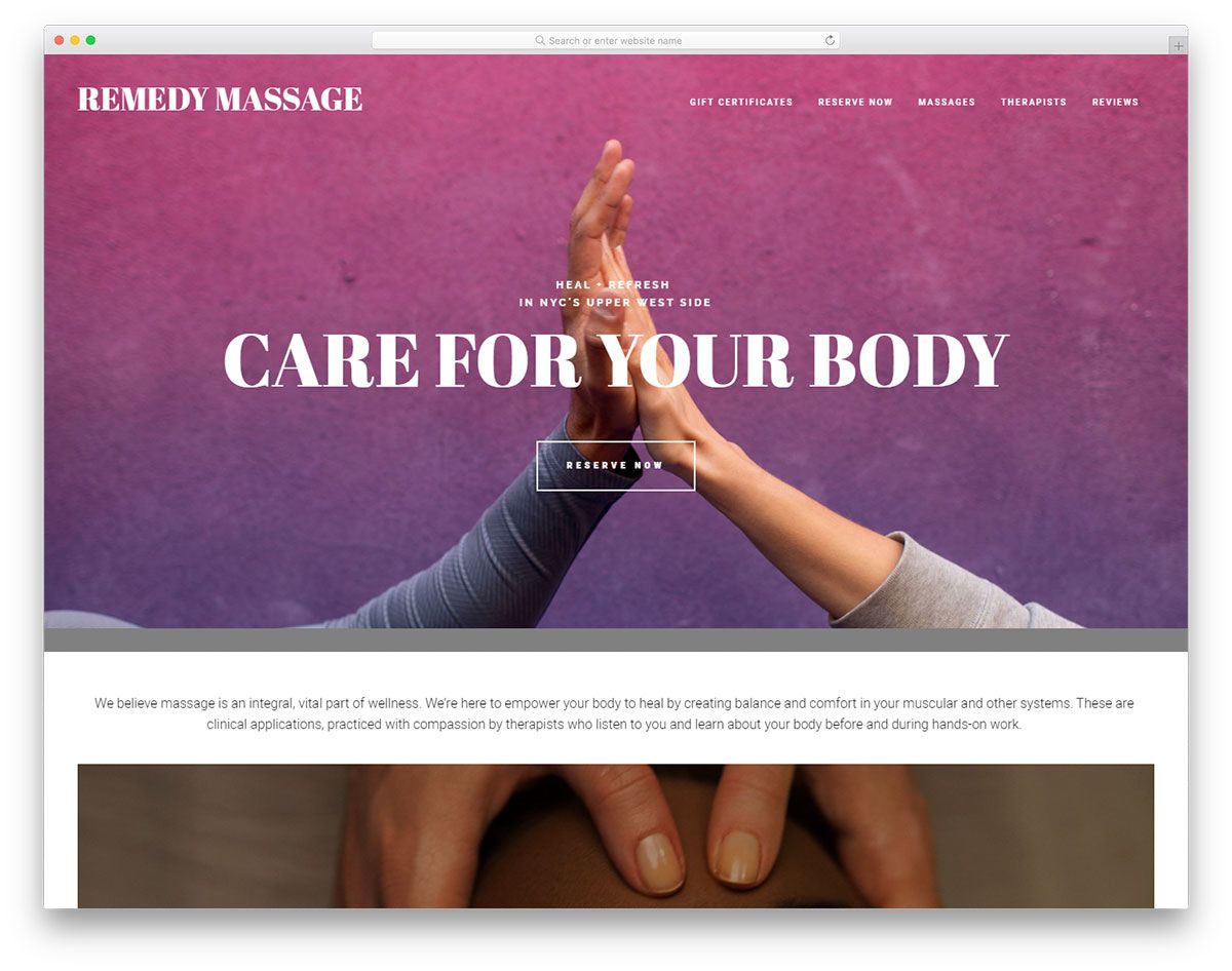
Today, almost all businesses have a website, no matter how small it is. It has become an essential part of every brand’s marketing tool. If you’re looking for an inspiration to create your massage website, Remedy Massage is one that you should examine. The hero header embraces the innovative parallax effect with an outline style of CTA. Since images play a vital role in persuading people, Remedy Massage displays huge, clear and full-width images on different sections of the website. The white spaces separating the images also improves the quality of the website. The massage page is seamless and minimalist with the split screen layout. Furthermore, showcasing the prices on the left and an image on the other side with a white background is just irresistible.
White Stone Healing Center
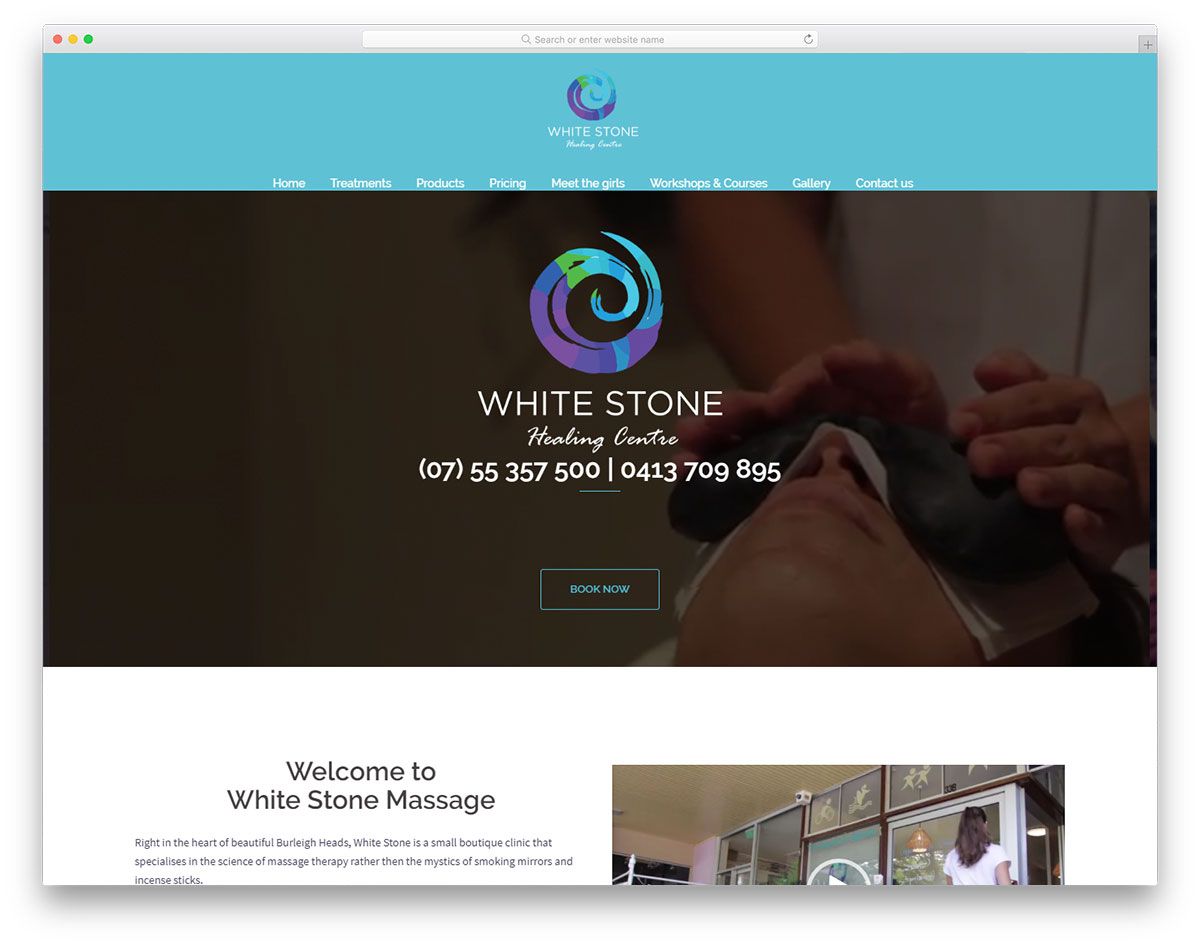
Reach an exponential number of people with your massage business as you build your web presence. White Stone Healing Center is one of the best massage websites design to look into. It has a simple design of the hero header – an image background, CTA and contact numbers. It also welcomes visitors with video integration and a brief introduction to its brand. This brand offers different treatment options to potential customers so it showcases these services using boxes in a smooth slider. The website enables a visitor to access the team page or shopping page. Other useful pages of the website include pricing, workshops and courses, gallery, etc.
Body Balance Massage & Float
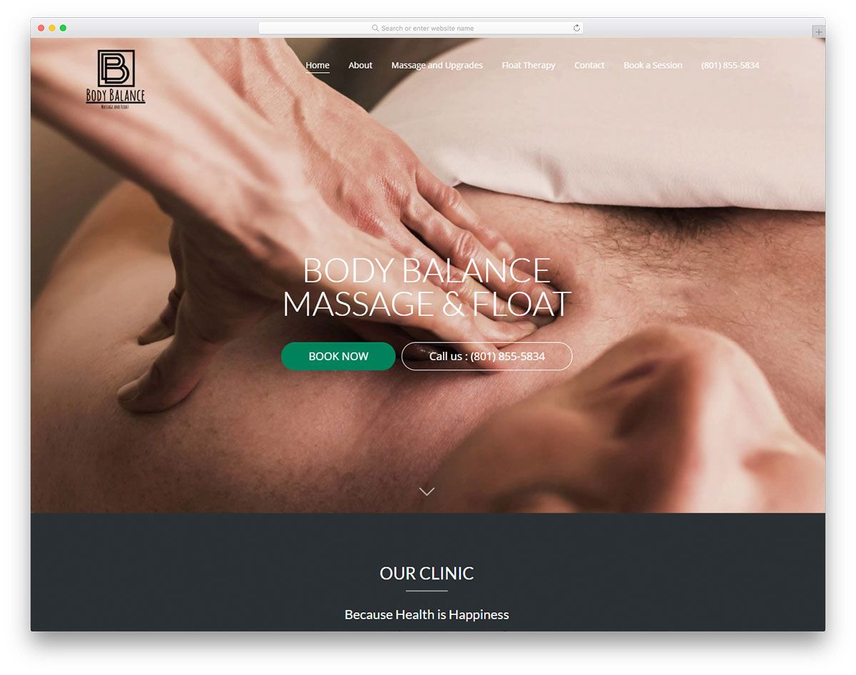
As most people look for businesses to buy goods and services online, every brand must have a website. This way, businesses can open greater opportunities. Body Balance Massage & Float utilizes an excellent full-width image on the hero header. To make the presentation of services interesting, this website uses simple rounded icons to connect to the individual pages. Other sections of the website implement a split-screen – image and a brief description along with CTA. Also, video integration is added to the video tour section. Other captivating features of the site are the parallax effect, social media, sticky menu, and more.
Vitality Float Spa
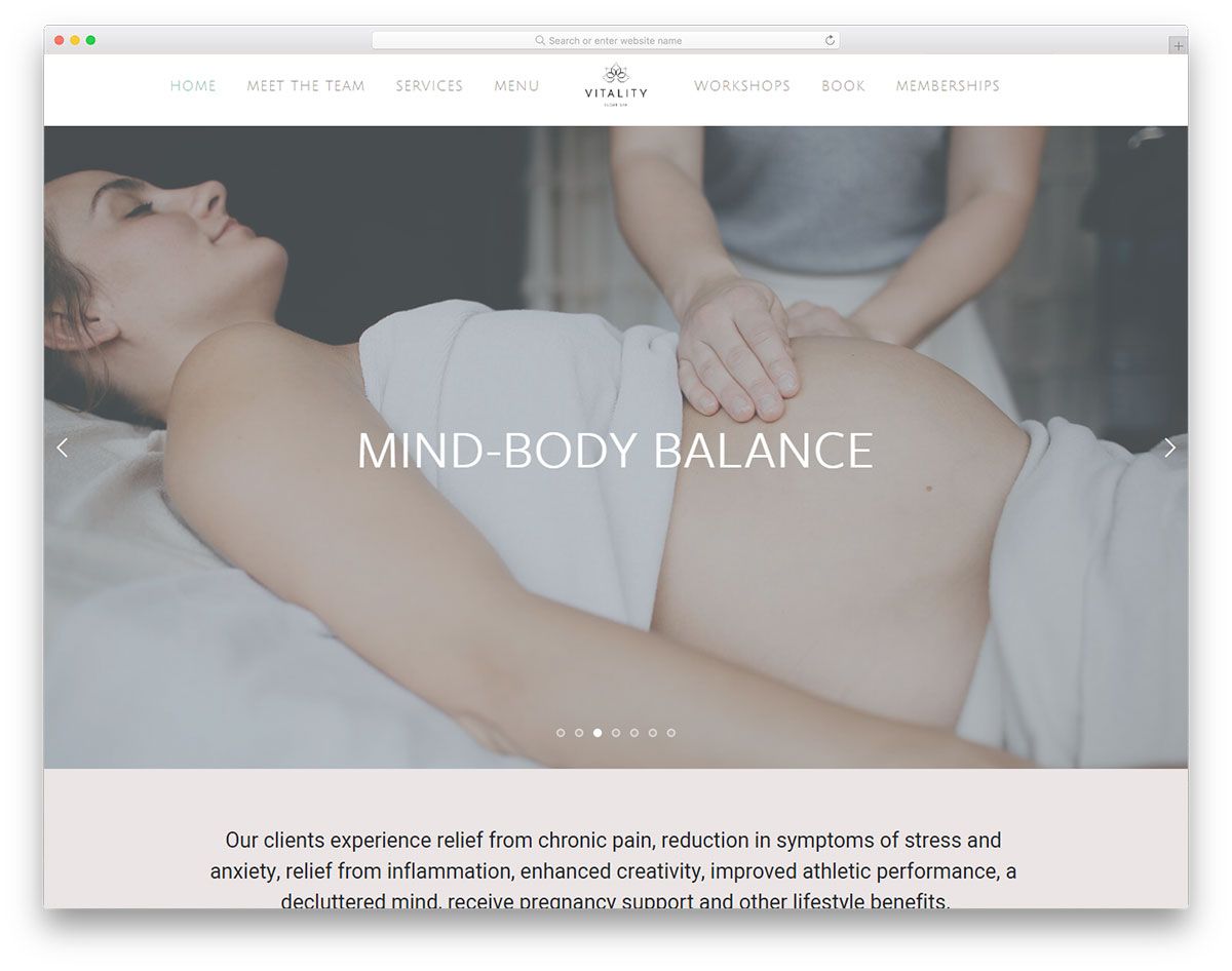
You need to set your goals and pick the right marketing strategies. Building a strong web presence requires a thoroughly thought strategy. Vitality Float Spa has a simple yet influential design. It displays various images in the hero header that looks superb using slider. To showcase services creatively, they are exhibited using boxes and are linked to each individual page. Specifically, a user can easily book an appointment or shop products efficiently. Since social media presence also improves business performance, this website also applies social media integration.
Amber Dawn Hallet
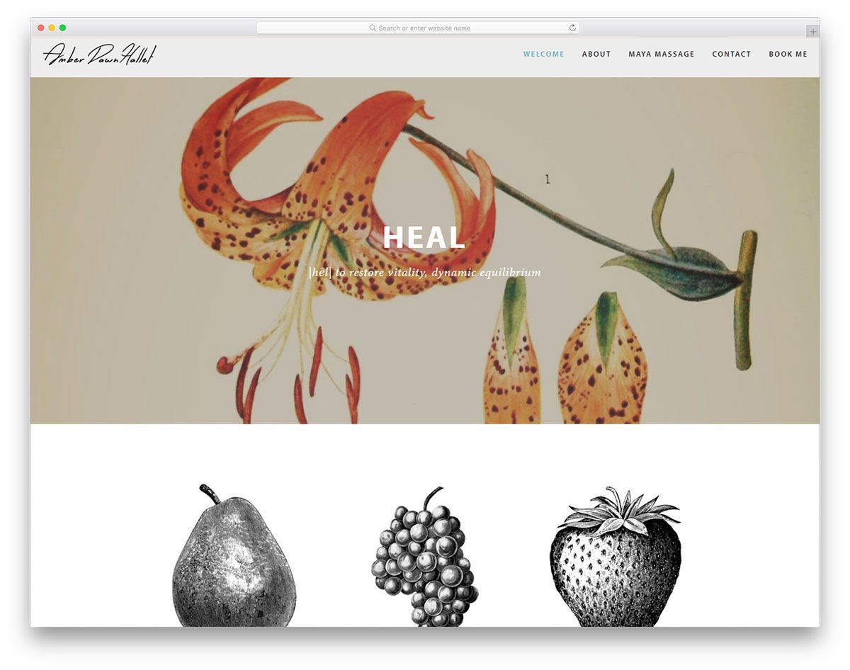
Looking for the best resources for your next massage website project? If you do, this list of massage website designs will benefit you. Amber Dawn Hallet has a simple design. It’s an outstanding design of a licensed massage practitioner, a certified massage therapist, etc. The hero header exhibits different images via a nice slider. The services section of this website has a clean and readable layout with thumbnails, a brief description and the services titles. What’s more? If a visitor wishes to access the resources page, that’s much possible with Amber Dawn Hallet. Moreover, the testimonials page also has a simple layout but can help improve its credibility.