An unknown author once says "The best time for ice cream is always". Precisely! Ice cream is one of the most delicious, yummy and refreshing treats for everyone. No wonder why many ice cream brands emerged in the market these days. Consequently, those brands must strive hard to establish credibility online. Hence, an excellently designed website for every brand to excel in the industry is vital. For ice cream businesses, it is best to create a stunning design of a website not just to reach more customers but to unlock more opportunities for the business. Today, we’ve handpicked some of the amazing ice cream websites to inspire web designers and entrepreneurs.
With the advanced technology that the world has, crafting an exceptional website is much possible. Whether you’re hiring an adept web designer to complete the project or opt for the premium website templates, the choice is yours. But one thing’s for sure, you truly need inspiration in finalizing the design so you won’t be left behind. In this collection, you will find different styles and layouts of ice cream websites. These websites have enticing images, compelling taglines and clear typography ready to empower each brand’s web presence.
So, don’t miss these creative and professional-looking websites and jot down the elements you’d be integrating into your upcoming ice cream website project.
Ice Cream Website Designs
Sugaro
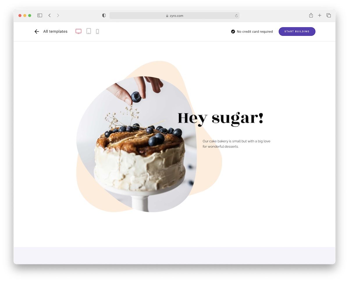
Sugaro is a fantastic ice cream website design with a clean and minimalist style. It emphasizes all your delicious creations, putting extra shine on them, just like they deserve it.
Display beautiful images, share your menu, include working hours and more – Sugaro is ready for everything.
And you can also freely customize it, although the out-of-the-box look is already so refreshing. Be your own boss and manage and maintain your ice cream website from one location (including hosting & domain name).
Woodlands
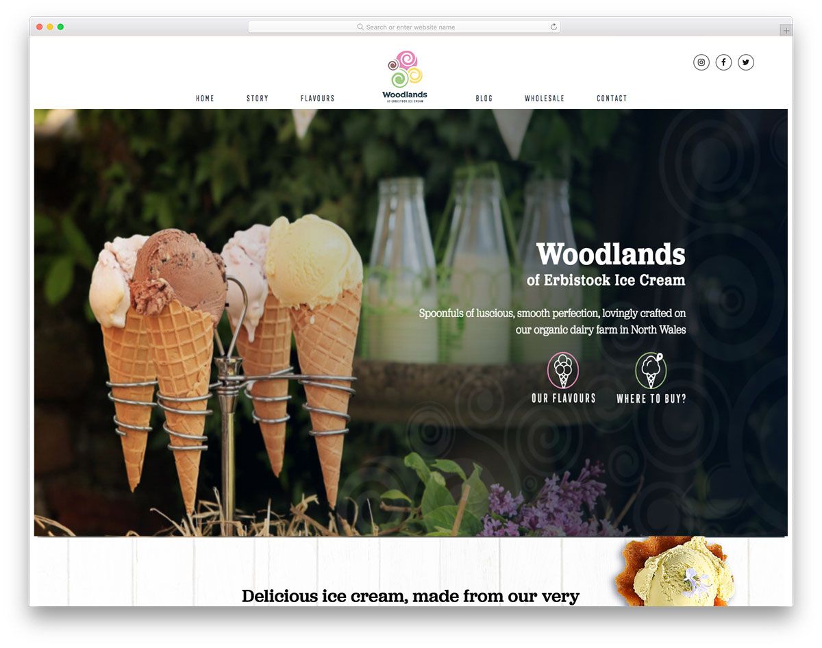
Deliciously creative ice cream websites are tempting. Since websites reveal the personality of the brand, businesses must consider using their color scheme on their websites. Connoisseur utilizes black as the primary color which makes the website look elegant and sleek. It has a straightforward intro page with images, CTA and headlines. Specifically, the pages of this website have a unique layout. The screen is divided into three columns with vertical sliders on both sides while the center is scrollable. Since it is easier for a sticky header to provide user-friendly navigation, Connoisseur ensures that such a feature is never missed. Basically, the menu includes sticks, tubs, cookies, media, the story and contact.
Pierres
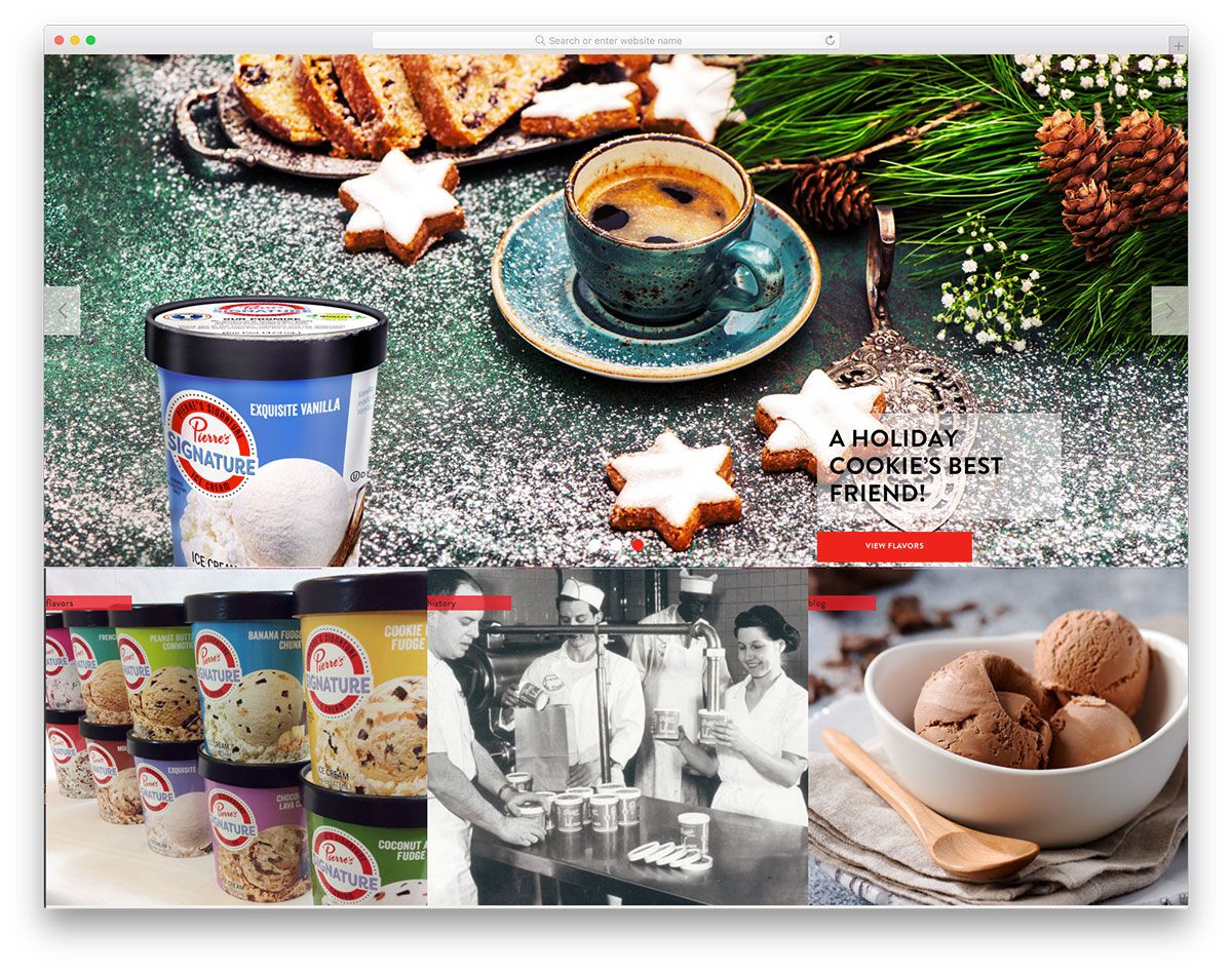
If you have unique, delicious flavors of ice cream that you wish to disclose, you should have a website to showcase them attractively. Pierres is a great potential for ice cream websites as an effective inspiration. With its stunning website and user-friendly features, it is a valuable tool to improve the web presence. Apparently, the hero scene displays full-width ice cream images with descriptive CTA and headlines. Aside from the sticky header, the flavors, history and blog pages can also be accessed using the big and square images. Meanwhile, another slider is also added to showcase the different flavors of ice cream in various containers. There is also a blog page that is ready to boost the website’s visibility on search engines.
Subzero Ice Cream
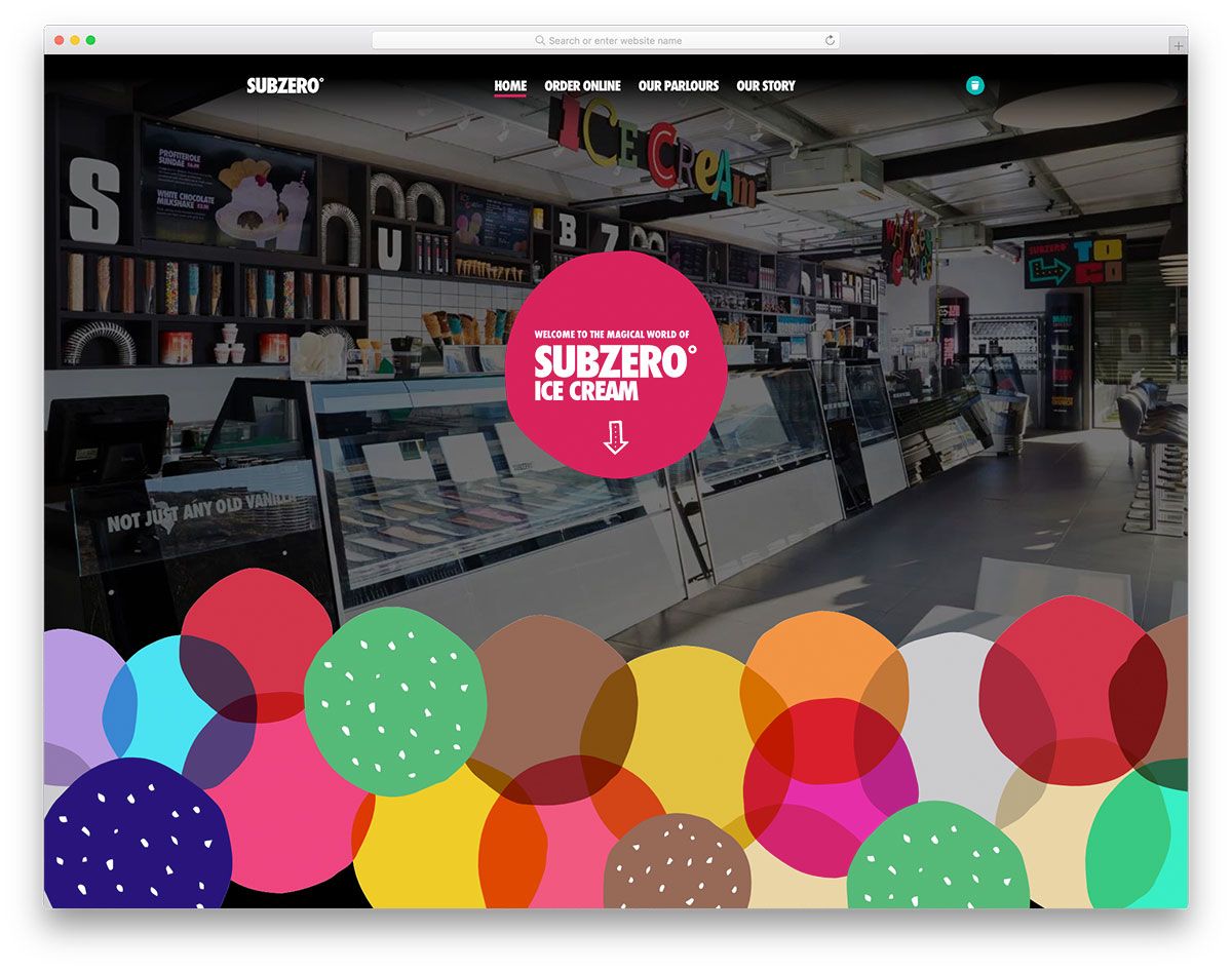
One of the most powerful strategies to adapt to your business is online presence. By making your products available on the web, it is easier for customers to come across your brand. Subzero Ice Cream doesn’t just provide irresistible and delicious products on the physical store but caters online ordering. Particularly, the cartoon-style designs of some elements are captivating and look fun and creative. Specifically, a customer can easily order online from the various products available. It also presents the parlors including the essential details such as opening times and addresses. Meanwhile, the creative and innovative presentation of the brand’s history using a smooth slider is enticing too.
Billy Goat Ice Cream
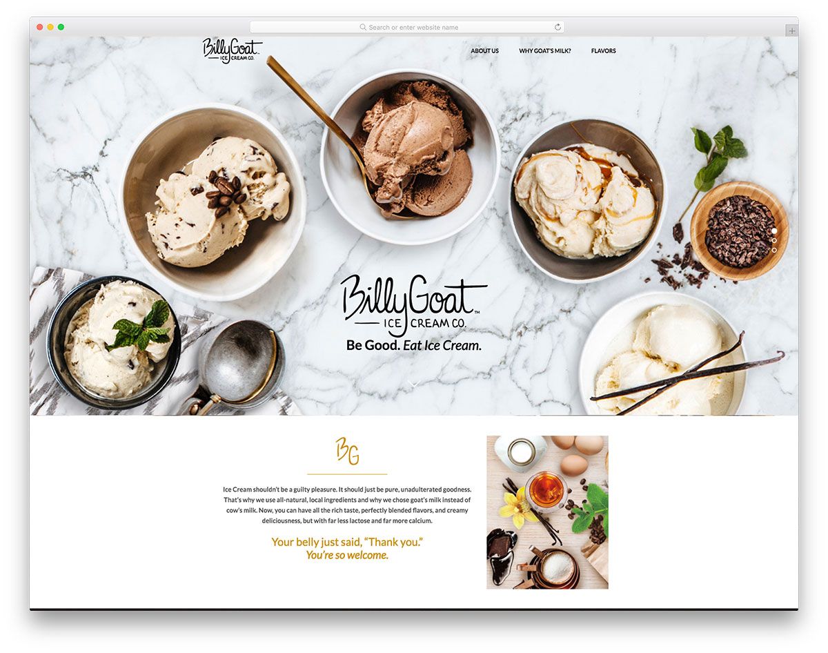
Ice cream brings joy and delight regardless of the time and season. That’s why many businesses join the ice cream industry with excellent flavors to brag about. Billy Goat Ice Cream promises to provide all-natural, delicious goat’s milk ice cream as a healthy alternative for dessert. Its website has a tasty, mouth-watering, full-screen image, tagline and logo. It also implements the parallax effect on most of the sections of the website. Of course, social media plays a great role in brand awareness campaigns, hence this website never ignores its essence and added the social media icons on the bottom just above the footer. Also, this website allows a customer to check for the stores that sell their products.
Jude’s Ice Cream
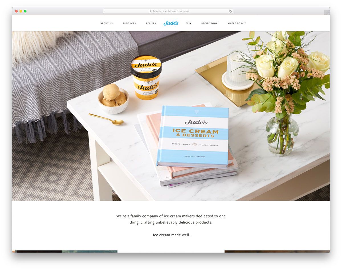
Ice cream is a popular dessert that captures people’s tastes regardless of gender and age. And because many ice cream brands are joining the market, it is essential that websites present products in a creative way. Jude’s Ice Cream has tasted and tested thousands of different recipes and was able to come up with the best and tasty ones. Aside from the menu in the header, the image on the hero also exhibits the menu in an attractive manner using the grid layout. Since it is ideal for every website to allow online ordering, Jude’s website embeds an eCommerce platform for ease in transactions. Furthermore, it also offers various ice cream recipes that will surely motivate individuals to make their own ice cream at home.
Eat Me
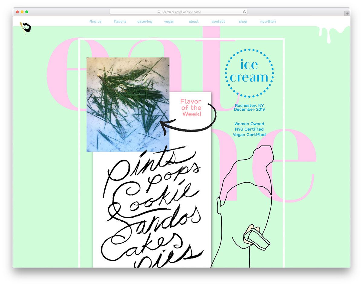
Staring out an ice cream business can be tough. But as long as you produce quality products coupled with effective strategies, success is much possible. Eat Me has a creative style of website that utilizes useful elements to convey the content. Apparently, the homepage is loaded with magnificent images coupled with art objects. Other websites place social media icons on the footer but Eat Me intends to include them on the hero scene. It also indicates the groceries and restaurants where the product is available for purchase. In addition, the presentation of different ice cream flavors is astonishing. Apart from that, this website enables the customer to have special orders and catering to events.
Afters Ice Cream
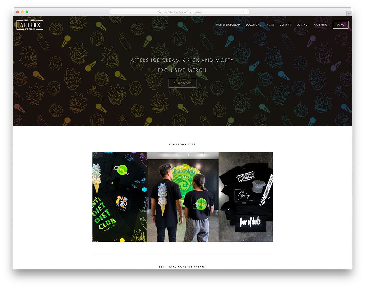
Ice cream is undeniably one of the best treats that is ready to delight both children and adults. Hence, different ice cream brands emerge in the competition. With that fact in mind, excellent products and effective strategies are a must! Afters Ice Cream is another simple and straightforward design that can impart a cool inspiration to designers. Using black and white as the primary color, this website looks elegant and sleek. As it is an eCommerce website that sells stuff online, the hero header comes with a descriptive CTA. For the navigation, it uses the awesome sticky header where the menu is accessible. It also showcases a variety of ice cream flavors to offer to ice cream lovers.
Pretty Cool
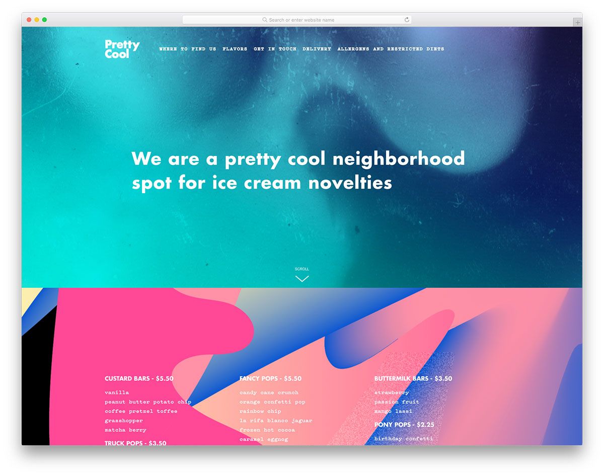
If you haven’t got a web presence for your ice cream business, you might want to consider it to reach your goals. Better check out these ice cream websites and start picking the right elements you should implement. Pretty Cool has a simple design of the homepage but the parallax effect adds a touch of creativity to it. Apparently, all sections have a similar parallax effect. It showcases the different products with a colorful and vibrant background. Furthermore, it also integrates the Instagram feed using a grid layout, a Google map, and a newsletter feature too.
Oat & Mill
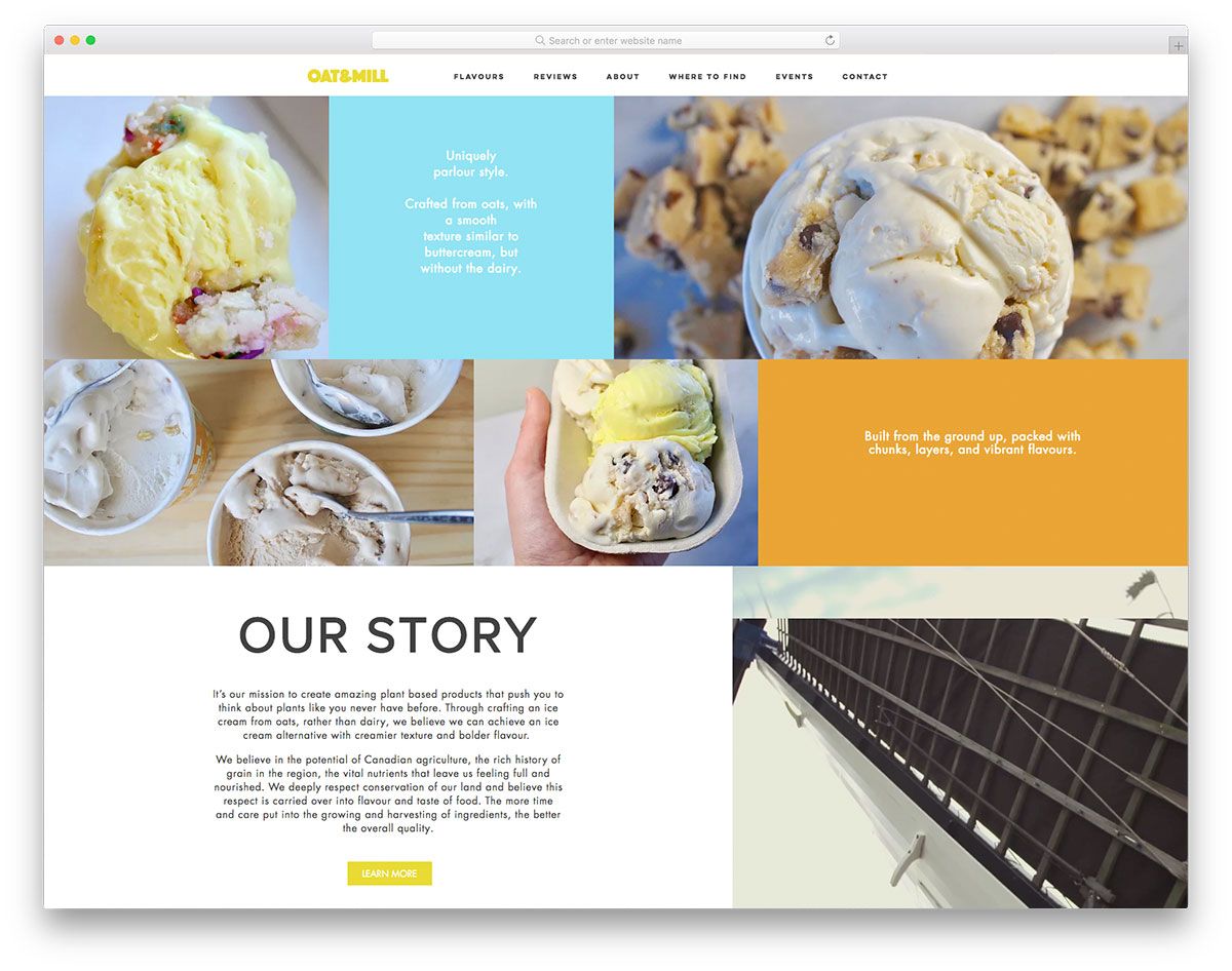
A better way to improve the ice cream business is to embrace the digital marketing strategy. With a good website to represent your brand across the web, achieving business goals may be possible. Oat & Mill is one of the simple yet elegant ice cream websites. The hero scene looks cool with the masonry layout. Displaying different ice cream images along with headlines is totally impressive. Having a sticky header, customers can browse for the various flavors, read about reviews, learn of the history and where to find the ice cream brand. Moreover, it also presents the upcoming events and festivals where ice cream is available to taste. It also has another set of elements in the footer like the menu, social media icons, and newsletter.
Oyya
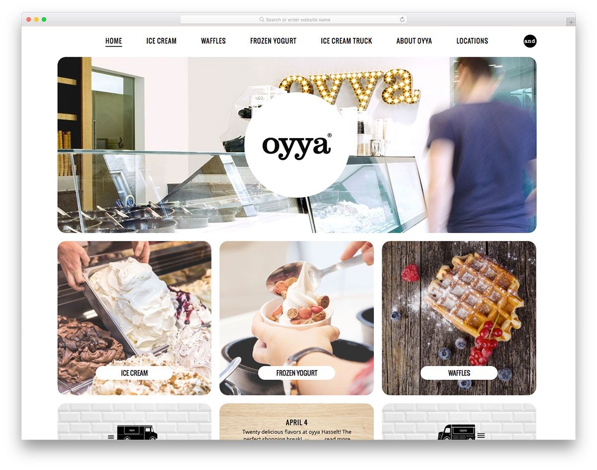
Launching an ice cream business needs passion and dedication to pursue goals. And if you love to see how other ice cream websites startle customers with their websites, then you should not miss these handpicked websites. Oyya has a grandeur website that has a clean and simple homepage. It presents content strikingly using images on a grid layout. While the menu is accessible on the header, it is also visible on most of the pages of the website.
Haagen Dazs
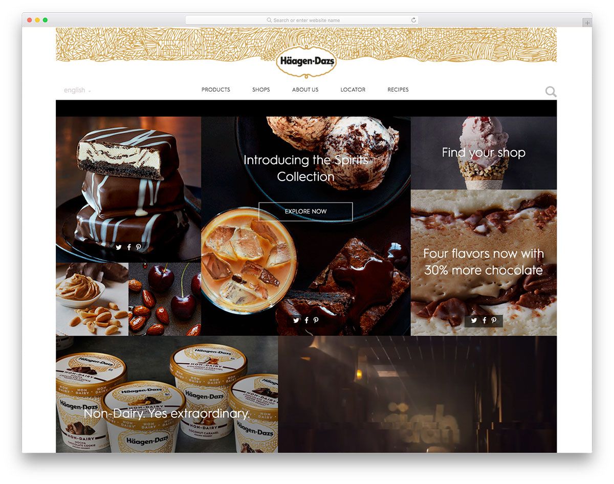
One of the effective ways to promote the ice cream business is to have an ideal website. Haagen Dazs has a clean and neat website design dedicated to its ice cream brand. It has a straightforward design of the homepage – a gallery of images and a video displayed in the masonry layout. Moreover, the news section looks stunning presented through a slider. With such a feature, it will not just offer useful content but will help in search engine optimization. Apparently, the ice cream products are neatly showcased using the grid layout. In addition, the animation upon scrolling adds a taste of creativity to the product page. For the shop’s page, another masonry layout is utilized to display a menu like find a shop, owning a shop, joining shop rewards, career opportunities and more.
Kind Cones
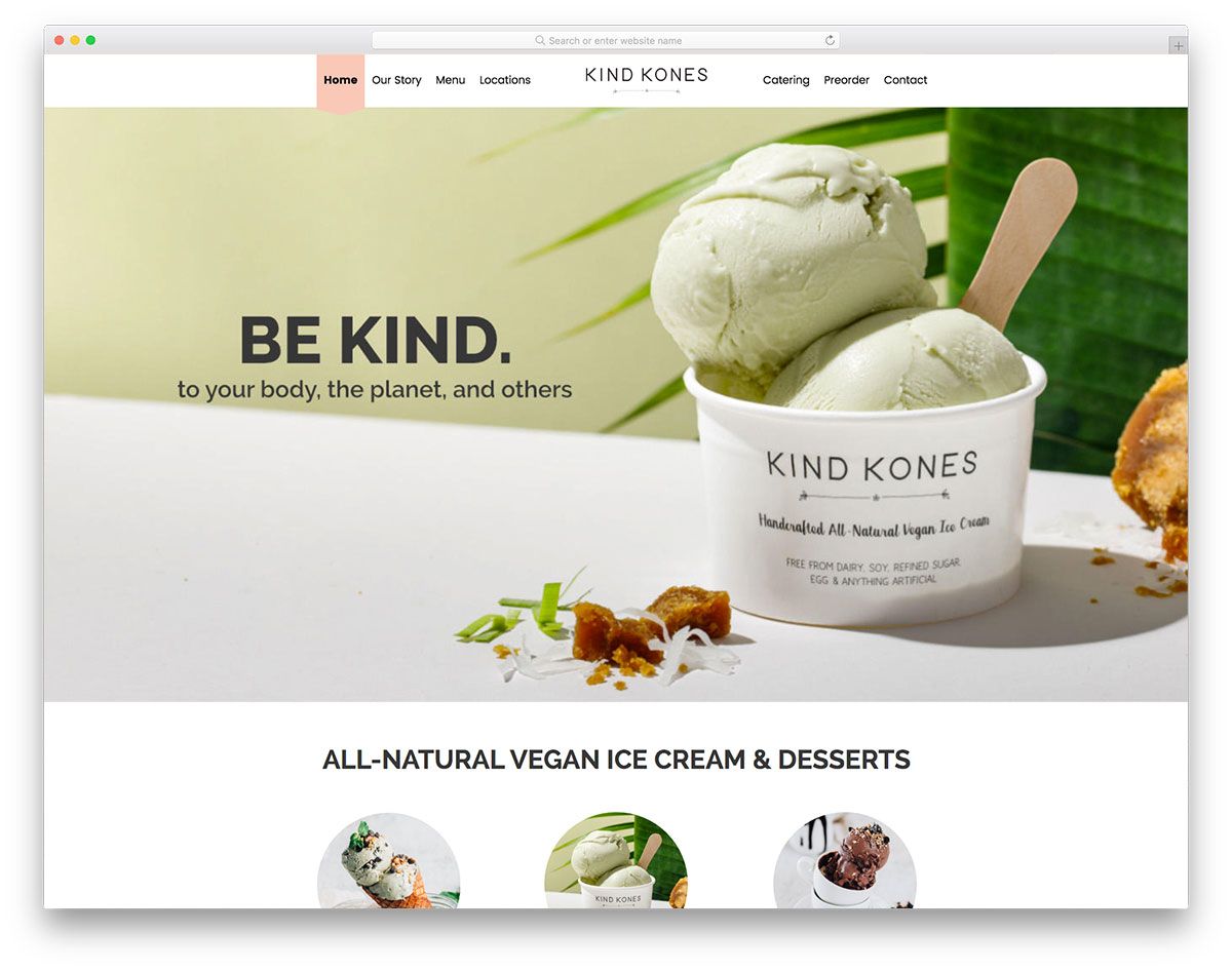
If you need an inspiration to craft the best website for your ice cream business then these ice cream websites are excellent tools. Kind Cones welcomes visitors with a beautiful homepage design. A full-width image on the hero header and a tagline are ready to impress visitors along with rounded thumbnails which indicate the potential distinction of this brand to others. Dedicated to provide 100% natural, fresh ingredients Kind Cones guarantees customers its brand’s credibility using testimonials through a sleek slider. This website also integrates the sticky header where visitors can access the story page, menu, locations, catering, preorder page and contact.
Paradis Ice Cream
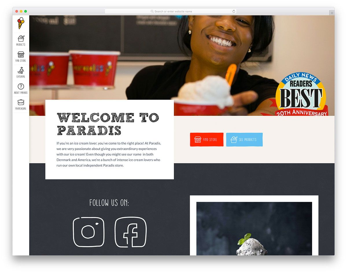
Feast your eyes with these amazing ice cream websites that are ready to impress visitors and inspire fellow ice cream brands. Paradis Ice Cream looks cool and unique with its simple but stylish sidebar menu. It features a big and full-width image on the hero scene with descriptive CTAs and a brief introduction. The homepage looks seamless with various sections and elements on it. Likewise, the products page also looks clean and is accessible with the drop-down menu options. Since this brand offers different stores and catering services, a visitor can check for the availability of the products with ease. What’s more? This website also utilizes creative and unique typography which adds a touch of elegance to the design.
Earnest Ice Cream
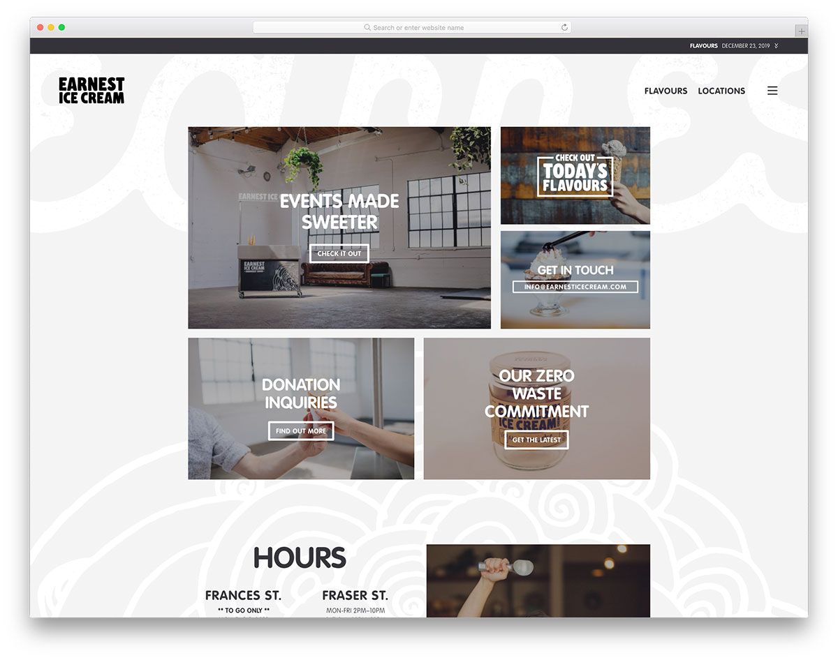
Simple but comprehensive, Earnest Ice Cream website is a great example for ice cream brands who wish to build an online presence. Unlike other ice cream websites, it utilizes a masonry layout on the hero scene in the presentation of the menu. Specifically, a customer can easily check the events, flavors, get in touch, donations and other essential pages. In addition, this website showcases job opportunities for interested ice cream enthusiasts. In order to present the brand more clearly, video integration is added that introduces the brand across the web. What’s more? The off-canvas menu is also added, the ice cream flavor page looks great and so with the locations’ page.
Movenpick
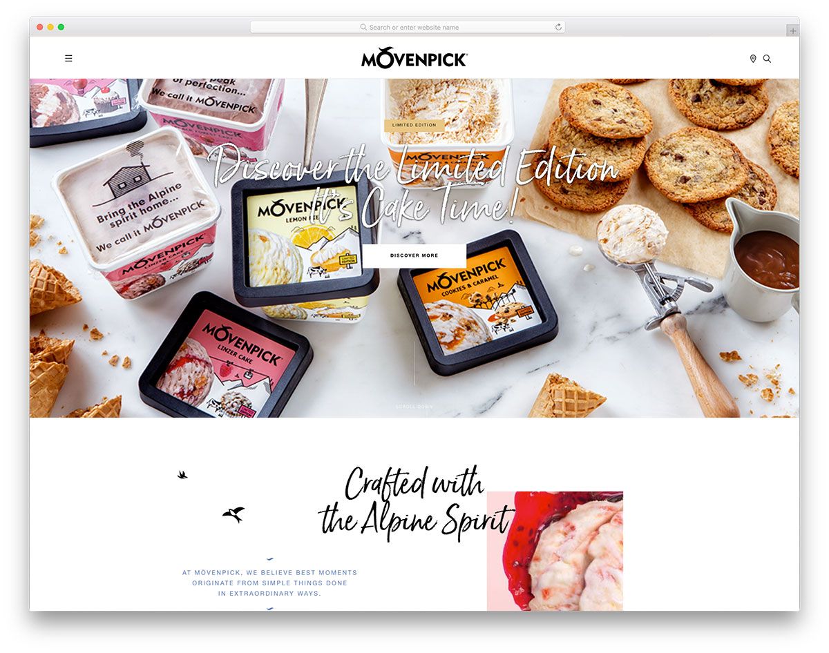
Starting an ice cream business needs serious planning, enthusiasm and inspiration. So, get inspired with these ice cream websites and never miss listing the ones you love. Movenpick doesn’t only exist to improve the brand’s credibility but to inspire both ice cream brands and designers. It comes with an elegant and sleek design of the homepage. Apparently, the hero scene displays a full-width image, CTA and headline. It also comes with an out-of-the-box layout for the brand introduction along with video integration. For the presentation of the featured products, another smooth slider is added to make them look interesting. Since video is more captivating and can increase retention, Movenpick embeds various videos on the website.
Three Twin Ice Cream
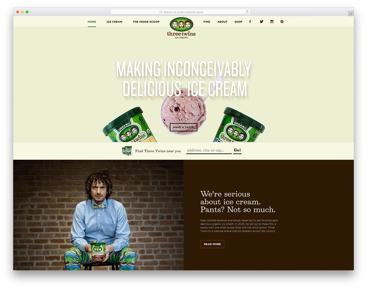
Three Twin Ice Cream is another good inspiration for ice cream websites. The homepage comes with a simple layout with outstanding content. The hero scene is added with essential elements such as full-width image, CTA and headline which looks even more appealing with the parallax effect. The introduction of the brand looks cool with a split-screen layout. Moreover, this website also exhibits excellent features compared to other brands through the use of grid layout. In order to encourage the customers to purchase more of their products, it displays an actual counter for the square feet protected with a pint of their ice cream products. It also comes with a creative and attractive CTA for catering.
Cone Flower Creamery
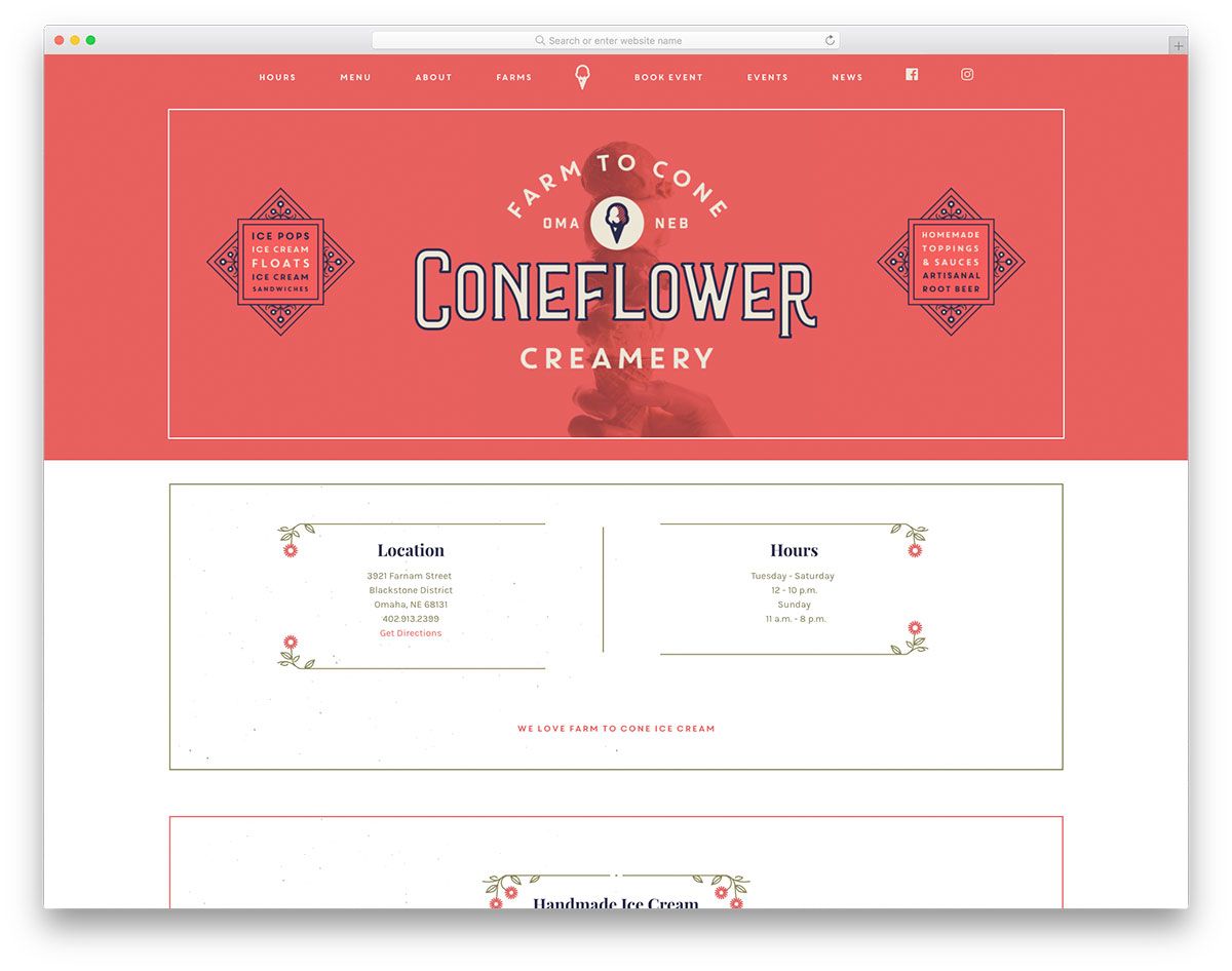
No need to doubt that ice cream is a super tasty treat. Whether it’s a kid’s birthday celebration, graduation, party or just an ordinary day, ice cream is always the best dessert. If you’re planning to build a web presence, better check out these ice cream websites we’ve handpicked for you. Cone Flower Creamery is a sophisticated and minimalist website. The hero scene is a subtle display of an ice cream photo as a background with a logo. The website also comes with a simple and straightforward display of ice cream flavors and other menus the brand serves. In order to introduce well the brand, it presents the locations, opening hours, about and local partners.
