A good website is a powerful tool to advertise your brand worldwide. Additionally, this marketing scheme is cost-effective too. Thus, brands that have websites have greater impact and more opportunities that await them. Similarly, tv channel networks also need a strong web presence. If you’re looking for a nice and wonderful inspiration, these stunning tv channel websites will be valuable.
Television is now a demand for every household. It is one of the most powerful communication tools globally, it now plays a vital role in society. Televisions are a huge source of information: whether entertainment, news, culture, sports, education, or music, TVs are indeed worthwhile. Today, we can find plenty of channels for different topics. Thus, people have various choices on what channels to pick, depending on their preferences. In turn, channel networks must have a website to market channel programs, shows, upcoming events, and other necessary details. Favorably, there are plenty of practical, contemporary themes that are carefully crafted to meet the needs of the channel networks. Thanks to the expert designers and developers who build practical and functional themes. In turn, you can turn to these tv channel websites for awesome inspiration.
In this handpicked collection, you can find clean, modern, and easy-to-use websites. Regardless of the topic each channel network promotes, they will serve as a grandeur motivation. So, explore these websites and note the finest features you think are perfect for replicating your project. Check them out and enjoy!
Best TV Channel Website Design Examples
iTV
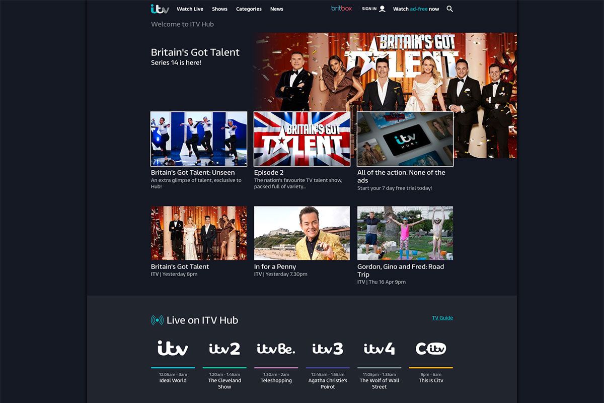
Promote your shows and programs effectively with a website that will help you reach more people. Don’t miss these tv channel websites we’ve collected for you as inspiration. iTV is a British free-to-air television channel – the biggest and most popular commercial television channel in the United Kingdom that operates in England, Wales, Scotland, and Isle of Man. The website design looks great, with a black background that complements the white typography. The homepage uses a magazine layout where shows and programs are placed in boxes. Furthermore, this website also uses a sticky header to give easy and quick navigation to the audience.
Canal Plus
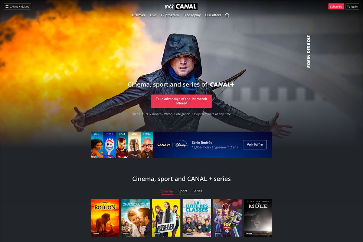
There’s no better way of advertising tv shows and programs than a good website can do. So, if you’re working with tv channel websites, you shouldn’t miss Canal Plus. It’s a French television channel launched in 1984. This is the most complete and the only streaming site that brings together films, series in (HD, VF, and VOST) all of TNT, and the most beautiful sports competitions live or in the replay. Similar to the previous inspiration, the website design of Canal Plus looks elegant and captivating with a dark tone background and white typography. The hero header is a display of compiled videos of its shows. Moreover, the site ensures that the promotions of cinemas, sports, and series shine well, using tabs to showcase them all.
Discovery Channel
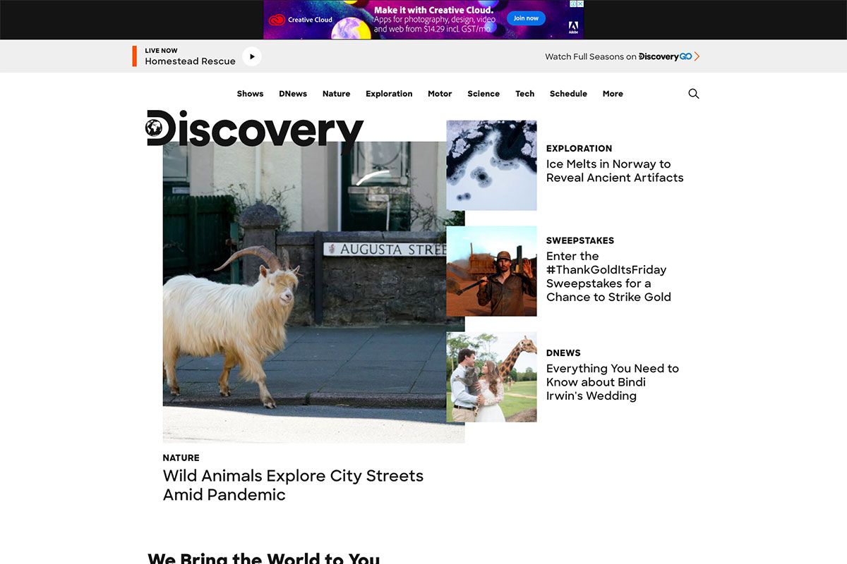
Who could have ever forgotten about Discovery Channel’s breathtaking programs and shows? You missed many of your childhood days if you haven’t watched this channel. It’s an American pay television network and flagship channel owned by Discovery, Inc. Initially, it provides documentary television programming focused on popular science, technology, and history. It has become the third most distributed subscription channel in the United States with that awesome shows. Like most TV channel websites, Discovery Channel uses a clean magazine layout that showcases content nicely. The hero header features overlapping of thumbnails with little descriptions of the shows. On the other hand, the different science shows of the site look attractive using a smooth slider.
Showtime
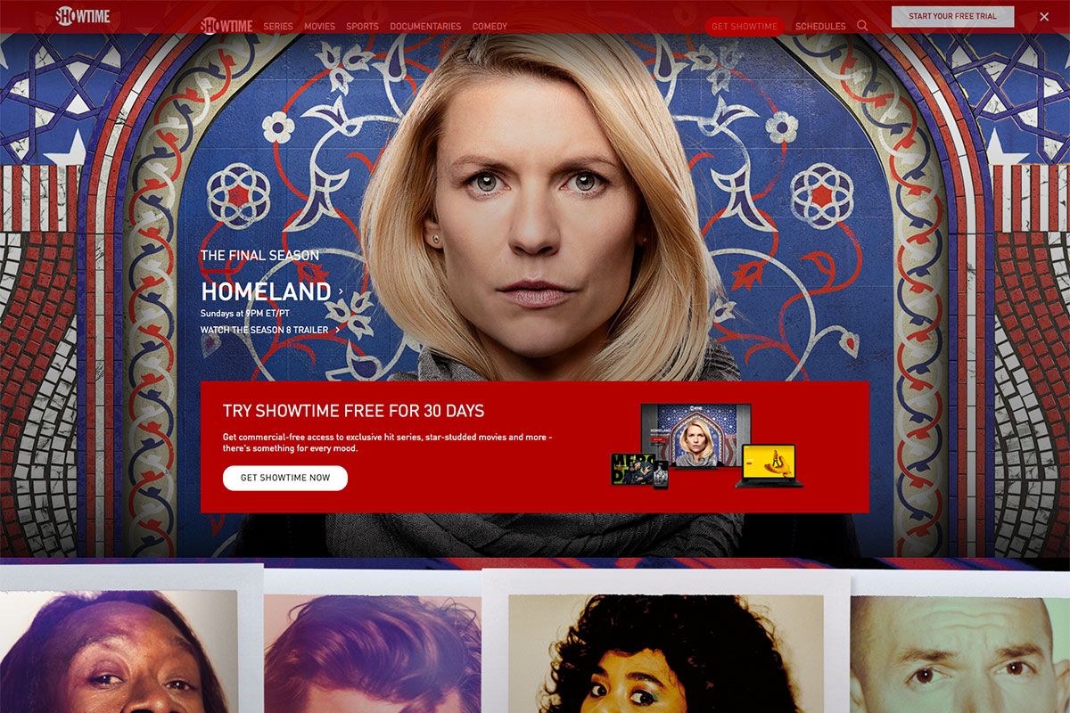
Promoting tv channels is not so difficult when you have a website to spread awareness of it. So, have a glimpse of these tv channel websites for your upcoming project. Showtime is a tv channel that allows you to access Showtime series, movies, documentaries, sports, comedy, and other genres. The website design is pretty impressive, with many web elements fused to create a seamless website. It stands out with quality images, white typography, and black background.
Animal Planet
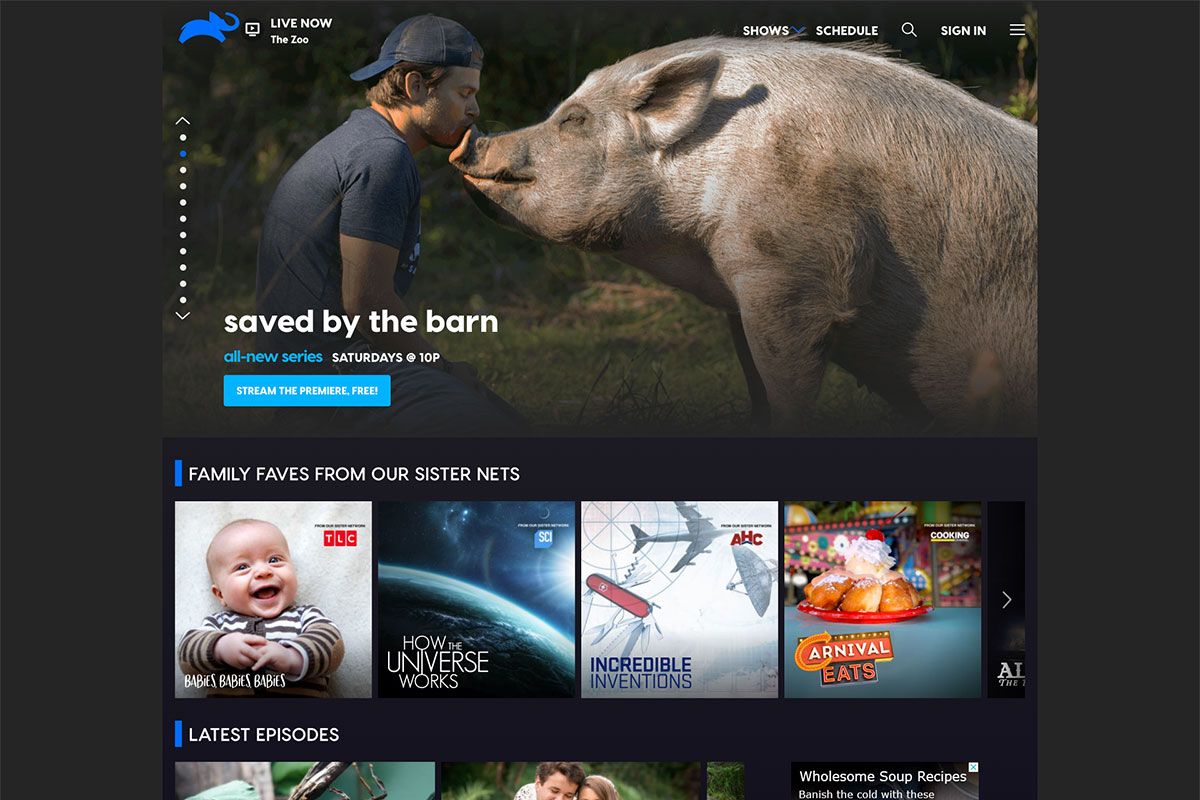
If you’re currently working with a client’s tv channel website, you may have plenty of inspiration to delve into with this list. Animal Planet is an American pay television channel owned by Discovery, Inc. This network is primarily devoted to series and documents about wild animals and domestic pets. Like most example websites in the list, the content is compelling with a black background. Specifically, the hero header exhibits a variety of shows this channel offers to the audience via a slider. Meanwhile, the logo plays a great role in branding, so this tv channel ensures that the logo is exceptional and clear.
BBC America
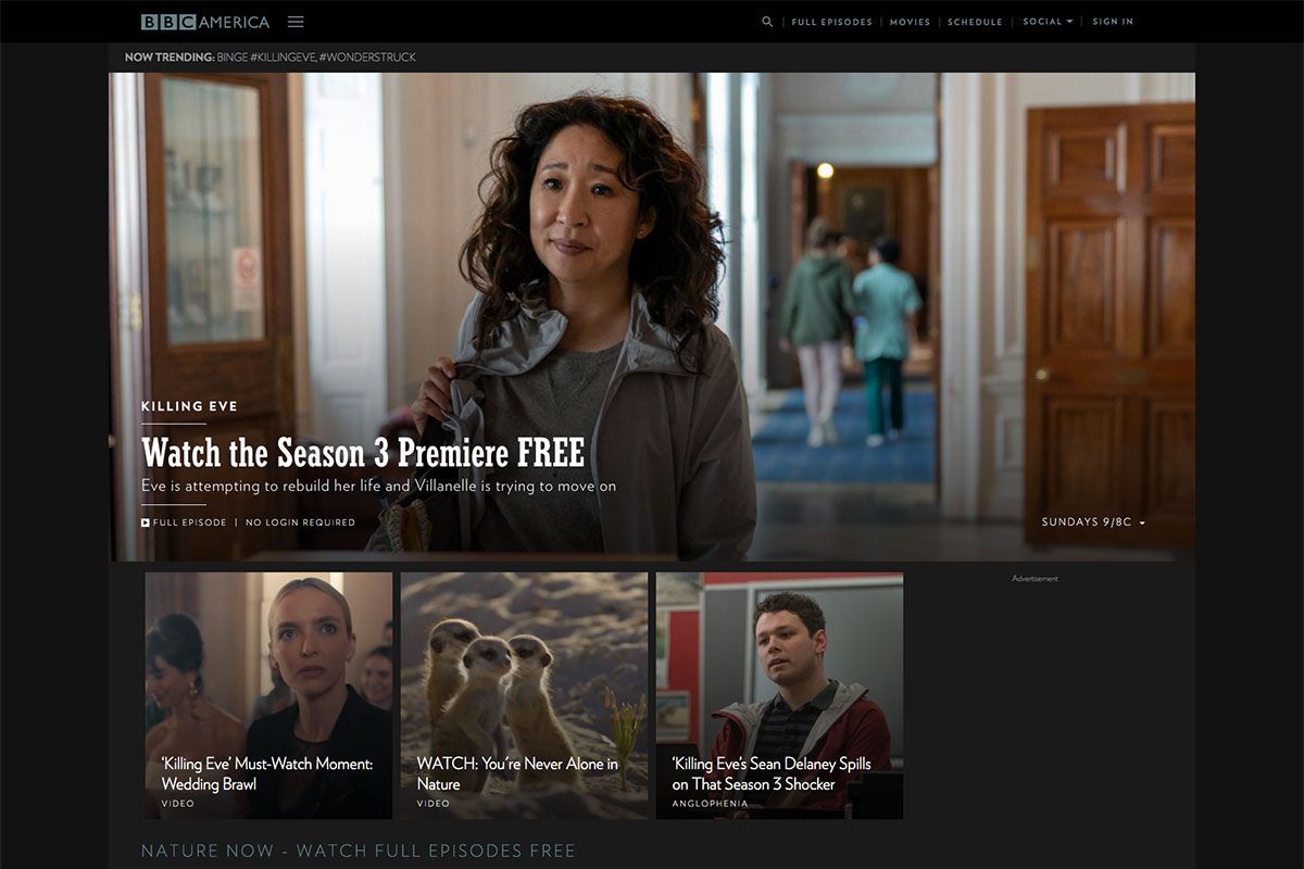
Undeniably, most industries have taken advantage of digital marketing, and results have been great. Today, we can find plenty of tv channel websites for motivations. The best thing with the TV channel website is that you gain more opportunities to advertise your shows and programs, so they spread easily. BBC America is a primary cable network that primarily airs sci-fi and action series and films. BBC America ensures that the best shows and programs are displayed on the website nicely. It features the latest show on the hero header with the clear and visual title. The display of full episodes regarding nature uses video integration arrayed horizontally. Other content also looks visually appealing with large and clear thumbnails.
ABC – American Broadcasting Company
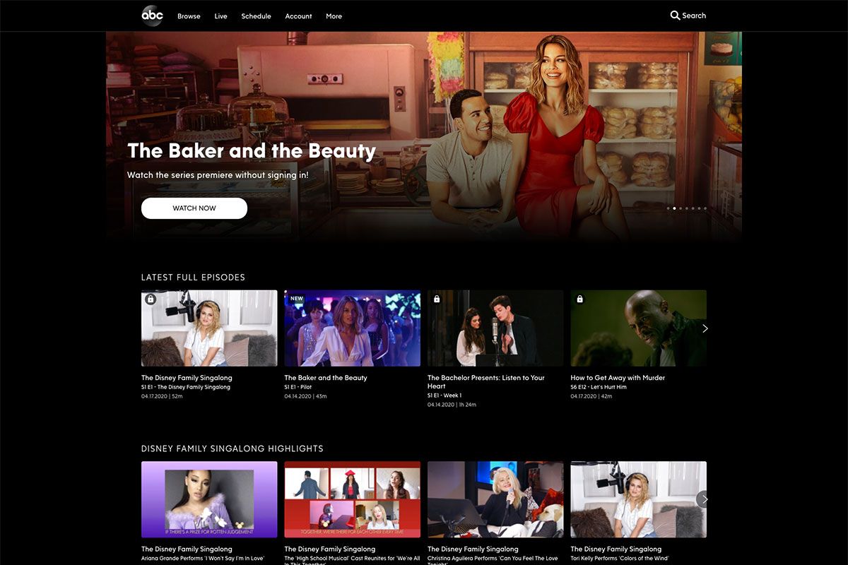
Get inspired by these tv channel websites we’ve gathered to provide you with stunning website examples. ABC is an American commercial broadcast radio and television network owned by the Disney Media Networks. It has an elegant, modern, and resourceful website design packed with useful web elements. The hero header stands out with the slider it uses, not to mention the captivating show title, background image, CTA, and more. Additionally, another carousel displays the latest full episodes in a grandeur manner. Commonly, sliders exhibit the content more impressive than mere image display, hence this website utilizes such a feature to its content. Other genres of this tv channel have a similar layout but come with a captivating Stream Now call-to-action button.
A&E
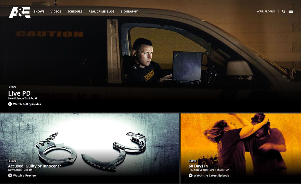
Television channels need to have an effective marketing scheme to empower brand awareness. Like these tv channel websites, they have embraced the power of web presence. A&E is an American pay television network headquartered in New York City and operates in Atlanta, Georgia, Chicago, Illinois, London, United Kingdom, and more. It primarily focuses on non-fiction programming, including reality docusoaps, true crime, and documentary miniseries. The hero header plays an essential role in the success of every website, so this tv channel ensures that it’s captivating. The website design shines well with clear and quality images added to the shows as thumbnails. While the header contains various essential web elements, the footer also includes useful elements.
CBS – Columbia Broadcasting System
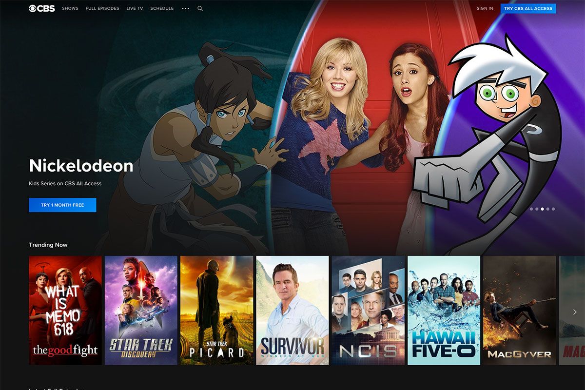
With more brands trusting digital marketing these days, almost all industries have considered it effective marketing. CBS is an American English-language commercial broadcast television and radio network that airs fantastic and entertaining shows. With the desire to reach more audiences, this brand never ignores the essence of a website. Hence, it has tailored a modern and easy-to-use website for viewers to browse. Since it is in the hero header that makes the first good impression, CBS highlights some of its wonderful shows via a slider. In like manner, the trending shows are also visible on the homepage, which looks better in the carousel. Once the viewer hovers on the thumbnail, it manifests a cool and subtle animation effect. Meanwhile, the latest full episodes and the rest of the content also look great with a similar layout.
Hallmark Channel
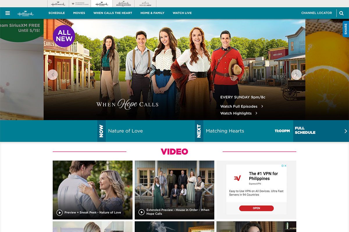
Discover the finest features you can include in your project with these tv channel websites. Hallmark Channel is a private, family-owned American company based in Kansas City, Missouri. It’s the oldest and largest manufacturer of greeting cards in the United States. The homepage design manifest a lot of the brand’s personality including color scheme and classic design. The hero header exhibits various shows with thumbnails, title and schedules of the show. Additionally, the viewers can check for the now showing, next, later and the full schedule of shows. The website uses a sticky header to make the navigation more accessible where the logo, menu, and search are visible. There are also banner ads all over the homepage too.
USA Network
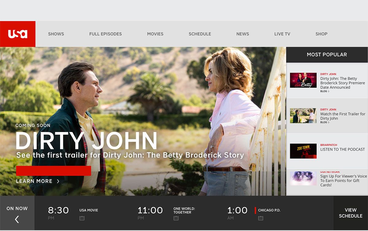
TV channel websites are a great way to exhibit upcoming shows. That’s why most of them always opt for a good website. USA Network is the best place to catch up on the most recent season of your favorite shows, watch live TV, and stream movies. Of course, you can also discover full episodes of original series and exclusive interviews, episode guides, and news. The website design is pretty unique and creative compared to other tv channels, but they all have a stunning look and feel that they can brag about. It has a seamless layout on the hero header with a slider that highlights the featured shows, and about one-third of the screen is the scrollable sidebar that displays the most popular shows. Below that hero scene is the slider highlighting the showing now, next, tonight, and full schedule.
WGN America
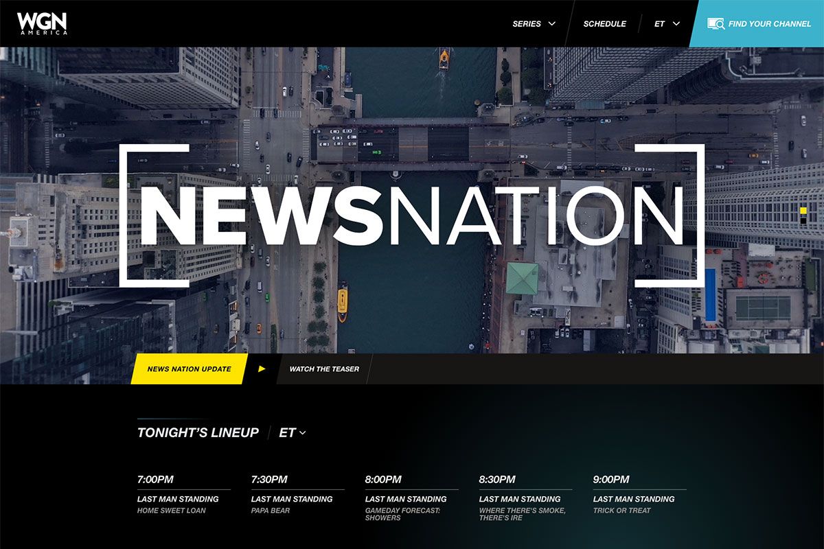
There are numerous inspiration that you can choose for your upcoming project. WGN America is one of the grandeur tv channel websites to explore. It’s an American subscription television network that the Nexstar Media Group owns. It’s a nationally distributed television network whose reach is approaching 75 million homes via cable, satellite, and telco. Its website welcomes viewers with a slider that displays featured shows and teasers. After that, another section displays the Tonight’s Lineup Shows with simple white typography. Other featured shows look exceptional with larger thumbnails.
What’s more? The website also shows consistency in some web elements, such as parallelogram shapes. It also uses a mega menu for displaying the different episode series.
TLC – The Learning Channel
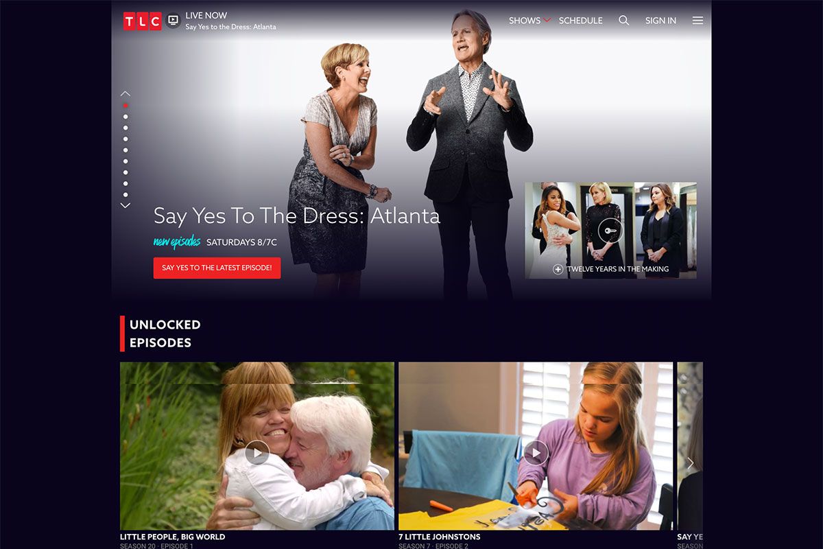
Education TV programs are perfect for children and adult. No wonder why we see a lot of tv channels that exist today. Luckily, we have plenty of tv channel websites to delve into for inspiration. TLC is an American pay television channel owned by Discovery, Inc. Initially, it focused on educational and learning content and began to focus on takers reality series involving lifestyles, family life, and personal stories. The hero header has a remarkable and modern design with featured shows and clear CTA, the show’s title, trailer, and a quality background image. On the other hand, the other relevant shows are presented using slider. So, whether it’s an image or video content, they both look attractive.
MSNBC
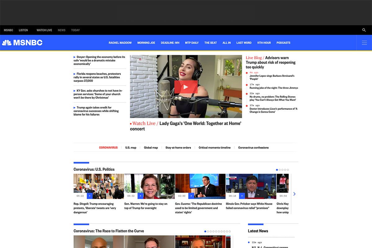
Get ample ideas in building your web presence with these tv channel websites. You can browse this collection and never let your projects look dull. MSNBC is an American cable television channel that provides NBC news coverage and its reporting and political commentary on current events. The website design is totally clean, neat, minimalist, and modern. The hero header displays the breaking news video on the center with the latest live blogs on both opposite sides. The must-watch section stands out in a cool carousel. The same goes with the US Politics section, Economy, and other necessary categories. This tv channel uses blue as the primary color and ample white space all over the homepage, making the design outstanding.
Comet
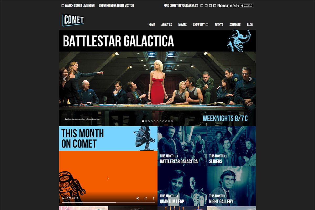
Don’t miss the chance to build a strong web presence with these tv channel websites. Comet is an American digital broadcast television network that focuses on science fiction with supernatural, horror, adventure, and fantasy series and films. The website design amazingly looks elegant with a black background and white typography. It welcomes the hero header with a slider that showcases different shows. This way, viewers will learn the upcoming shows to watch. Other exciting shows and programs appear superb, with enticing teasers in a grid layout.
What’s more? The website also links to the live TV and social media links on the header section. Other awesome pages include movies, events, schedules and a blog page.
MTV
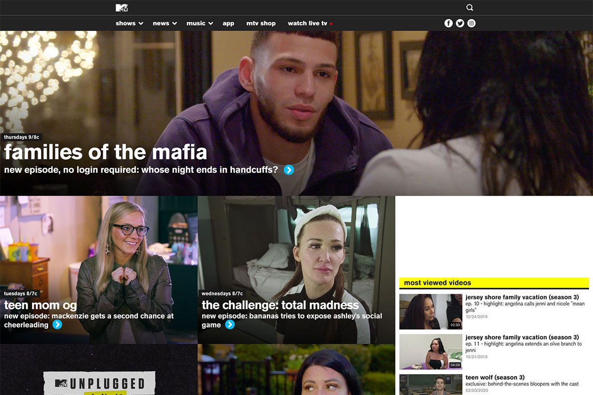
People love music as it is the “food for the soul”. That’s why music televisions exist to entertain viewers with glamorous music. Here’s MTV, one of the tv channel websites that enables you to see episodes of your favorite MTV Shows. It features the latest music videos from favorite music artists. This American tv channel has a modern and intuitive design. The header bears the channel logo, menu, search, and social links, while the hero header displays the latest episode of their shows with stretched thumbnail and CTA. Furthermore, the sidebar shows the most viewed videos to be easier to access. Aside from the accessibility feature this website has, it also uses a sticky menu to navigate easier and quicker.
NBC
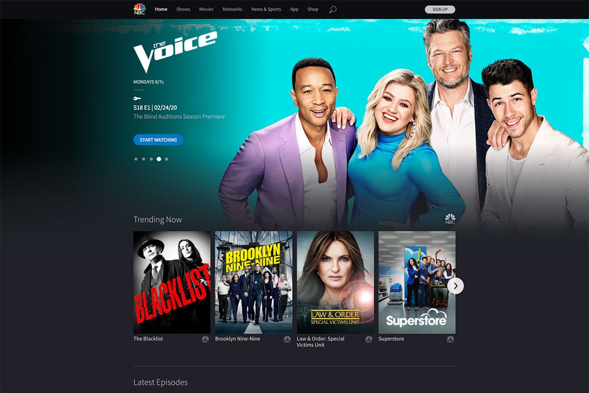
NBC is sometimes referred to as the "Peacock Network" with a stylized peacock logo. It’s an American English-language commercial terrestrial radio and television network. Since black often implies elegance, its website looks attractive and sleek with black background white typography. The header bears the TV channel logo, the menu, search, and the signup button. Additionally, the hero header utilizes the slider to highlight some of its latest shows and episodes. Part of it is the clear CTAs, the show’s title, trailers, and more. Furthermore, the trending programs are still visually pleasing and easy to navigate through a smooth slider. And they’re even more interesting when it displays short scenes from the shows as users hover on thumbnails.
MeTV
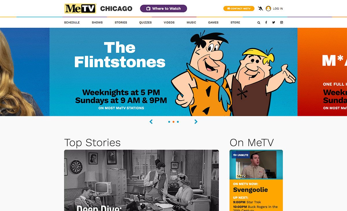
Explore these tv channel websites and learn the best inspiration to consider. Here’s MeTV, an American broadcast television network that Weigel Broadcasting owns. It offers memorable entertainment television from America’s #1 classic television network airing over 50 different classic TV series. This channel uses more vivid colors in its web elements. Thus, the design looks lively and engaging. The homepage comes with valuable features and web elements ready to deliver the content nicely. These include sliders, sticky header, useful CTAs, video integration, infinite loading, and more. It also integrates a store page, quizzes, games, and more.
Cooking Channel
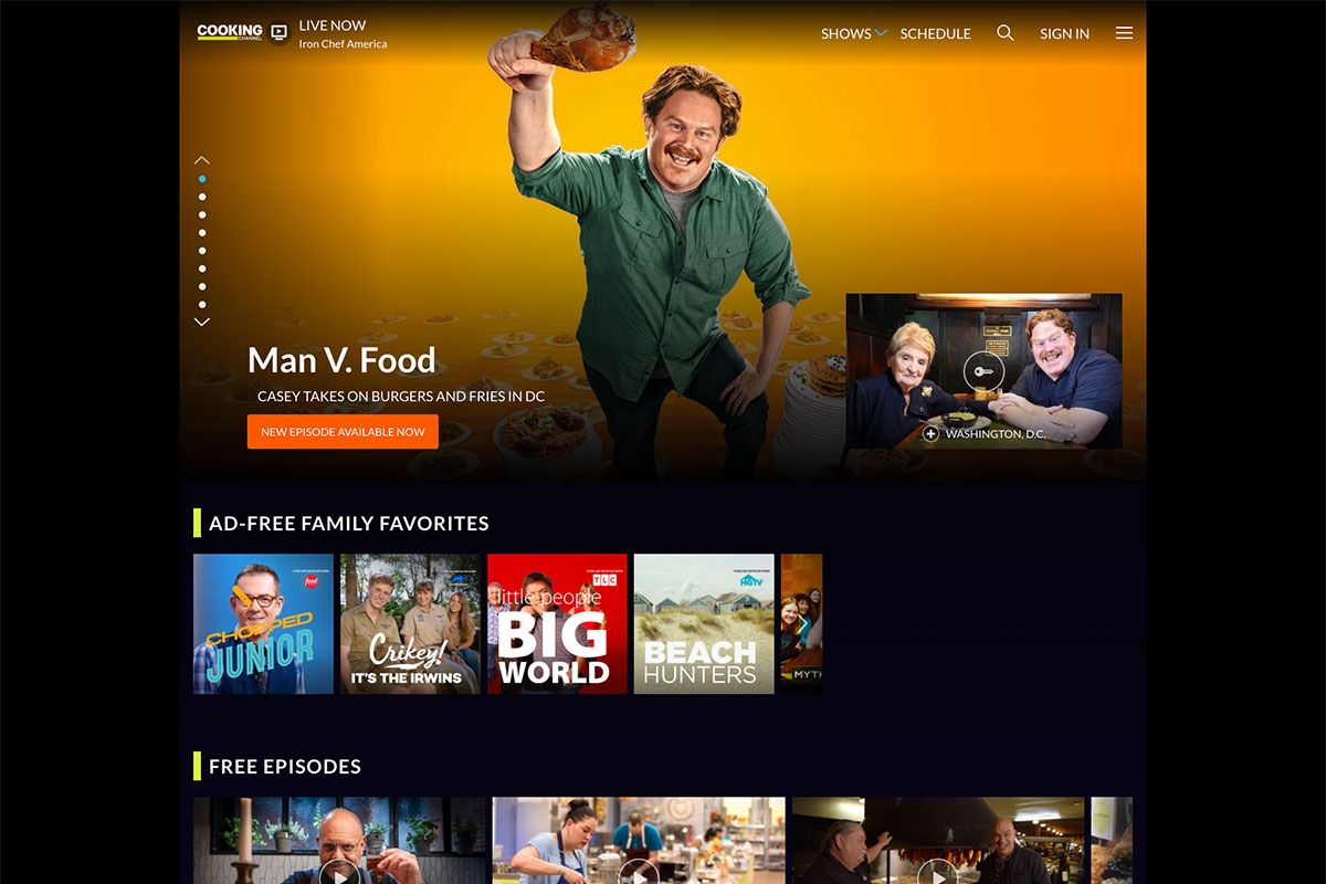
Cooking is one of the most exciting and enticing topics in the world. That’s why Discovery, Inc ensures that special and mouth-watering cuisines are always available for the home cooks. So, Cooking Channel exists to feature episodes all about food. The website design, similar to the topic itself, is engaging too. The hero header displays some of its featured shows nicely using the slider. Of course, it includes the clear CTAs and title of the shows with awesome image background. Specifically, it also uses a cool sticky header to display the list of shows using the dropdown menu, search, schedule, logo, and off-canvas menu. Other content also appears exceptional with the slider this website uses.
