Are you building a website for a museum or art gallery and looking for some inspiration? These museum website design examples are exactly what you need.
With the modern marketing schemes that most brands embrace today, growing business’ reach is at the tip of one’s fingers. Luckily, the museum industry can effectively reinforce its position as a global institution through a well-designed website. If you’re working with similar projects, you shouldn’t miss acquiring the best concept of museum website design in this handpicked collection.
Typically, museums are built to engage and educate the community. Hence, the exhibitions must kindle the interest of every visitor. Fortunately, museum websites are crafted to help promote exhibitions with minimal effort but are impactful. Thanks to the power of digital advancements, booking a visit to museums is just a few clicks away. For museum institutions that would love to build a web presence, innumerable pre-made themes are available on the web to take advantage of. In this way, it is possible to omit the burden of building a website from scratch. While that option is excellent, you can also find talented designers to build your project’s outstanding museum website design. Whichever works best for you, this list is still a great inspiration to look into.
Whatever type of museum you’re planning to build an online presence with, indeed, this set is amazingly inspiring. In this collection, you can find various museum website designs that inspire other institutions to build similar websites. Check them out and grab the amazing features you would love to replicate in your upcoming project.
Best Museum Website Designs
Ayomide
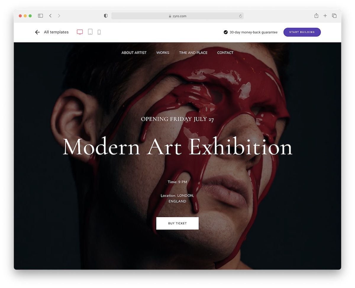
Do you need the best museum website design that speeds up the creation of your online presence? Of course, you do!
Ayomide is ready for you to achieve the best result quickly and effortlessly. You can enjoy the default settings as-is and save yourself even more time.
But you are also welcome to customize, brand and personalize it. You can even expand it with a blog and an online store.
The options are numerous, so make the most out of it! It’s possible.
Stornoway
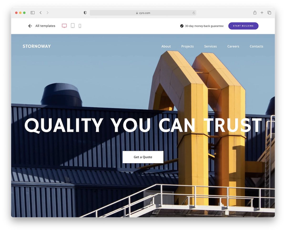
Building a museum website is very possible due to Stornoway’s flexibility. Hey, we like going against the grain, so we thought you’ll enjoy the amazingness of Stornoway, too!
It is a template that you can easily and quickly modify and improve with your branding and content. You’ll never need to code for this, which is always a plus.
And if you’d like to start a blog, even potentially sell stuff, you can do that, too. Stornoway is here for YOU!
Natural History
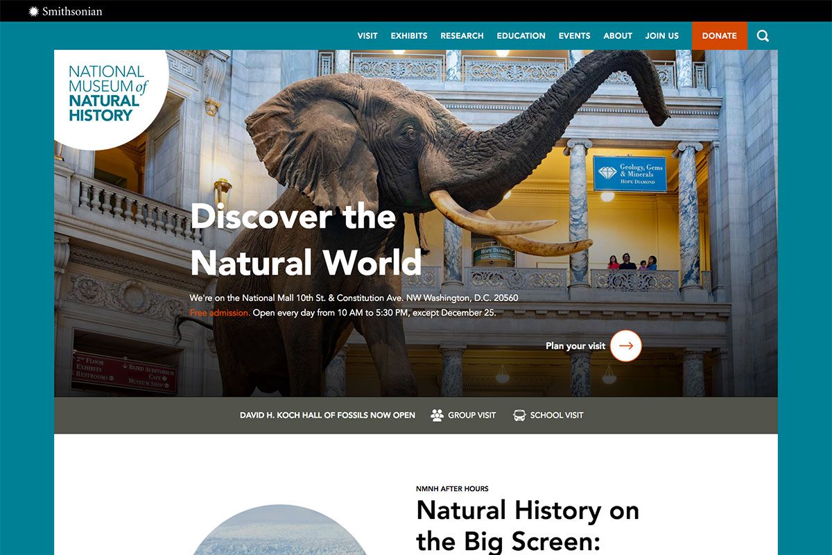
No matter what type of museum an institution runs, it is always a great choice to have a website. Natural History has a great museum website design that enables the audience to explore exhibitions at a glance. With its mission to promote understanding of the natural world, this museum exists to tell the planet’s history. To achieve its goal, its website comes with awesome web elements to showcase exhibits, events and to set up visits online. In this way, people planning to visit the museum will have ideas on what to expect during their visit. The homepage has a nice and modern design. From clear CTAs, bold headlines, visual hierarchy, quality images, and cool animation upon scrolling, this website is ready to help interested visitors explore the natural world!
British Museum
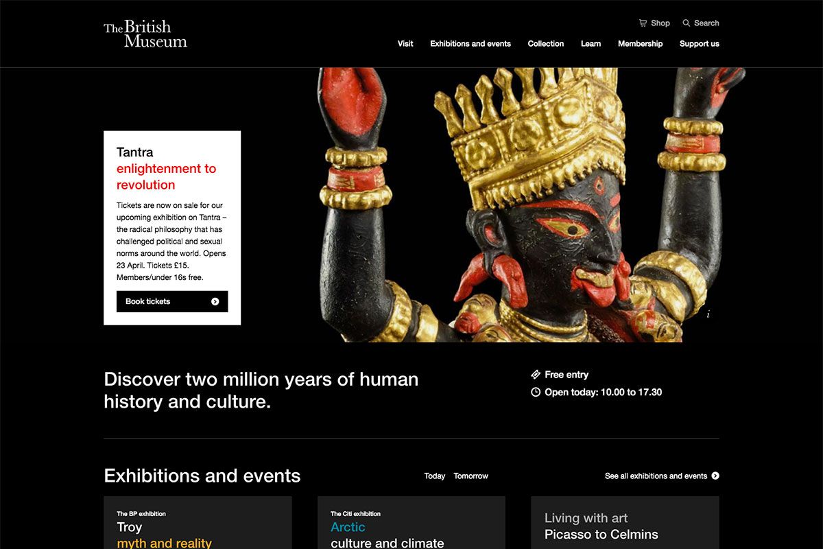
Reach more people and create opportunities for your museum institution. That’s possible when you build a museum website and get inspiration from these designs. British Museum aims to bring together the cultures of the world under one roof, spanning continents and oceans. It has an elegant and modern museum website design that is ideal for inspiration. This website stands out with white typography on a black background. It’s even more visually appealing with the integration of GSAP animation. Hence, elements have cool and subtle animation upon hover. Aside from that, it also features a nice drop-down menu, clear video integration, sleek slider for multiple collection showcases, social network icons, and so much more.
National Museum of African American History & Culture (NMAAHC)
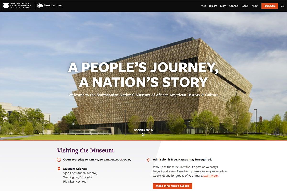
Indeed, museums provide an effective way of learning. That’s why more and more museum institutions are built to provide similar goals. NMAAHC is the only national museum devoted exclusively to the documentation of African American life, history, and culture. With such goals, it didn’t ignore the essence of digital marketing. Notably, it has a well-built website with a clean, modern, and elegant design. While most businesses take advantage of GSAP animation, this institution never embraced it. The hero header comes with a bold headline, attractive image, and clean typography. It also utilizes the sticky header for quick and easy navigation. Having red as the primary color, it looks superb with white space all over the pages.
National Air and Space Museum
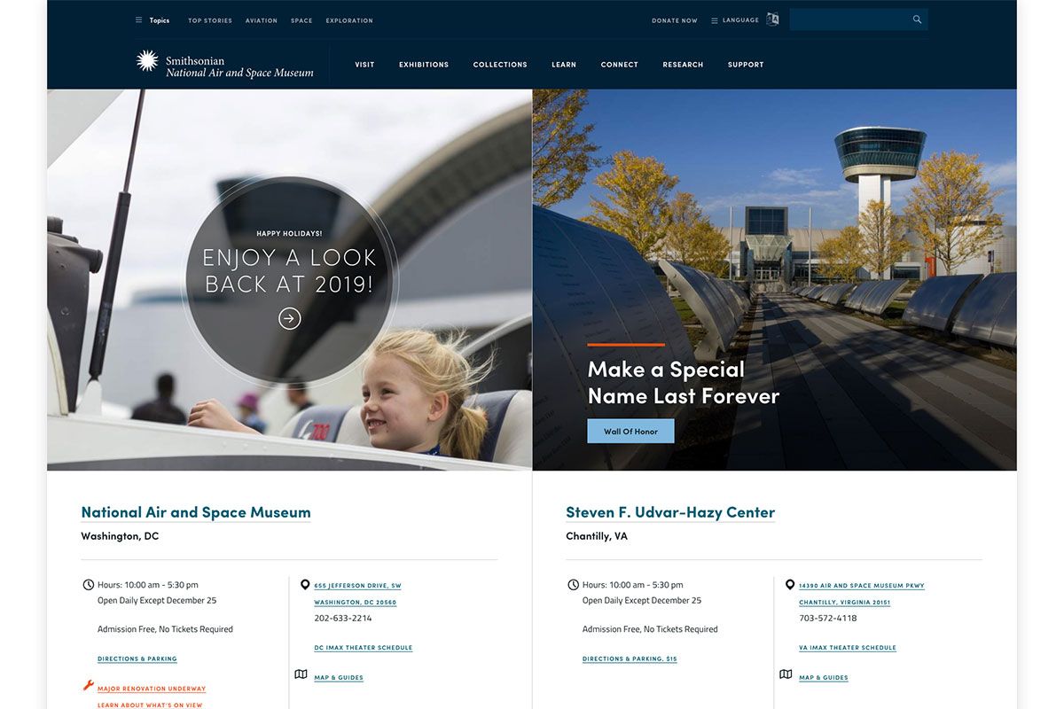
Most museum institutions are typically adept at giving educational experiences. If you provide such an exciting adventure, then your website should be ready to cater to the audience’s needs. Here’s National Air and Space Museum with an exceptional website design. It is a perfect tool for fellow museum institutions to build innovative websites. The hero header is a cool display of awesome web elements arrayed in a split-screen layout. It is even more interesting when it animates upon hover.
National Gallery
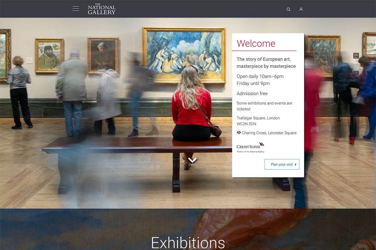
Museum websites don’t need to be dull. While the web presence is the main reason you build your website, the design must be perfect. Here’s one of the inspiring museum website designs you should delve into. National Gallery houses one of the greatest collections of paintings in the world. In particular, the design of the homepage is attractive and minimalist. With many painting images, visitors can easily access the painting they’re interested in.
With its website, one can find important details such as the Google map to guide visitors through public transport, walking, cycling, or car. It also displays the services you can enjoy upon visiting the museum, including the exhibitions, arts, artists, research, and more! Furthermore, the events section also showcases multiple upcoming events through a slider.
Museum of Modern Art
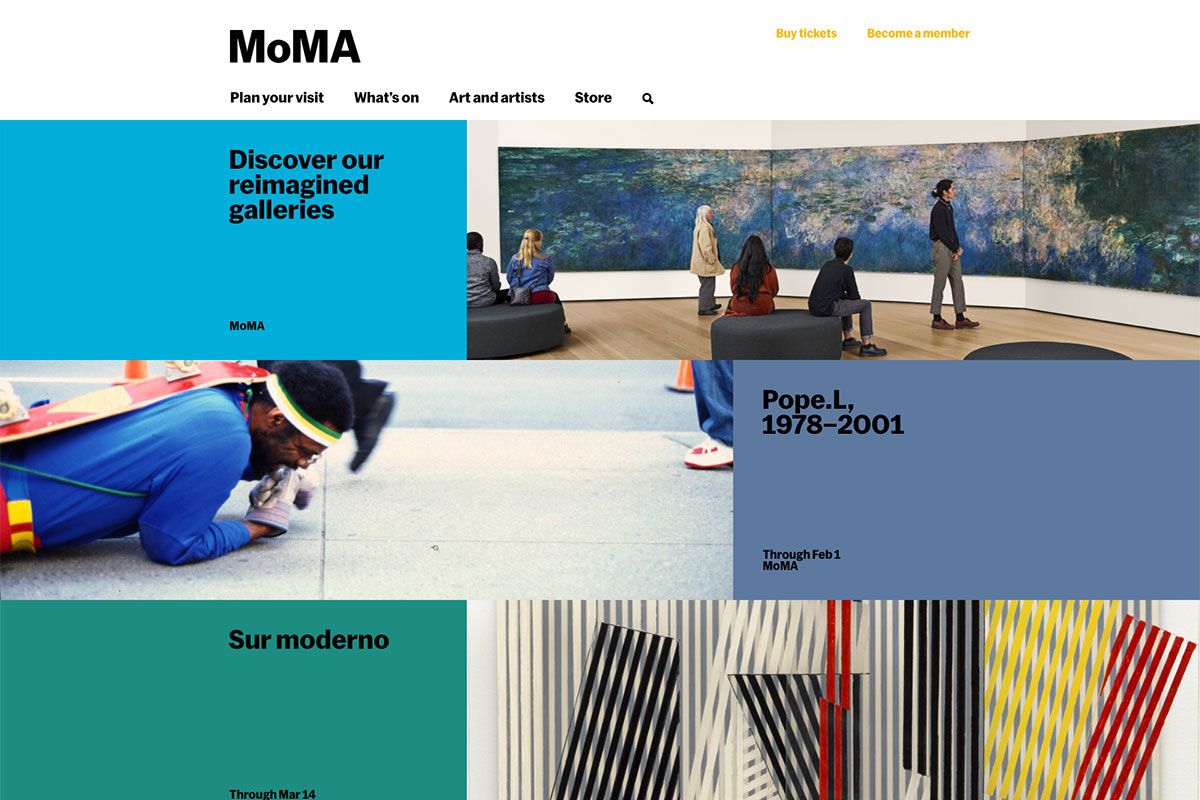
Museums are truly valuable environments to have informal learning. It’s a place where one can explore exhibits. The Museum of Modern Art’s website can inspire fellow institutions to craft innovative websites. Particularly, this museum is a beautiful place that fuels creativity, ignites minds, and inspires. It aims to share modern, contemporary art to explore art, ideas and issues. Aiming to achieve its goals, the website has a simple but comprehensive design. The hero header is loaded with useful elements ready to shine in the museum industry. It utilizes a nice magazine layout on the header to exhibit the arts attractively. Since white space plays an important role in the design, this website embraces white space and looks clean and minimalist.
Brussels Museum
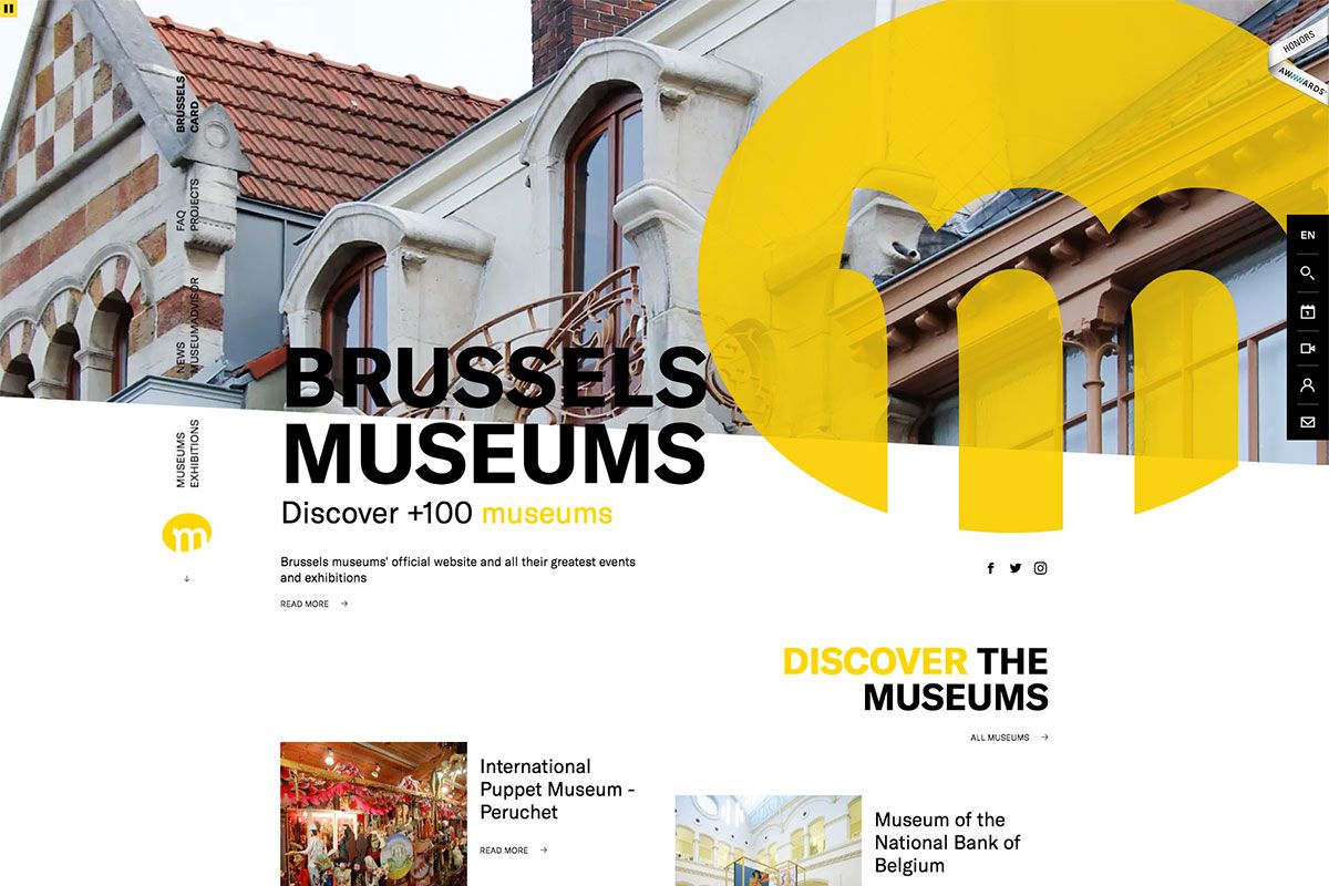
Museums are a great way to spend time with friends and family. Depending on the type of museum an institution runs, acquiring a web presence is never a waste of time and resources. Your greatest events and exhibitions will always be noteworthy and accessible with a fully responsive and mobile-ready website. Typically, people are easily attracted to images; hence, this website added a short compilation of images on the hero header. It also integrates the social media links for easy access to the pages. Furthermore, the navigation on the sidebars also adds to the user-friendly features of the website. Additionally, the hover effect on some web elements is also interesting.
Frans Hals Museum
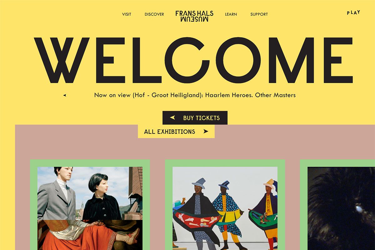
If you’re currently redesigning a website for a museum, these museum website designs will be noteworthy. Frans Hals Museum has Frans Hals paintings as the main collection. It has a vibrant, modern, and creative design perfect for inspiration. The homepage is creative and innovative with the GSAP animation. The hero header presents the headline with bold typography, an attractive logo, a super creative drop-down menu, and animated featured events. The essence of a website is to enable visitors to book a visit to the museum. Well, with this website, buying tickets and discovering more exhibitions is just a few clicks away. Furthermore, the sticky navigation on the left sidebar makes it easier for visitors to navigate the website. Meanwhile, the social network icons and the newsletter are also ready to do their vital roles.
Museum of Science + Industry (MSI) Chicago
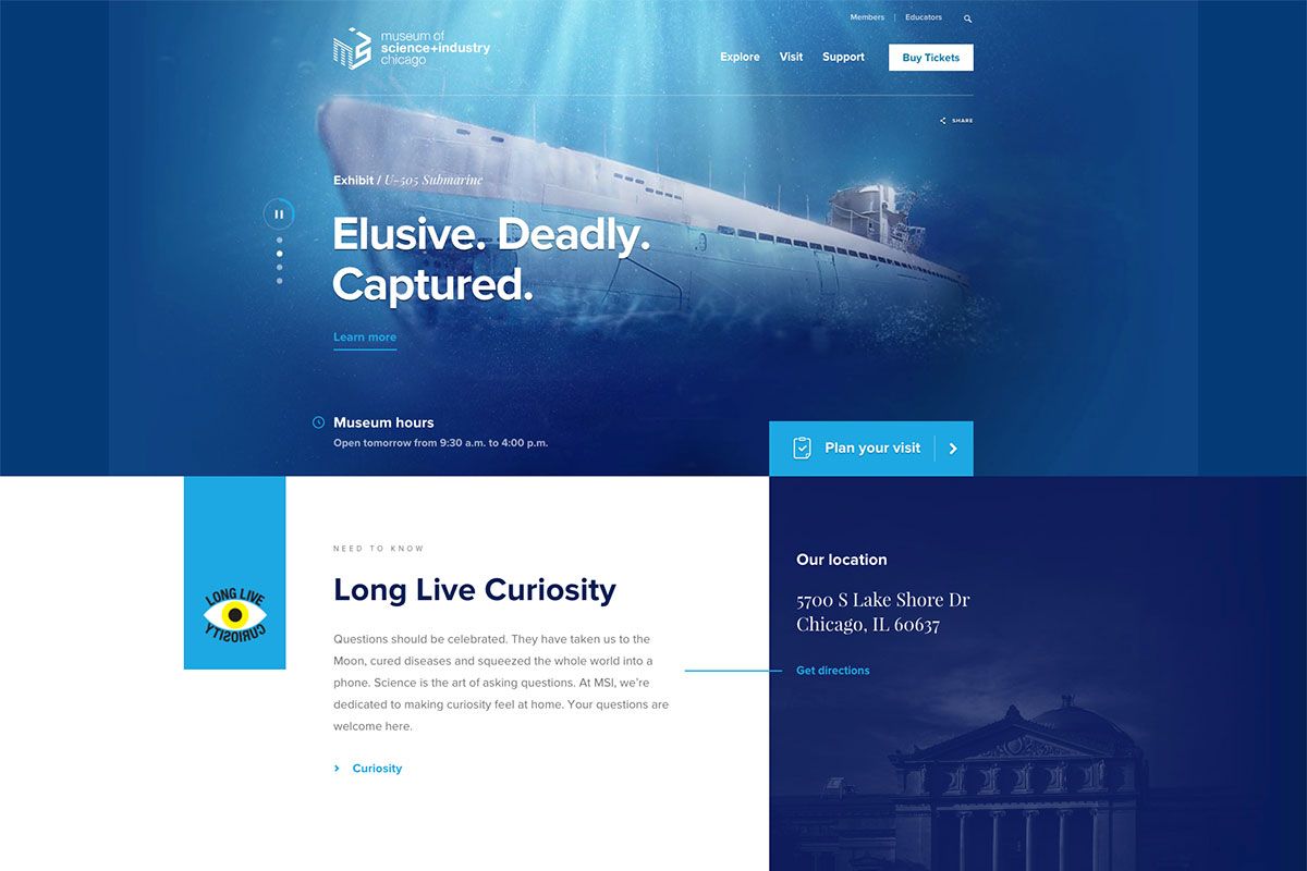
Whether you’re working with natural history museums, maritime, art, or science museums, the designs should be contemporary. Thus, it would behave a competitive edge over the competition. MSI Chicago is one of the largest science museums in the world. It’s home to more than 400,000 square feet of hands-on exhibits designed to spark scientific inquiry and creativity. While the website’s content should be compelling, the layout and design should complement it. With MSI, the homepage is attractive and innovative. The hero header displays various quality images, headlines, and CTAs. This website also utilizes an asymmetrical layout to present content nicely. Other notable features include social media links, slider, sticky header and more.
National Museum of Asian Art
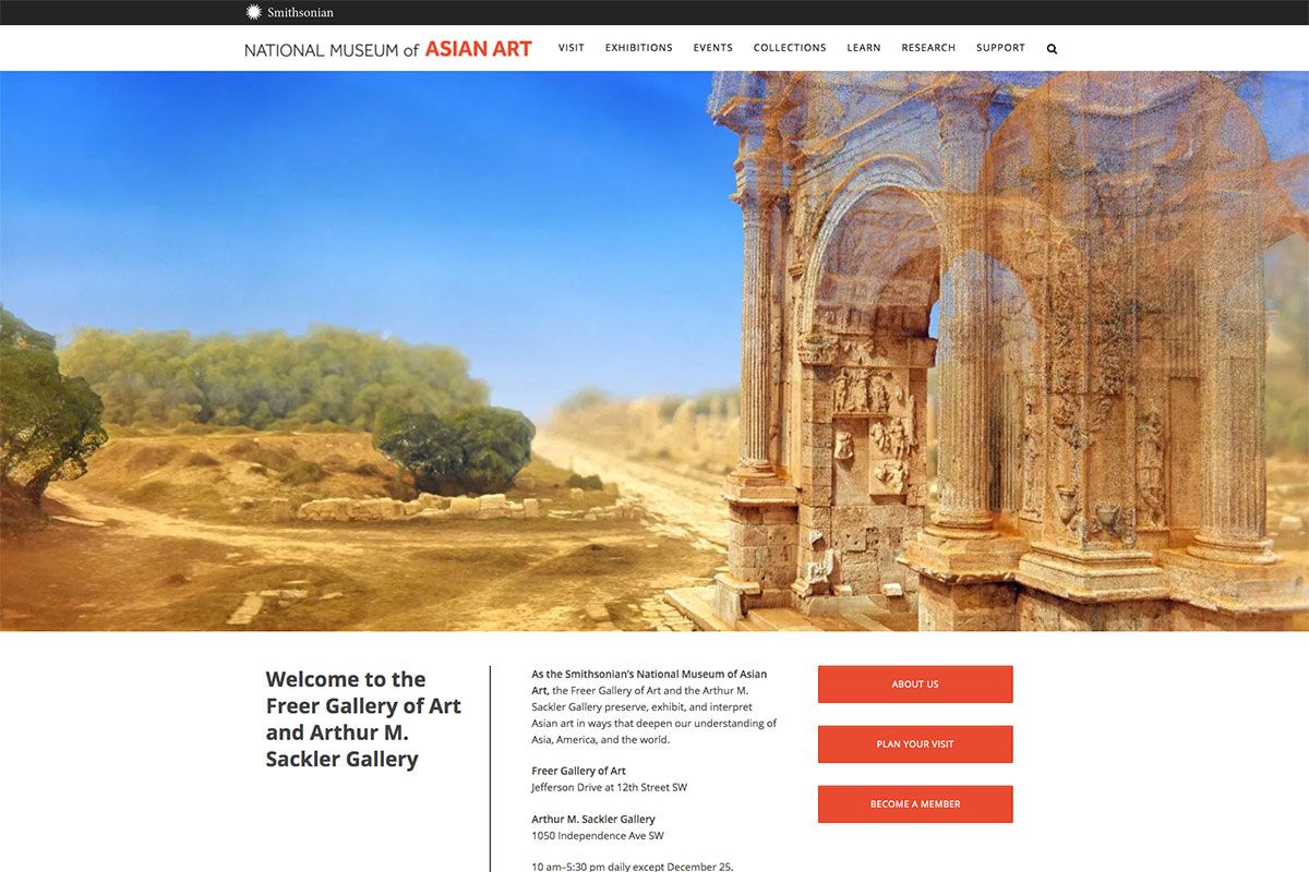
Clean and minimal designs of websites are excellent. This set is valuable and effective if you need such inspiration for your upcoming museum website design. National Museum of Asian Art has a fresh, modern, and minimal design. This institution is committed to preserving, exhibiting, and interpreting exemplary works of art. Specifically, a full-width image on the hero header and a menu display using a drop-down completes a simple hero scene. Whether visitors want to access the exhibitions page, events, collections, research, and support, it’s always accessible. Moreover, the arts also look attractive with bigger thumbnails and through the use of a smooth slider. Check them out!
Field Museum
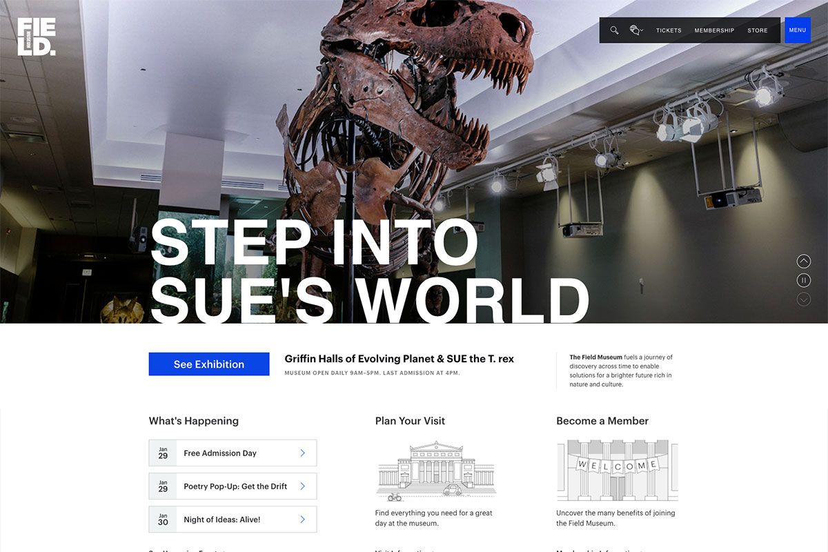
Field Museum fuels a journey of discovery across time to enable solutions for deeper study of nature and culture. Contrary to the objects the institutions exhibit in the museums, its website should be modern and visually appealing. This collection of museum website designs are totally inspiring and creative. Apparently, the homepage has a stunning and elegant design with an exceptional layout and features. In particular, the hero header highlights different collections through a slider which can be played or paused. Meanwhile, this website also has an advanced filter in discovering more exhibitions and articles. Aside from consistency in the web elements, a clean layout is also apparent in this website. Other essential pages include tickets, membership and store.
Art and History
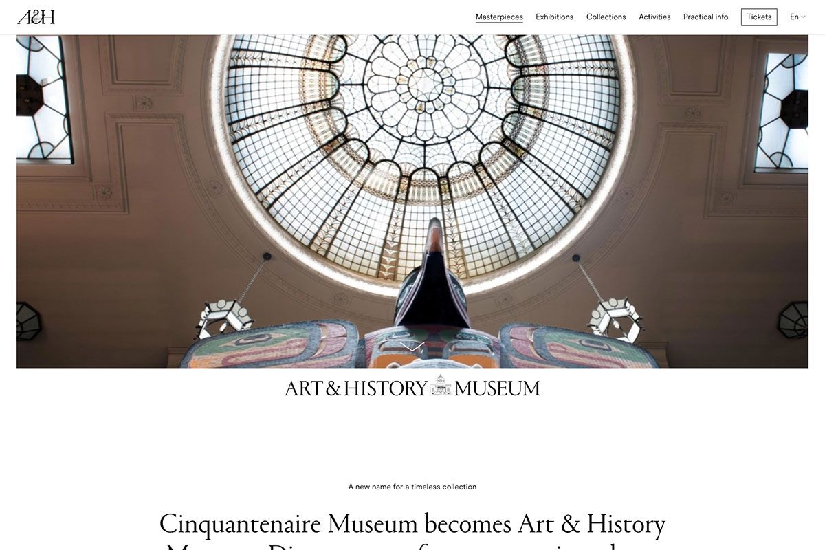
Simple design makes content more understandable. This is probably the theme of Art and History on its website. It’s a museum that houses an incredible collection of works belonging to all four corners of the world from the pre-historic period to the 20th century. Having an advanced museum website design is a valuable inspiration to fellow institutions. Its simplicity in design makes a seamless combination with GSAP animation. The homepage has a nice and smooth animation upon scrolling and a cool hover effect. While the sticky header provides ease in navigating to other necessary pages, the Instagram feed also extends the value of the social network as it is a powerful marketing tool that you can take advantage of.
Met Museum
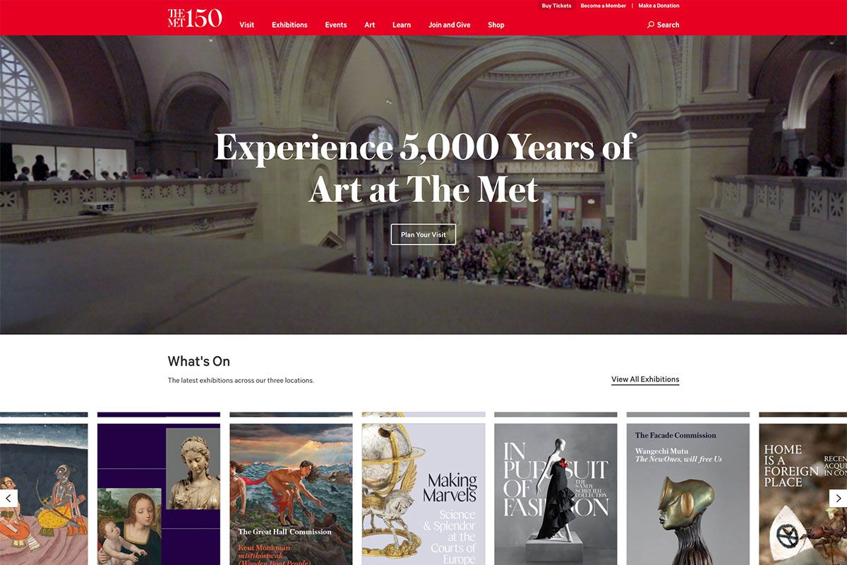
Museums are important vessels that house historical, scientific, artistic, and cultural artifacts. In like manner, such institutions treasure those objects for everyone to study and understand. Met Museum presents more than 5000 years of art from around the world for everyone to experience and enjoy. While the content is important, it is the design that captures attention. With this website, the design and content are altogether engaging. Specifically, the hero scene utilizes a nice video background with bold headline and descriptive CTA. Additionally, the exhibition section also adds sophistication to the look and feel of the website as they’re presented in card design with a sleek slider. Similarly, the presentation of the museums in three locations also looks grandeur.
National Museums Northern Ireland
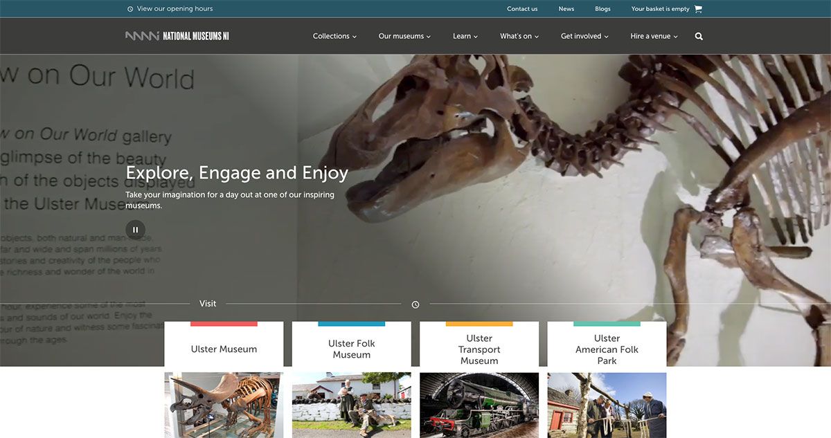
A website can do so much to the development of a museum. With a well-built museum website design, an institution can enhance the visitor experience and unlock more opportunities for its growth. National Museums NI houses premier cultural, learning, and tourist destinations. It’s a home for 20,000 works of arts, over a million plants, animals and geological specimens, and more. Since websites play vital roles in development, they are crafted with style and innovation. The hero scene is a magnificent video display as a background that can be played and paused. Moreover, the upcoming exhibitions look stunning with the card design layout. Here’s a list of awesome museum websites to explore before you finally set up yours.
National Portrait Gallery
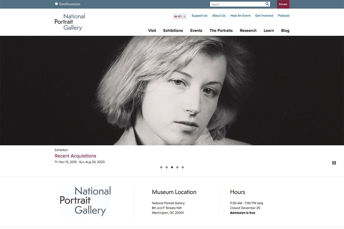
Like any other businesses, non-profit institutions should also have a well-designed website to convey goals and missions. If you’re looking for effective inspiration, these handpicked museum website designs will inspire you a lot. National Portrait Gallery presents people of remarkable character and achievements in America. They’re altogether stunning in this museum from artists, politicians, scientists, inventors, performers, and activists. For its website, the overall homepage design is clean and minimalist. The hero header comes with exhibitions presented using a flawless slider. To make a clear display of information about the location and opening hours, the website also uses a simple and clean layout with white spaces. It also exhibits some of the amazing portraits in the highlight section.
Van Gogh Museum
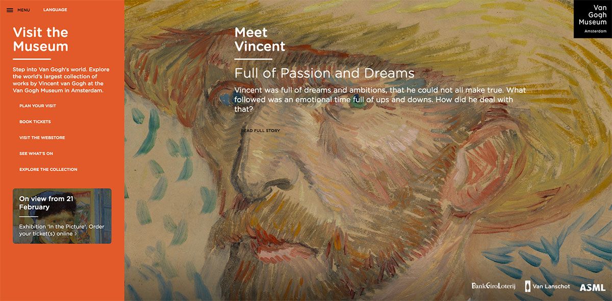
To preserve the arts of Vincent Van Gogh and his life and works, Van Gogh Museum is established. This way, such timeless artwork will be accessible and reaches as many people as possible to enrich and inspire them. Its website will make it easier to book tickets, locate the museum, purchase valuable objects, and even explore the collection. , the website utilizes a full-screen layout for the homepage and a simple sidebar menu. It also comes with an off-canvas menu to showcase further sub-menus, social media links, and newsletters. Moreover, this website can truly inspire more people regardless of nationality, race, and language. With the different languages this website offers, nationality is never a barrier to spreading awareness of this museum.
Scriabin Museum
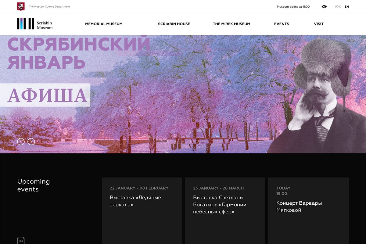
A museum is a timeless place that can preserve and spread awareness of a certain object or people. You can achieve great inspiration with these selected museum website designs before finalizing your design. Scriabin Museum is dedicated to the great Russian composer of the Silver Age, Alexander Scriabin. Its website is crafted with innovative elements, including sliders, magnificent hover effects, video integration, white space and more! As it uses the sticky header, navigating the website is fast and effortless. Additionally, the sub-menus are integrated with an elegant drop-down menu. It also didn’t ignore the importance of social media links to the institution’s progress.
Art Museum
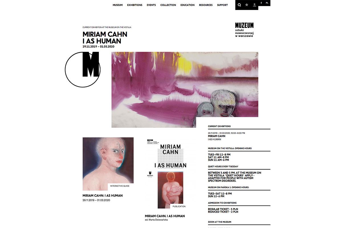
Art museums play vital roles in arousing the interest of artists all over the world. By preserving the objects of certain artists, their timeless artworks will linger throughout the generations. So, such museums must be promoted and marketed. This museum website design is a great tool if you need the inspiration to do so. Art Museum collects works of art through gifts, purchase, bequest, and deposits. The website of Art Museum is crafted to help promote and inspire fellow artists worldwide. This website enables a visitor to view upcoming exhibitions and events and check resources, collections, and other relevant activities of the museum. It embraces the animation upon scrolling, center content, social media integration, sticky menu, and more.
Wirtualne Muzeum Gazownictwa
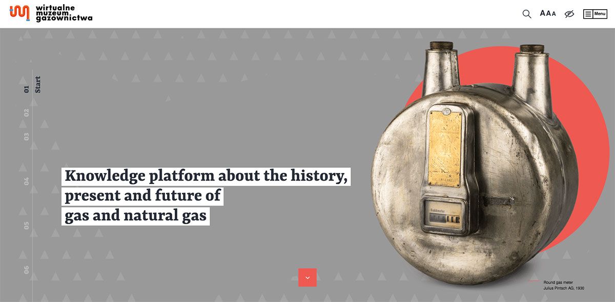
There’s no better way to reach more people and encourage them to visit museums than a well-built website. As most people own smartphones today, it would be best to design a mobile-friendly museum website. Wirtualne Muzeum Gazownictwa is a beautiful tool to inspire museum institutions that don’t have a website yet. One of the most creative websites on this list utilizes out-of-the-box layout and cool scroll animation. Through this medium, visually appealing virtual exhibitions are apparent and captivating. Aside from the clear images added, video integration also complements the content. To provide ease in the navigation, the sticky menu and the off-canvas menu are also utilized with social media links.
Museum Brandhorst
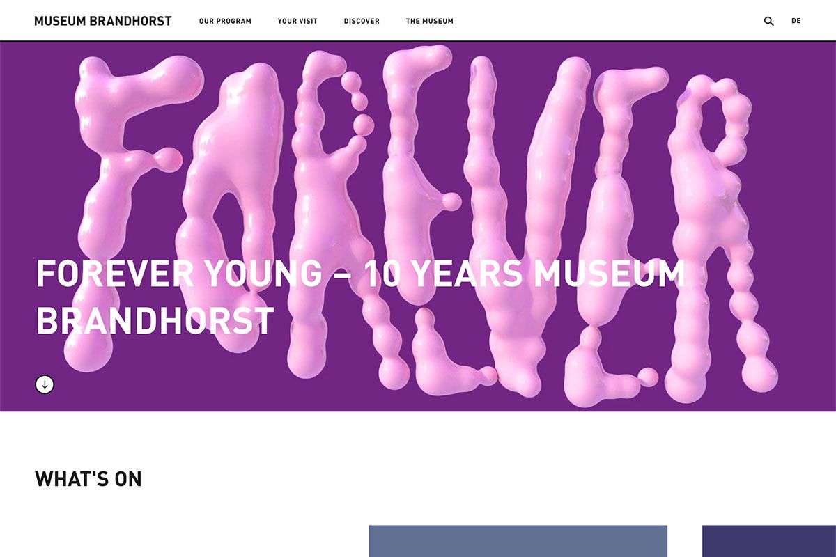
A website is a good medium to spread your missions as a museum institution. Here’s Museum Brandhorst dedicated to contemporary art in Germany with a spectacular facade of 36,000 ceramic rods. Getting ready with the opportunities lying at web presence, its website is built with amazing features and contemporary design. The homepage has a beautiful and artistic design with cool animation on the hero scene. The large thumbnails that represent exhibitions appear seamless with the smooth slider below the hero scene.
